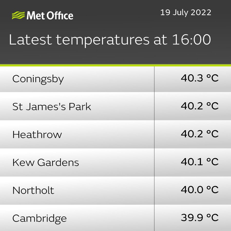
It was rather hot a month ago. In fact, the temperature record for the UK was clearly broken on the 16th of July 2022. Even with my ten gallon sceptics’ hat on, I could not dispute that. On the face of it, the 40.3°C recorded on the 19th of July this year was quite remarkable.
Now, in Denierland I did dispute the previous record of 38.7°C, set in July 2019 at the Cambridge Botanic Garden – sort of. I accepted it as a true record of how hot it was that day where people live – but questioned whether the record could be a true representation of how hot the UK would have been that day, in the presence of anthropogenic CO2 but in the absence of anthropogenic habitat alteration. That is to say, I doubted whether a temperature station in that very location but set in the original wildwood that covered the UK from stem to stern would have recorded the same value as the temperature station in the real Cambridge Botanic Garden in the real UK in 2019.
The same applies to the new 40°C record. It’s a true representation of what people experienced that day. It is not necessarily a direct measurement of climate change via CO2 emissions.
The record, it should be noted, was taken by RAF Coningsby in Lincolnshire. But five places recorded 40°C, as reported by Paul Homewood on the day itself (these records may have been revised, I do not know).
I would have been more than happy to let this stand without saying a word, right up until the point when the BBC began to browbeat us once again. Their headline:
UK heatwave: Five common myths debunked
“Debunked” is a kind of arrogant word that should not be used casually. If your intent is to demean your opponent, and you really have no sense of honour, then by all means use it. In any case its usage here is spare. “UK heatwave: five common myths” was sufficient. And if you debunk, you had better be sure your debunk is correct. Otherwise you end up showing that your priority is winning the argument, not ensuring that the facts are known. The article has already been mentioned at Cliscep, by John here and Mark in Open Mic.
Of the five “myths” presented by the BBC, I want to concentrate on #2, which like the others is enclosed in snark quotes just in case the reader might think the proposition is believed by the writer:
‘Runway temperatures are making it hotter’
The Met Office was accused of manufacturing and manipulating the record-breaking temperatures, because some were recorded at Heathrow. Some suggested heat emitted from the airport’s runway had skewed temperatures.
Temperature readings in the UK are taken from standardised weather stations, which have to meet specific criteria and are maintained and inspected by specialist teams.
Although some weather stations are located at airports, temperature readings are taken from thermometers in a Stevenson screen, which is a white slatted box with its door facing north.
The locations of these are also standardised, positioned over level grass and away from concrete or hardstanding wherever possible, which minimises the influence of man-made surfaces, like airport runways.
The Met Office also measures temperatures of the soil, ground and water in places too.
Now, if you want to argue that runways are not skewing the readings, it would be better to simply point to the fact that the records are not at runways. However, of the top 5, one is Heathrow and the other two are RAF bases with runways. That’s quite a strike rate.
What about those “specific criteria”? Perhaps the BBC debunker could have actually investigated, in an open-minded way, whether those 5 stations do in fact fulfil those criteria? Ya know, engage in a disinterested search for truth rather than a search for ways to get the deniers to shut the **** up once and for all?
Luckily this correspondent decided to do the work of the BBC’s debunker for them. So: just how good are these sites? One would hope that those crowing about records would first make damn sure that the sites where the records were made were beyond reproach, even by the most denialist deniers, the ones with the ten gallon sceptics’ hats. Are they?
WMO siting classification
The WMO classifies weather stations based on a range of criteria, from Class 1 (very good) to Class 5 (terrible). The criteria can be obtained here.
To summarise the relevant criteria:
Class 1
A source of heat (or expanse of water) is considered to have an impact if it occupies more than 10% of the surface within a circular radius of 100 m surrounding the screen, makes up 5% of an annulus of 10–30 m, or covers 1% of a 10 m radius area.
Class 2
A source of heat (or expanse of water) is considered to have an impact if it occupies more than 10% of the surface within a radius of 30 m surrounding the screen, makes up 5% of an annulus of 5–10 m, or covers 1% of a 5 m radius area.
Class 3 (additional estimated uncertainty added by siting up to 1 °C)
A source of heat (or expanse of water) is considered to have an impact if it occupies more than 10% of the surface within a radius of 10 m surrounding the screen or makes up 5% of a 5 m radius area.
Class 4 (additional estimated uncertainty added by siting up to 2 °C)
(a) Close, artificial heat sources and reflective surfaces (buildings, concrete surfaces, car parks, etc.) or expanse of water (unless significant of the region), occupying:
(i) Less than 50% of the surface within a 10 m radius around the screen;
(ii) Less than 30% of the surface within a 3 m radius around the screen;
Class 5 (additional estimated uncertainty added by siting up to 5 °C)
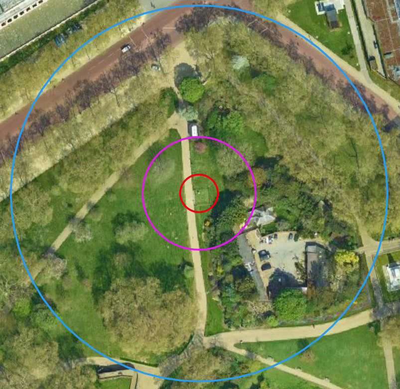
Coningsby
Here is the met station (these and subsequent snips from Google), with 10, 30 and 100 m rings (relevant to defining Class 1 and Class 2 sites):

Conclusion: Class 3. Fails Class 2 because of the hardstanding within the 30m radius.
St James’s Park
Conclusion: Class 4. The metalled path is within 10 m.
Heathrow:

Conclusion: Class 3. Significant hardstanding within 30 m. Note: it looks as if the weather station has been surrounded by a solid fence.
Kew

Conclusion: Close to Class 1, definitely not worse than 2. The children’s play area at lower left looks to be astroturf. There’s a cafe and some metalled paths. Putting it together the artificial surfaces total >10% within a 100 m radius, which would make it Class 2. Note: the children’s play area is fairly recent, and replaced natural ground with trees. This therefore has slightly contaminated the station.
Northolt

Conclusion: Class 3. Significant hardstanding within 30 m. The empty square at bottom looks like the former location of the weather station, but I can’t be sure. If so it was better before.
Of the five stations exceeding 40°C, only one is close to being “pristine” – Kew Gardens. And it is perhaps unnecessary to add that even Kew is in the middle of a large urban area. Caveat: I might have have mistaken the locations of the weather stations. Google Earth is very good, but it’s sometimes not obvious where the weather station is.
Harpenden
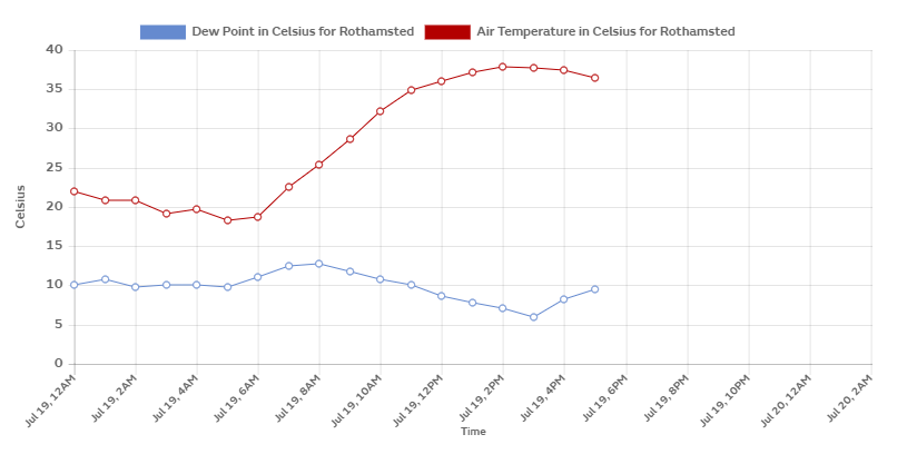
At this stage it is worth making a comparison with another site, this one that ticks the boxes and definitely meets the WMO criteria for Class 1: Harpenden. This site replaced the Cambridge Botanic Garden as a representative station for the Central England Temperature series. There are no buildings and no hardstanding within 100 m.

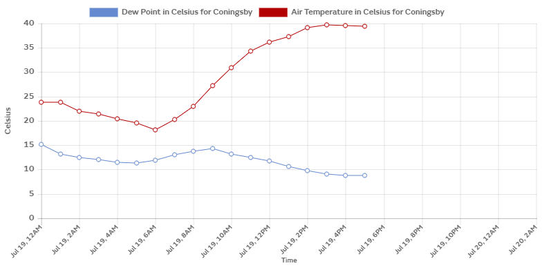
A sceptic might quibble about the qualities even of Harpenden, despite it qualifying as a Class 1 station. That is (i) because a set of arable fields are not representative of the pristine island that existed before wholesale forest clearance and (ii) the site is not far north of the great metropolis, and might receive pre-warmed air from there on a southerly breeze. However, the difference in temperature achieved is notable. I took these snips quite shortly after the record was announced, as you can tell from the time that the data is cut off. Both taken from the Met Office’s WOW. First, Coningsby, capping out at 40.3°C:
Next, Harpenden (the Rothamsted research station there), capping out at 37.8°C:
The day before the record, Radio 4’s The World at One was trailing, not 40°C, but 43°C. First the figure was given as a forecast, but that nuance was soon forgotten as Sarah Montague began asking learned guests: is this the new normal?
43°C, it need not be said, was way off the mark, and the time to discuss the record was after it had been achieved, not before.
Conclusion
The top score of 40.3°C came from a site of Class 3, with a 1°C variation from true. The question remains as to exactly how valid that record is.
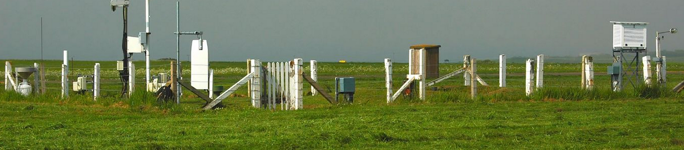
Finally, I present the Met Office’s conception of what a weather station is supposed to look like. Doesn’t look a lot like an airport.
Featured image:
A frame from the BBC forecast of 16th July, showing climate change over the UK and Western Europe, and nothing much to see happening to the east of there.

Jit,
What part of ‘specialist teams’ did you not understand? 🙂
Leave poor old Merlyn alone. She’s only trying to do her job and her job is not to question what she has been told to say.
LikeLike
“And if you debunk, you had better be sure your debunk is correct.”
How very true. At the risk of taking this thread O/T, I’d like to remind everyone about the events surrounding the so-called Myth #1 (‘Weather maps are alarmist’).
It started when Aidan McGivern tweeted to draw attention to a ‘ridiculous comparison’ that deniers were making between old style graphics and a new style temperature map used by the Met Office. Aiden claimed that the temperature map doing the rounds on social media was obviously faked and this was a good example of the devious tactics that deniers resort to all the time. This accusation was then shown to be false when someone found the original posting of the weather map concerned — and it turned out it originated from the Met Office! That’s what you call debunking. And where was Merlyn whilst all of this was going on?
In the meantime Aiden had tried to pull the wool over everyone’s eyes by referring to changes necessary to help out those with colour blindness. This involves adoption of a Colorbrewer palette so that red/green comparisons are avoided. But that was never the issue for the ‘deniers’. The problem was to do with the fact that deep hues that had been used to represent 39c were now being used to represent 29c. This much was apparent by examining the examples of authentic maps that Aiden had himself tweeted.
Accentuating hues does not help the colour blind, it just helps the cause, and by tweeting the ‘correct’ weather maps Aiden had accidentally managed to debunk himself. And where was Merlyn whilst all of this was going on?
When all of this was discussed here on Cliscep earlier this year (see ‘Fiery Maps and Climate Change’), I posted the following comment:
“I now look forward to a Reality Check from one of the BBC’s intrepid climate disinformation specialists.”
And now here we have it, with Merlyn repeating the same lame, irrelevant smokescreen emitted by Aiden. Do you think Merlyn has even heard of Colorbrewer and the real reason it is used?
Now I’ve got that off my chest, let’s get back to runways and weather stations.
LikeLiked by 2 people
Who is the author of this excellent article?
(Since cliscep is a collaborative effort, it would be best if y’all would make a practice of always “signing” your articles with bylines. Please?)
LikeLike
“Who is the author of this excellent article?”
Some say he was delivered prematurely by a midwife who used a hockey stick.
Some say his adjectives are secretly funded by the Koch brothers, but not the nouns.
Some say he has a mole on his shoulder that he calls his little Greta.
All we know is that he’s called The Jit.
LikeLiked by 1 person
Jit, many thanks for doing that. The BBC’s propaganda is increasingly obviously just that – propaganda.
The ‘debunk’ relating to the relationship between temperature records and airports/runways irritated me greatly at the time. We are told that the connection is a myth, when patently it’s fact, as the BBC ‘debunk’ effectively acknowledges , by telling us that the use of a Stevenson screen “usually” “minimises” the influence of manmade surfaces. Usually isn’t the same as always. Minimises isn’t the same as eliminates.
LikeLiked by 1 person
Specialist teams, Mark. You’re forgetting the specialist teams.
LikeLike
John, not remotely O/T. I might have talked about #1 through #5 but had neither the will nor the time. In any case you’ve now done a better and more concise job on #1 than I could have.
I suppose we should not expect young (I presume) journalists in the BBC to produce fact checks that go against the zeitgeist. It’s nevertheless disappointing.
Dave, are author names not visible to you? Immediately below the title on every post. (Perhaps they don’t appear on a phone?)
LikeLike
Of some interest, in my little South Shropshire Market town, during the last week my temperature readings have been 3 degrees C lower than those forecast by the MO and BBC!
Thighest I’ve rever recorded was 32C in 2002 and when it was 40+ at Heathrow it was 30.1 here (hardly a record).
LikeLike
Then there are those hot city nights. All that concrete………….
https://agupubs.onlinelibrary.wiley.com/doi/10.1029/2021GL095678
LikeLike
Jit,
I notice that the highest temperatures recorded during this last heatwave were attributed to the Charlwood weather station. From what I can see, it is located about 35m from the main road into Crawley. What does that imply as far as its classification is concerned? Perhaps of more interest is the fact that it is about 1000m from the end of the runway at Garwick Airport and directly under the flightpath. Do you think that is an issue?
LikeLike
John, I see the station you are looking at. The road probably doesn’t cover >10% of the ground within a 100 m radius, so it’s probably Class 1. Looking back in time on Google Earth, the station wasn’t there at all in 2001. It’s visible in 2005, and it looks like some bushes are growing up immediately south of it that might cast shade at times of year with low sun angles, which would make it biassed low at those times. It should not be so close to a hedgerow, which should introduce a bias in the other direction by limiting air flow?
I can’t see the weather station at the airport, so can’t compare it with that. If we actually had the data, we could test for the effect of air traffic – I’m not quite sure how, but the Covid lockdown might provide an angle.
LikeLike
Crowcatcher, as I noted up top, Heathrow might be particularly bad. To judge from the satellite pic, it looks as if the weather station has a solid fence around it, not chainlink.
Are you up a hill? There’s the approximate 1 degree per hundred metres of elevation to consider.
LikeLike
Jit:
I have a small screen iPhone (an iPhone SE, the same screen size as the original iPhone). On that the author is visible on all posts on the Cliscep home page and after clicking on the post.
That said, I did like John’s allusion to The Stig.
LikeLike
No name, just “Jit”.
Google reports:
LikeLike
Dave, I see what you are getting at. The fact is, I’m working towards first name recognition.
(That is a lie. JIT is formed of my initials, and is what I have been mostly called since schooldays. Eventually I stopped all-capping it; hence “Jit.” Pity it is also “Just in Time” and a style of music. It also means either “warrior” or “king” according to a former colleague whose name was Ranajit, which he said meant “warrior king.” I can’t remember which word meant what. If you hover over my gravatar, you will see the cover of a book wot I rit, and a fuller name there. I keep meaning to amend the description to say “Just some guy.”)
LikeLike
Jit – a bit O/T but from your “Featured image: A frame from the BBC forecast of 16th July, showing climate change over the UK and Western Europe, and nothing much to see happening to the east of there.”
I notice that it shows north Africa average & colder mostly, wonder where the heat from there went ?
LikeLike
More to the point Jf, hot weather in Europe and the British Isles commonly is described as having originated in the Sahara Desert and has been driven northwards. Sometimes there is even red dust in those winds. But not so this time. If anything heat from the Iberian Peninsula is warming Morocco. Does global warming (or any of its multitudinous alternatives) predict this?
LikeLike
Jit,
Thank you for your question.
When I recorded the 32C I happened to be at the cricket in Worcester where it was reported as 34C.
I live in the highest house in my little market town about 60 metres higher than the river. A few years ago I did a rough check with my thermometer by taking it down there and measured about 1.5C higher than at home, so, still lower than the Met forecast.
LikeLike
In the Daily Sceptic, fresh suspicions about this July’s records: https://dailysceptic.org/2022/11/27/fresh-doubts-emerge-about-40-3c-u-k-temperature-record-next-to-airfield-runway/
LikeLike
“Climate Change Scandal in Australia Heating Up”
https://dailysceptic.org/2023/04/17/climate-change-scandal-in-australia-heating-up/
LikeLike
“Climate change: Spain breaks record temperature for April”
https://www.bbc.co.uk/news/science-environment-65403381
Can you guess where the new record was set? There’s something of a theme developing here, so there are no prizes for guessing:
I don’t deny that it’s been unusually warm this month in Spain, but then it’s been unusually cold where I live this month. The log burner is on as I write. It’s called weather.
LikeLiked by 1 person
Persistence paying dividends? Conspiracy theories becoming mainstream? WordPress alerted me to this Daily sceptic article, presumably because it links here:
https://dailysceptic.org/2023/06/28/exclusive-three-typhoon-jets-landed-next-to-measuring-device-when-britains-record-temperature-of-40-3c-was-recorded/
LikeLike
Jit, I wonder why WordPress didn’t alert you to my own linking to your article here in a piece I wrote yesterday, prior to the Daily Sceptic publishing its criticism of the Coningsby 40.3C ‘record’.
https://jaimejessop.substack.com/p/psy-op-wars-the-british-are-being
LikeLike
Jaime, it was stuck in pending, thanks to WordPress. I released the pingback earlier this morning.
LikeLiked by 1 person
I tried commenting on that DS article only to discover that they require a financial contribution before allowing you to do so! Sod that. Not really conducive to open discourse.
LikeLike
Mark/Jaime
I received two emails re: Daily Sceptic. One to ask me to moderate the pingback, and another notifying me of the pingback comment (after Mark had released it?). I have had no mails at all about Jaime’s, which is mystifying.
LikeLiked by 1 person
“It is mystifying indeed.”
I am of course following, as always, the prayers and responses for the solemn gathering of WordPress admins.
(They said we don’t have a prayer but that’s quite wrong. I have many, some more desperate than others.)
LikeLiked by 1 person
Jit, I didn’t receive a message about it, but I noticed it when I was checking if anything needed to be released from Spam. Apologies from me, it was on your thread, and I should have emailed you to let you know, though I guessed that on this occasion you wouldn’t mind.
LikeLike
Mark/Jit,
Makes me wonder if WordPress are downgrading notifications from Substack.
LikeLike
Update: Notalot identifies the met station for Northolt as in a different place & confirmed with streetview. I will have to revise my score for this one (it’s probably worse). And it looks like I had the location in the head post in the wrong place anyway – the little compound west of the control tower was where I supposed the station to be, I think. Google Earth is good for a lot of things, but when out of range of streetview, interpretation is difficult.
LikeLiked by 1 person
Yesterday the Guardian had a headline about temperatures in Delhi having exceeded 50C. Today things seem less clear:
“Delhi heatwave: officials investigating if temperature of 52.9C due to faulty sensor
Meteorological department examining data from Mungeshpur station amid soaring temperatures that came close to 50 degrees Celsius”
https://www.theguardian.com/world/article/2024/may/29/delhi-temperature-hits-499c-as-indias-capital-records-hottest-day
Authorities in India are investigating whether a faulty sensor may have been behind a reading that showed temperatures in Delhi soaring past 50 degrees for the first time, amid a scorching heatwave in the capital.
The India Meteorological Department (IMD) said it was examining the data and sensors at the Mungeshpur station after an unusually large variation in temperatures was recorded at the station compared to others.
A raft of other stations around the capital recorded more consistent temperatures that were close to 50, with Najafgarh the highest at 49.1 degrees Celsius, as authorities warned of water shortages in India’s capital.
Note to Guardian – 49.1 is a lot closer to 49 than to 50. Yesterday they were so pleased to have a temperature of more than 50C. Today, in view of the doubts, they are left claiming that 49.1C is close to 50C. Still, it’s good to see them recognising that not all weather station readings are accurate, and that there can be huge uncertainties, often of several degrees, especially when the urban heat island effect is involved. It casts considerable doubt on all and any claims about new records, achieved by a fraction of a degree or in places where weather stations are unreliable and/or dubiously sited.
LikeLiked by 1 person
This is a line that the Daily Sceptic is – with good reason – pushing very hard just now. Here’s their latest:
“Met Office Should Put 2.5°C ‘Uncertainties’ Warning on All Future Temperature Claims”
https://dailysceptic.org/2024/05/30/met-office-should-put-2-5c-uncertainties-warning-on-all-future-temperature-claims/
It is “abundantly clear” that the Met Office cannot scientifically claim to know the current average temperature of the U.K. to a hundredth of a degree centigrade, given that it is using data that has a margin of error of up to 2.5°C, notes the climate journalist Paul Homewood. His comments follow recent disclosures in the Daily Sceptic that nearly eight out of ten of the Met’s 380 measuring stations come with official ‘uncertainties’ of between 2-5°C. In addition, given the poor siting of the stations now and possibly in the past, the Met Office has no means of knowing whether it is comparing like with like when it publishes temperature trends going back to 1884.
There are five classes of measuring stations identified by the World Meteorological Office (WMO). Classes 4 and 5 come with uncertainties of 2°C and 5°C respectively and account for an astonishing 77% of the Met Office station total. Class 3 has an uncertainty rating of 1°C and accounts for another 8.4% of the total. The Class ratings identify potential corruptions in recordings caused by both human and natural involvement. Homewood calculates that the average uncertainty across the entire database is 2.5°C.
LikeLiked by 1 person
A comment on the above article from the excellent ‘varmint’:
LikeLiked by 2 people
On the Delhi heatwave, the Guardian is still claiming a record temperature, but in a surprisingly desultory sort of way, having noted this:
“Sensor error means New Delhi heatwave record overstated by 3C
Meteorologists found 52.9C reading to be false, though new record does appear to have been set”
https://www.theguardian.com/world/article/2024/jun/01/sensor-error-means-new-delhi-heatwave-record-overstated-by-3c
A record temperature registered this week for the Indian capital of 52.9C (127.22F) was too high by 3C, the Indian government has said.
The Indian Meteorological Department (IMD) had investigated Wednesday’s reading by the weather station at Mungeshpur, a densely packed corner of New Delhi, “and found a 3C sensor error”, the earth sciences minister, Kiren Rijiju, said.
“Corrective measures are now in place,” the minister said, sharing the conclusion of a draft report about the all-time high reading on X. He did not give a corrected figure for Wednesday’s temperature.
LikeLiked by 1 person
Watched a BBC NEWS report on the India Election 2024.
they were more intent to shoehorn the Delhi ‘unbearable’ as temperatures soar past 50C – BBC News into the piece than report on the Election.
From the above link – “Parts of northern and central India are sweltering under a severe heatwave, with a provisional record temperature of 52.3C (126.1F) registered in Delhi.
If verified, it would be the highest ever recorded in India.
More than 37 cities, external in the country recorded temperatures over 45C this week.
Warnings of heat-related illnesses have been issued, with at least three deaths reported so far.”
Yep, climate fear nudge in any & all reports.
worth a read of that BBC link if only for this quote “The city’s power demand has soared to an all-time high, with residents turning to air conditioning, coolers and ceiling fans to cope with the heat.”
all powered by, wonder what ?
LikeLike
Paul Homewood and some citizen sleuths on his site have of course been doing sterling work in identifying the number of junk weather stations used by the Met Office, and exposing the number of “records” that are set at such sites rather than Class 1 or Class 2 sites. Well, the BBC and the Met Office don’t care:
“UK sees hottest day of the year so far”
https://www.bbc.co.uk/news/articles/cx882q4x7zdo
Wednesday was the hottest day of the year so far, the Met Office has said, after 30.3C was recorded at London’s Heathrow Airport.
London’s Heathrow Airport – yet again. I may be mistaken, but I believe it’s officially a class 3 site, though on what basis I don’t know – I should have thought it’s a class 5.
Ms Chalk added: “Yesterday we got to 30C and that was the first time we reached 30C since September 10 last year.“
How odd – that’s what usually happens when summer follows winter. Doesn’t sound as though autumn or spring were anything to write home about. Will it last? Don’t be silly…
BBC weather said many places – including Glastonbury – can expect largely dry conditions this weekend, albeit with lower temperatures.
Other areas will experience outbreaks of rain and strong winds with gusts of up to 50mph in places.
Further south, there will be less rain and it won’t be as windy – but it will turn cooler.
Where I live, the forecast is now for the temperature to peak at 14 or 15C every day for the next fortnight, with the luxury of 16C forecast for two hours between 4 and 6pm on Tuesday July 9th.
LikeLiked by 2 people
As for yesterday’s high temperature, Paul Homewood has more:
LikeLiked by 2 people
Typical Guardian, turning a puff piece about Glastonbury into a climate crisis headline:
“Glastonbury opens its gates as UK temperatures soar to 30C
Organiser Emily Eavis says it is ‘best moment of the year’, as visitors are sprayed with water while they set up camp”
https://www.theguardian.com/music/article/2024/jun/26/glastonbury-opens-gates-uk-temperatures-soar-30c
The headline is misleading. Temperatures at Glastonbury reached 27C, which is what we used to call a summer day. The 30C readings were at Heathrow (an airport), yet again and at Chertsey – embedded among hundreds of solar panels.
LikeLiked by 2 people
Well, that was your ‘scorching’ summer in the Era of Global Boiling. We had ONE very warm day here (yesterday). Temperature over the next 5 days is not forecast to rise above 16C and there are going to be gales along the coast later today.
The Met Office reports that it’s the first time the mercury has risen above 30C since Sept 10th last year. So, 9 months when it has not been genuinely hot and even then, it only got hot on the tarmac at Heathrow and amongst some solar panels at Chertsey. Looks like Global Boiling has abandoned poor old Britain.
But at the end of the month, I can guarantee it, the headlines will read:
‘Despite a poor start to the month, June turned out to be slightly warmer than average’.
Nudge, nudge.
LikeLiked by 3 people
LikeLiked by 1 person
“Junk Temperature Measuring Network Means the Met Office Cannot Prove There’s Been a “Dramatic Increase” in Temperature”
https://dailysceptic.org/2024/08/13/junk-measuring-network-means-the-met-office-cannot-prove-dramatic-increase-in-temperature-extremes-and-records/
...Human-caused and urban heat encroachment are the problems, with extreme cases found at airports, which can add many degrees of warming to the overall record. But this has been known for some time, and it is a mystery why the Met Office has not done anything about it. Recent FOI disclosures reveal that over eight in 10 of the 113 stations opened in the last 30 years are in junk classes 4 and 5. Worse, 81% of stations started in the last 10 years are junk, as are eight of the 13 new sites in the last five years.
It’s almost as if the Met Office is actively seeking higher readings to feed into its constant catastrophisation of weather in the interests of Net Zero promotion. Whatever the reason – incompetence or political messaging – serious science would appear to be the loser. As currently set up, the Met Office network is incapable of providing a realistic guide to natural air temperatures across the U.K. Using the data to help calculate global temperatures is equally problematic….
LikeLiked by 2 people
I have been very interested to hear what the Daily Sceptic has found regarding the quality of the Met Office Temperature Measuring Network. However, I think we need to be careful in how we interpret the significance of the numbers of Met Office weather stations that fall into the various CIMO classes. It is true that, according to the World Meteorological Organisation, the classification:
And that:
However, they go on to say:
It seems that this apparent contradiction is due to the fact that different stations have different purposes, and so a Class 5 station, for example, may still be perfectly adequate for its purpose. Hence, they say:
So the question is not how many of the sites within the network are Class 4 or Class 5, but how many of these are used to calculate the UK’s temperature record and how many feature in the record-breaking headlines.
https://community.wmo.int/en/activity-areas/imop/siting-classification
LikeLike
And whilst I am on this subject, there is this article at The Conversation to be considered:
“Victorian technology for measuring the weather is still remarkably accurate – new research“
https://theconversation.com/victorian-technology-for-measuring-the-weather-is-still-remarkably-accurate-new-research-236831
Of course, the thorny subject of siting classifications is completely avoided. Instead, the author focusses upon the differences in accuracy between using a modern aspirated thermometer and a Victorian technology Stevenson screen. And he had this to say:
Maybe not, but an increasing reliance upon poor CIMO classed stations certainly would.
LikeLike
“More Horror Pictures Emerge Showing Locations of Met Office “Extreme” Record Temperatures”
https://dailysceptic.org/2024/09/13/more-horror-pictures-emerge-showing-locations-of-met-office-extreme-record-temperatures/
LikeLike
“Met Office in Denial as It Rates Almost all its Temperature Stations as ‘Excellent’, ‘Good’ or ‘Satisfactory’”
https://dailysceptic.org/2024/09/18/exclusive-met-office-in-denial-as-it-rates-almost-all-its-temperature-stations-as-excellent-good-or-satisfactory/
…According to World Meteorological Organisation (WMO) international standards, almost eight in 10 Met Office stations are in junk Class 4 and super junk Class 5 with possible errors of 2°C and 5°C respectively. But it turns out that over nine in 10 stations are internally rated by the Met Office as ‘Excellent, ‘Good’ and ‘Satisfactory’. Just 27 stations are considered ‘Unsatisfactory’.
It might be hoped that the Met Office is rushing to upgrade these unsatisfactory stations not least because they produce numerous ‘record’ highs, or ‘extremes’ as they are now termed, that litter the database. It is not a good look to be caught promoting all-time ‘extremes’ from recordings that you consider internally to be unsatisfactory. Nevertheless, two of the four national temperatures records were produced by this small band of unsatisfactory stations – on July 18th, 2020, Hawarden Airport in Wales recorded 37.1°C, while on July 21st, 2021 a temperature was recorded of 31.3°C in Castlederg, Northern Ireland….
...Also known as CIMO ratings, the Met Office states categorically that the records “must” be between 1 and 4. “CIMO 5 will mean data from the site will be flagged and not quoted in national records,” adds the Met Office.
Presumably the instruction is not fully understood across the entire organisation. For instance, in a week analysed last June by the Daily Sceptic the Scottish Class 5 station Leuchars provided an area ‘extreme’ on four out of the seven days examined. In England, the Class 5 station at Killowen also featured four times, while Usk No.2 and Durham made the top spot on three occasions. From the Met Office’s own tiny ‘Unsatisfactory’ list we get Kinlochewe, which provided the highest January temperature ever recorded in Scotland at 19.6°C, and London St James’s Park, which holds the record for England SE and Central S. In fact, this record of 40.2°C on July 19th, 2022 was only pipped for 60 seconds near the runway at RAF Coningsby where 40.3°C was achieved at around the time three typhoon jets were attempting to land. Seemingly besides itself with excitement, the Met Office lauded the breaking of the 40°C barrier as “a milestone in climate history”.
The Met Office appears to be in denial about its temperature network...
LikeLiked by 2 people
Hi everyone, only just come across this thread – just shows how parochial I have become, don’t get around much! I have been on at the Met Office about their dodgy sites for quite a while now. Finally decided to have a go at updating the Surface Stations Project on Rog’s Tallbloke site. I am managing not quite a daily post so up to about 30 since late August. Hopefully I can manage every site plus quite a few special topics along the way but will probably take a couple of years.
The headline list needs a few minor tweaks. St Jame’s Park is Class 5 and Unsatisfactory by the Met Office’s own unique assessment system as at end of August 2024 – it took a FOI to get details of MO’s own grading of Excellent, Good, Satisfactory and Unsatisfactory but they still will not exactly define their rating parameters. Cambridge Botanic Gardens is Class 5 and kicked off the CET in 1931 for identified UHI. Northolt is Class 5 due to heavy shading effects.
I am compiling a lengthy report on Heathrow (allegedly Class 3 but obviously no chance) and there are some weird goings on……there was a second Screen close by from 2008 to 2014 (who knew eh?) which is not that unusual for the Met Office.
Ultimately I am hoping to identify a group of good quality sites with long history and compile a separate temperature record. Well it’s an aspiration……
LikeLiked by 2 people
The other side of the coin if Met Office sites are recording too high…:
“Millions of Pounds of Cold Weather Benefits Could be Lost Due to Unreliable Met Office Data”
https://dailysceptic.org/2024/11/18/millions-of-pounds-of-cold-weather-benefits-could-be-lost-due-to-unreliable-met-office-data/
LikeLike
“Met Office Claims to Have Been Recording Temperatures at “Stornoway Airport” 30 Years Before Aeroplanes Were Invented”
https://dailysceptic.org/2024/12/31/met-office-claims-to-have-been-recording-temperatures-at-stornoway-airport-30-years-before-aeroplanes-were-invented/
The U.K. Met Office claims to have a continuous record of temperatures at Stornoway Airport going back to 1873. This is truly remarkable since manned powered flight was not achieved until 1903 and the actual airport was built in 1937. Yet another error in the Met Office’s temperature recording database. Yet another sign that in its mission to scare the population into accepting the looming Net Zero catastrophe, the Met Office is failing in its day job to accurately record temperatures across the U.K. Over the last year there have been revelations about data invention at 103 non-existent weather stations while almost the entire 380-strong network is heavily skewed by unnatural heat corruptions. All of this in a year when it added a politicised measure to its “Indicators of Global Warming” based on just 10 years of actual data and 10 years of computer model speculations loaded with improbable claims of future temperature rises.
Again we are obliged to the work of super sleuth Ray Sanders, who has been conducting a forensic examination of the temperature claims made by the state-funded Met Office. Of course there was no airport on the site in 1873. The coordinates provided apply to the current airport location, although there is no indication in the detailed records when these might have changed. The diligent Sanders discovered that the original site was located 4.25 kms away in the grounds of Lews Castle. Further research found that the move to the airport site occurred in 1968. “Is all of this just ineptitude on the part of the Met Office or is there some motivation behind this covert dataset bonding?” asks Sanders. “Did nobody ever stop to think about the dates when attributing 19th century readings to a site with the name ‘Airport’ attached?” he further inquired.…
LikeLiked by 1 person
“40.3°C UK Temperature ‘Record’ from Halfway Down Airport Runway Enters the Long-Term Archive”
https://dailysceptic.org/2025/03/27/40-3c-uk-temperature-record-from-halfway-down-airport-runway-enters-the-long-term-archive/
How we laughed when the Met Office declared a UK temperature record of 40.3°C at 3.12pm on July 19th 2022, halfway down the runway at RAF Coningsby at a time when it later transpired three typhoon jets were coming into land. Mirth was unconfined when the ‘record’ that stood for 60 seconds as the temperature briefly spiked by 0.6°C was later declared by the Met Office to be a “milestone in UK climate history”. Now it appears that another nearby and busy RAF station in Lincolnshire is getting in on the ‘joke’ record business. It appears that RAF Waddington also declared a record high on the same day of 40.3°C and this has been entered into the archive run by the Centre for Environmental Data Analysis (CEDA). This is despite the Met Office itself calling the Waddington reading ‘suspect’ due to an application of weedkiller. Quite why this should disqualify a temperature recording four feet from the ground when jet exhaust does not is unclear, and the excuse has a touch of the ‘dog ate my homework’ about it.
Weedkiller or not, the 40.3°C recording at Waddington has found its way into the Met Office Midas Open dataset. This is said to be one of CEDA’s most popular datasets, containing historical meteorological observations back from the present to the 18th century. Popular with future scientists no doubt who will be able to point to two 40.3°C records, happy to disregard any airport heat corruptions and the even more severe warmth that seems to emanate from an application of paraquat...
LikeLiked by 1 person
“Met Office Shock: More Non-Existent UK Weather Stations Discovered Reporting Invented Data”
https://dailysceptic.org/2025/04/09/met-office-shock-more-non-existent-uk-weather-stations-discovered-reporting-invented-data/
It’s reported at Spiked, but thanks are due to the indefatigable Ray Sanders. The specific article is here:
But the ongoing forensic takedown of the Met Office is worth following more generally:
https://tallbloke.wordpress.com/
LikeLiked by 1 person
Bit late for this thread but…..here is my latest piece on Heathrow including Aitken Effect. There is a lot more yet to come but I am having to tread carefully for reasons I cannot yet disclose
LikeLiked by 2 people
“Global Climate Database Fed with Junk Data From RAF Airbase Where Helicopters Hover Over the Thermometer”
https://dailysceptic.org/2025/04/30/global-climate-database-fed-with-junk-data-from-raf-airbase-where-helicopters-hover-over-the-thermometer/
The Global Climate Observing System (GCOS) is one of the most important climate monitoring networks in the world. It is co-sponsored by the World Meteorological Organisation (WMO) and numerous UN, EU and scientific bodies and its collects information that is used for scientific research within the Intergovernmental Panel on Climate Change. Ultimately, it forms the basis for promoting and implementing global Net Zero plans. Given its importance and the need to keep to the highest standards of scientific reporting, it is a surprise that the UK Met Office seems to take its temperature reporting duties rather lightly. It provides information from eight sites, four of which are rated junk class 4 with international ‘uncertainties’ of 2°C. Barely beyond belief, another site is based slap bang in the middle of RAF Shawbury, where pilots in military helicopters make frequently low fly-pasts at all hours of the day and night.
The picture above is taken at the air base, the main RAF helicopter training centre, and it shows a helicopter next to the white Stevenson box containing the measuring device. Other clips – you couldn’t make it up – show helicopters hovering over the screen.
The image is captured from a YouTube video which shows extensive traffic at the base in close proximity to the temperature measuring station. Again we are obliged to citizen super sleuth Ray Sanders who is undertaking a forensic examination of the entire Met Office’s UK temperature station network. Sanders notes that the heat hazes from the engines and the powerful down-draughts from the rotors are clearly visible. He concludes that despite the site being one of the Met Office’s most important locations, it is “completely worthless” for climate reporting. Despite this being a ‘flagship’ site, it is said to demonstrate the “poor standards and total lack of supervision thar the Met Office is being allowed to operate to”. In fact, not only is Shawbury a key location feeding information to international bodies promoting the Net Zero fantasy, it is also one of only 37 UK station in the Met Office’s historical database. In the case of Shawbury it shows measurements stretching back to 1946….
LikeLike