January 2019 Update: The Science Still Isn’t Settled
The “basic physics” of climate change was settled by Tyndall, Arrhenius and others in the 19th century, they say. Then came the models, then came the irrefutable warming, then came the attribution and the fingerprinting and they assured us, again and again, and again over the years, that ‘the science’ was indeed settled – which, curiously, did not forego the need for further, lavishly funded research into just how settled it was.
Alas, though the blogosphere, media and Twitter’s little army of climate change scientivists and Green blobbies might insist otherwise, resorting alternately as they do to pointing out the ‘overwhelming evidence’, the ‘overwhelming scientific consensus’ or – for the benefit of those less easily convinced, engaging in a spot of sciencey-sounding mis(dis)information – the Science is not settled, even this late into the ‘climate crisis’. Peeps like myself who might be inclined to point this out are called deniers, pseudosceptics, serial climate misinformers and fossil fuel shills – because, presumably, if you have science on your side, you can liberally defame, insult, denounce, patronise and dismiss – and censor – your opponents with joyful abandon knowing that, if it comes to the crunch, and you really have to argue science, you can hit back hard with the actual scientific facts and blow them away. Well, that’s the theory anyway. I often found that silence was the more usual response when it got down to the nitty gritty.
So anyway, here we are, 40 years after the publication of the Charney Report and I can tell you with some confidence that the science is still not settled, despite five major UN IPCC reports (soon to be six), countless international champagne and oyster climate conferences and hundreds of thousands of research articles. All that vast accumulation of knowledge and expertise – and Dom Perignon induced climate changing flatulence – and they still can’t say for sure how sensitive the climate is to the build up of greenhouse gases and they still can’t tell us for definite what the crucial top of the atmosphere global energy imbalance is, or what part natural external (solar) forcing and internal variability has played in recent, historical and paleo climate change. But hey, don’t let that get in the way of unicorning the Western industrial economy into 100% reliance upon renewables by 2030 and crippling Western industrial competitiveness in favour of China, India, etc., or depriving Africans of cheap fossil fuel power so they can’t grow their own economies. Because despite all the uncertainties my luvvies – annulled by a judicious sprinkling of Precautionary Principle – we can still say ‘It Ain’t ‘Alf Hot Mum’ [RIP Windsor Davies] because 4x4s, because light bulbs, washing machines, hot tubs and ride-on lawnmowers, because cats, dogs, farting cows and corpse munchers.
Natural internal variability is the canary in the coal mine for climate alarmists. Despite wishing it away, it threatens to not obligingly drop dead, thus giving little credence to the urgent cries that we should abandon the mine right now and leave all the climate changing black stuff in the ground. In fact, the cheeky sooty canary appears to be in ever ruder health, chirruping and chattering its way through the peer-reviewed scientific literature. Imagine if you will a reversal of the classic Monty Python sketch with Judith Curry insisting that the canary is very much alive, while Gavin Schmidt swears blind it is dead. This is where we’re at.
Judith has written an interesting blog post just yesterday in fact, on this very subject, re. the early 20th century warming, arguing that internal decadal variability must have played a significant part in that early warming, casting doubt on the elimination of internal variability from the post 1950s warming attribution and questioning the logic which basically says ‘we have a rational explanation (anthropogenic GHGs) for late 20th century warming, so it must have been GHGs wot dunnit’ – despite the fact that similar warming in the 1940s cannot be attributed in its entirety to CO2.
Judith kicks off by saying:
A careful look at the early 20th century global warming, which is almost as large as the warming since 1950. Until we can explain the early 20th century warming, I have little confidence IPCC and NCA4 attribution statements regarding the cause of the recent warming.
Tamino, bless his cotton socks, takes huge issue with Prof. Curry saying ‘almost as large’. He reckons it was nowhere near as large and, as proof, wheels out some graphs of global temperature which he’s fitted ridiculous curves to. He bizarrely claims, on this ‘evidence’, that the modern warming is anywhere between 2.8 and 1.8 times as much as the early 20th century warming and that “deniers” (whips out silver crucifix) have used fake graphs to argue that they are similar. In light of Tamino’s conspiracist musings, let’s take a look at Hadcrut 4:
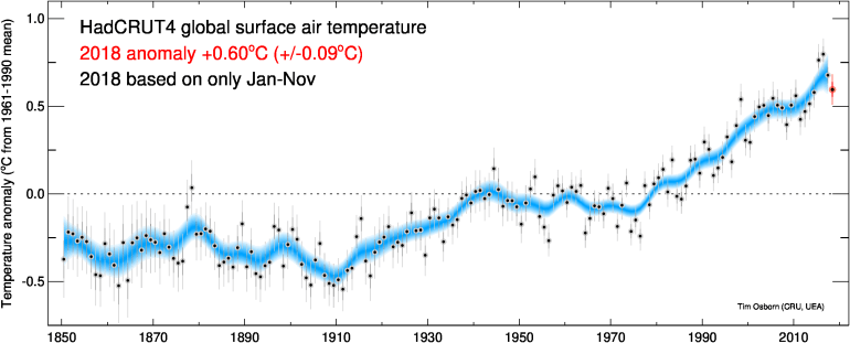
This is not a fake graph. It is actual data via Tim Osborn of the UEA. The blue line is a decadally smoothed average. What it shows is that between 1910 and about 1945, global temperature increased by just over 0.5C. Between 1950 and now, global temperature has increased by approximately 0.75C, looking at the decadal average. 0.75 is 1.5 times 0.5C, not forgetting that the decadal average ends with a particularly powerful El Nino in 2015/16 and begins when the mid 20th century cooling was starting to bite. If we look at the anomalies only, notice that 1910 was a little less than -0.5C, 1945 was about +0.1C, 1950 was about -0.05C and 2018 – the latest year in the series – is +0.6C (January to November). So, very similar warming 1910 to 1945 and from 1950 to 2018. Whichever way you look at it, the warming from 1950 (or 1979 if you prefer, which I do, because it was uninterrupted rapid warming, just like the E20C warming) to present is of similar magnitude and rate to the early 20th century warming. They are not vastly dissimilar as claimed by Tamino. Unless there is a significant El Nino in 2019, the magnitudes will be even more similar.
Judith’s concluding remarks are as follows:
In order to have any confidence in the IPCC and NCA attribution statements, much greater effort is needed to understand the role multi-decadal to millennial scales of internal climate variability.
Much more effort is needed to understand not only the early 20th century warming, but also the ‘grand hiatus’ from 1945-1975. Attempting to attribute these features to aerosol (stratospheric or pollution) forcing haven’t gotten us very far. The approach taken by Xie’s group is providing important insights . . . . . .
There are too many climate scientists that expect global surface temperature, sea ice, glacier mass loss and sea level to follow the ‘forcing’ on fairly short time scales. This is not how the climate system works, as was eloquently shown by Gebbie and Huybers. The Arctic in particular responds very strongly to multidecadal and longer internal variability, and also to solar forcing.
Until all this is sorted out, we do not have a strong basis for attributing anything close to ~100% of the warming since 1950 to humans, or for making credible projections of 21st century climate change.
I would say that qualifies for the epithet ‘the science is not settled’. There’s a lot more ‘unsettled science’ of course, some recently pointed out to climate scientists publishing inferior quality work claiming that it’s ‘more settled than we thought’, only to have their research mercilessly critiqued by people who know what they’re talking about, who’ve pointed out glaring and very basic errors in their work. Unsettled scientists and unsettled science go hand in hand I guess. Watch this space.

Today there is a rather dogmatic letter from a Leeds university head of Climate Science
which is basically PR not science
and essentially says “The science is SETTLED : it’s fossil fuels, the Earth is near ending, renewables are magic , so shut up”
I discuss it here on my 4:22pm post
http://bishophill.squarespace.com/discussion/post/2702542?currentPage=8
LikeLike
Yes Jaime, I still don’t understand the extremely partisan and emotional reactions to Judith Curry. Part of it is just consensus enforcement by the usual suspects, but I really do wonder if part of it is just that Curry is a very independent woman who thinks for herself and doesn’t try to advance her career by weighing every sentence against what others will think. And she does occasionally do Congressional testimony but so do a lot of other scientists.
The Tamino thing is just really nit-picking. Out of a very long blog post, he “selects” one statement that is not even really quantifiable and spends a lot of energy trying to show its not exactly right. Well, any qualitative statement is not going to be “exactly” right. I really do wonder if these people actually have real lives and if so how can they justify spending time on such minutae.
Some people have personalities that combine arrogance with censoriousness. These are particularly prone to hunting witches and finding them everywhere.
LikeLiked by 1 person
DPY:
I think it’s because she’s regarded as a heretic, a traitor. Her early work on hurricanes was incorporated into the consensus and she did not question its direction / other work, until further investigation began to reveal what she considered to be group-think and unacceptable practice.
LikeLike
https://judithcurry.com/2016/12/05/climate-heretic-to-be-or-not-to-be/
LikeLike
This is not new. Mainstream climate science has consistently ignored the results of studies which suggest a much greater contribution to the post 1950s warming from internal multidecadal variability. Instead of admitting that they may have got it wrong with IPCC AR5 attribution statement, they have instead gone in completely the opposite direction to absurdly claim that all post industrial warming is anthropogenic. This is politics, not science.
“Although there is a competing theory that the observed multidecadal variability is forced by anthropogenic aerosols during the industrial era (33), our present work showing that this variability is quasi-periodic and extends at least 350 y into the past with cycles in the preindustrial era argues in favor of it being naturally recurrent and internally generated. This view is supported by model results that relate the variability of the global-mean SST to North Atlantic thermohaline circulation (30, 31, 35) and by the existence of an AMO-like variability in control runs without anthropogenic forcing (28). If this conclusion is correct, then the following interpretation follows: The anthropogenic warming started after the mid-19th century of Industrial Revolution. After a slow start, the smoothed version of the warming trend has stayed almost constant since 1910 at 0.07–0.08 °C/decade. Superimposed on the secular trend is a natural multidecadal oscillation of an average period of 70 y with significant amplitude of 0.3–0.4 °C peak to peak, which can explain many historical episodes of warming and cooling and accounts for 40% of the observed warming since the mid-20th century and for 50% of the previously attributed anthropogenic warming trend (55). Because this large multidecadal variability is not random, but likely recurrent based on its past behavior, it has predictive value. Not taking the AMO into account in predictions of future warming under various forcing scenarios may run the risk of overestimating the warming for the next two to three decades, when the AMO is likely in its down phase.”
https://www.pnas.org/content/110/6/2058
LikeLiked by 1 person
stewgreen,
Great catch.
The question is whether he or his readers are clueless?
Green energy kills jobs. It costs more people to make less energy with wind and solar. The green destruction of plentiful low cost energy kills off industries (and their good jobs) that require dependable large amounts of energy.
Wind and solar will never be plentiful and low cost. Nor will they ever be low impact on the environment.
Then the professor echoee a common deceptive claim about weather, asserting that “extreme weather” is increasing.
Yet fewer people are dying from storms, droughts or famines. The biosphere is greener and more plentiful.
And finally predictions of climate change doom, loss of snow, loss Arctic sea ice, polar bears, Tibetan glaciers, etc. have all been proven wrong.
The follow up question to ask the professor is why he persists in scare mongering when at the least the data has proven to counter his claims?
Instead the professor wanders into magical thinking and reactionary paranoia, pretending that those who oppose his self declared virtuous beliefs are vile members of a vast fossil fuel conspiracy that he bravely exposed.
Sort of a Senator Joe McCarthy meets Inspector Clouceau type scenario that truly committed climate change believers act out daily.
LikeLike
Great piece.
“What it shows is that between 1910 and about 1945, global temperature increased by just over 0.5C”
These are of course anomalies compared to 1961-90, one of the coldest periods of the 20th century, esp. the 60’s and 70’s, guaranteed to give “good” results. Also Phil Jones favourite base line period.
LikeLike
Yes Dennis, the baseline for Hadcrut 4 anomalies is basically zeroed at or near the peak of the 1910-40s warming. It’s interesting to note that the early 20th century warming was about 0.5-0.6C, mid 20th century cooling only reversed this by about 0.2C, Thereafter it warmed rapidly again from 1979 onwards, culminating in the 1998 El Nino, whereafter warming ‘paused’ at about 0.5C above the baseline. The super El Nino of 2015/16 bumped up global temperature by another 0.25C approximately, ending the pause. It remains to be seen if this last global warming ‘spurt’ will endure or temperatures will drop back to pre 2014 levels. My guess is that we’ve yet to see some more staged release of heat from the oceans until AMO turns negative in about a decade, but if the downturn in solar activity starts to bite, we may see some cooling as early as next year.
LikeLiked by 1 person
I was always suspicious of Zeke’s twitter graph demonstrating how the models were performing so well when compared to observations, implying that the science must be settled, but was not bright enough to work out how he did it. Clive Best demonstrates Zeke’s Wonder Plot trick.
LikeLiked by 2 people
There are a few tricks you can use to get the data to fit:
1) The models are specifically tuned to fit the data they have.
2) Anomalizing and base lining can cover up a multitude of sins, particularly when you cut off half of the reconstructed period.
3) Only show agreement with a single climate parameter. Right answer, wrong method.
LikeLike
Yes Jaimie a lot of the difference has to do with baselining. I have noticed this with Gavin Schmidt too. Climate scientists seem to use long baselining periods near the middle of the period of time they are showing. That will tend to keep the data within the uncertainty. Choosing a baseline nearer the beginning will tend to make the data look lower than the models at the end. Clive used the same baselining period (1961-1990) as the IPCC did in AR5. His plot is an updated version of their plot.
LikeLiked by 2 people
Thanks DPY. So, it looks to me like, even if global mean surface temperature is ‘stepped up’ by 0.25C or so due to the 2015/16 El Nino, warming will need to continue at a fairly rapid pace over the next decade to ensure that the models at least look as if they’re doing a reasonable job of predicting future warming. No El Nino in 2018, as many people were predicting. I wonder what 2019/20 has in store?
LikeLike
El Nino is unlikely during the minimum of the solar cycle, but one may follow the start (or early stages) of the next cycle, whenever that is.
LikeLike
I thought SC25 was already have supposed to have begun Oldbrew, and predicted to be slightly stronger than SC24. We shall see.
LikeLike
As a rule of thumb, if the proof of an existential crisis depends on adjusting the starting date of the crisis, it ain’t an existential crisis.
LikeLiked by 1 person
We’re still in no man’s land between SC 24 and 25.
https://www.spaceweatherlive.com/en/solar-activity/solar-cycle
LikeLike
Tamino has responded to the OP.
https://tamino.wordpress.com/2019/01/27/jiggle-room-for-bigger-bull/
I think he makes some cogent criticisms, particularly regarding the estimates made here for early 20th century and recent warming. Check the last 2 graphs at the link.
LikeLike
Tamino (Grant Foster) can’t even get Jaime’s name or gender right.
This is just hilarious:
Is that what you meant by a “cogent criticism” barry?
LikeLiked by 1 person
Paul,
No, I said what I meant in my comment. Check out the last 2 graphs that displays Jamie’s estimates against the data. Read the text that explains it. Do you not think that criticism is fair?
(I didn’t notice Jamie’s gender being mentioned in the post above. How is anyone to know from that?)
LikeLike
Those last two graphs show that the early warming was about 0.5C and the late warming about 0.75C, exactly as Jaime says in the post. Regarding Tamino’s text, the term “dim-witted bullshit” applies to his own claims, particularly his “vastly dissimilar”.
LikeLiked by 2 people
I read through Foster’s post. It doesn’t really validly criticise anything I wrote; it’s just a lazy snipe back with the assumption of male gender for what is in fact a name – noting the spelling – used more commonly (in English speaking countries) for the female gender. He couldn’t even get my surname right either, even though it’s written clearly. We op’s take exception to being called up’s! Anyway, I can’t believe he hasn’t heard of me! Guess I’m not quite as infamous in my own lunch time as I assumed. LOL.
LikeLike
The main point is that the estimates of warming are not based on the underlying signal, which can be gleaned through any of various trend analyses. Jaime’s estimates (hi Jaime) are based on selecting two data points and ignoring all the others. The point of trend analysis is to account for all the data over a period to derive a trend, if any. What you can see in the lower graphs is that, even with a sub-optimal (10yr) smoothing of the data to estimate a signal, the selectivity of the data points exaggerates the warming of the early period and underestimates the warming of the latter period.
To get back to the qualitative point being picked up by Tamino in the first place (re Curry) and also here – an increase of 50% is a significant increase. If any one of us met someone who was taller than us by half our own height, we could not claim that we were “almost as tall” as them. The former period is not “almost as large” as the latter and that’s the lowest estimate that could be found by using a sub-optimal smoothing period on the data set that most helps the case.
But I’m curious – is it understood why simply subtracting 2 data points bounding a much larger series is a poor way to estimate a change? And how in the OP the choices bias the outcome?
LikeLike
Meaningless waffle. In fact pseudoscience gibberish, to claim that warming isn’t based on the signal. No “analysis” needs to be undertaken. Especially not by a graph-faking charlatan like Grant Foster. All you have to is to look at the graphs of the data.
LikeLike
I’m sorry Barry, but no amount of statistical jiggery pokery is going to detract from the fact that the 1910-1940s warming is comparable in rate and magnitude to the warming post 1950. Indeed, prior to 2014, the rapid warming from 1976 to the early 21st century was very similar in rate and magnitude to the early 20th century warming. What has changed since then is that warming ‘paused’ until 2013/14 and a very powerful El Nino in 2015/16 increased global mean surface temperature considerably, which rapid natural increase Tamino includes in his statistical analysis to claim that the trend from 1950 to present (a period of 68 years beginning with cooling, then rapid warming, then a ‘pause’, ending with massive rapid El Nino warming and subsequent cooling) is hugely greater than the early 20th century warming trend (a period of 35 years of uninterrupted rapid warming). Not strictly apples to apples. Bear in mind also that the datasets Tamino uses have tended to reduce the early 20th century warming relative to the late 20th century and ‘pause busted’ 21st century with adjustments to the data over the years.
I estimated the magnitude using two data points using two different methods: 1. by looking at the 10 year smoothed data in Hadcrut 4 and 2. by simply comparing annual anomalies at the start and end of the two periods in question. You seem to think that is incorrect, but then you point out that somebody who is 1 and a half times taller than another person is a LOT taller, in order to prove the point that the post 1950 warming is a LOT greater. You’re probably correct, but then again you measure height using two data points: the soles of the feet and the top of the head. Nobody would argue with this. The human body is not an ongoing data series of course, so perhaps your analogy was less than optimum. Note Tamino, in order to demonstrate that the post 1950 warming was MUCH greater than the earlier warming, estimated post 1950 warming to present to be anywhere between 1.8 and 2.8 times as much, simply by fitting curves to the various datasets. I believe this is grossly misleading. 1.5 is probably nearer the mark and this only because of massive rapid natural warming in 2015/16 which has added about 0.25C beyond the 21st century ‘plateau’.
LikeLike
A linear regression (simple straight line trend) on HadCRU data, the period 1950 to 2018 yields 70% more warming than the overall change from 1910-1950.
The rate is 0.125 C/decade for both, but the latter period is nearly twice as long.
You started out speaking about the total change for the period, Jaime. Before we shift the goalposts, a simple analysis that uses all the data – that doesn’t cherry-pick 2 data points out of hundreds (of monthly) that favour the outcome – yields a significant difference in overall warming.
I take it that you don’t understand why picking 2 data points to derive overall change in a period bounding hundreds of data points is folly.
What I don’t know is if you are curious to understand why that is. Worth talking about? Or are you going to call any criticism “jiggery-pokery”? Over to you.
LikeLike
In case anyone is interested, I also wrote a post about the early 20th century warming.
LikeLiked by 1 person
“A linear regression (simple straight line trend) on HadCRU data, the period 1950 to 2018 yields 70% more warming than the overall change from 1910-1950.”
“You started out speaking about the total change for the period, Jaime. Before we shift the goalposts . . . . . . . ”
*sigh*
OK. Here goes:
1.My post estimates the warming post 1950 to present to be 1.5 times the magnitude of the early 20th century warming (1910-45, NOT 1910-1950). In 1945 the annual anomaly was +0.025. The annual anomaly in 1950 was -0.173C. Thus, 1950 was cooler than 1945 by -0.2C! My estimate of the modern warming was 50% more than E20C. YOUR goalpost-shifted estimate of modern warming vs. E20C (redefined as 1910-50) is 70% and it’s not hard to see why!
2. If you go back to my post, you will note that I suggest warming from 1979 is a more suitable comparison because this was when uninterrupted rapid warming started, which continued until the early 21st century, after which warming ‘paused’, followed by the massive 2015/16 El Nino warming, which ended the 15 year ‘pause’. I was merely expanding upon this notion.
“I take it that you don’t understand why picking 2 data points to derive overall change in a period bounding hundreds of data points is folly.”
My estimate of 1.5 modern warming vs. E20C was not based upon “two data points”. It was based upon a moving decadal average which I think you will find involves a total of 20 data points. Nevertheless, Tamino, who calculated the proportion to be 1.54, objected to the decadal smoothing for the purpose of comparing the two periods of warming, claiming it incorporated too much ‘noise’. I DID use two data points (well, four actually) to look specifically at 1910-45 and 1950-2018. Those data points (annual anomalies) are:
1910: -0.49C
1945: +0.025C
1950: -0.173C
2018: +0.595
Thus, comparing E20C to post 1950 warming using the shockingly incorrect method of using just two (four) scandalously cherry-picked data points yields:
1910-1945 = 0.515C
1950-2018 = 0.768C
Meaning that the latter period is 1.49 times the earlier warming! I’m sure this is just pure coincidence – using the wrong method (“two data points”) to obtain the same answer as using 10 (20) data points (which is also, apparently, wrong, but maybe not quite as wrong as using just two).
So Barry, are you trolling this thread and attempting to patronise me or do you have something serious to contribute?
LikeLike
Yes, I noticed that Barry moved the goalposts and cherry-picked points before complaining about exactly that. He seems to be arguing against himself!
LikeLiked by 1 person
Ken, I’m not sure that the assumption that natural internal variability sums to zero over long periods is a sound one.
1. It would have to be a very long period compared to the periodicity of the internal variability (68-70 years in the case of AMO). That is simply not the case.
2. There may be complex interactions between internal variability and external forcing, plus most of the energy in the climate system is stored in the oceans: estimates of OHC are less than perfect and it is conceivable that natural internal variability may be stepping up global temperatures by releasing ocean heat in tranches, heat that may have been stored in the deep oceans for decades or even centuries. OHC is not necessarily in lock-step with external forcings.
LikeLike
Jaime,
1. What physical process would drive long-term warming through internal variability alone?
2. I don’t think this makes physical sense. The deep ocean is cold and water is essentially incompressible. You can’t have a net transfer energy from the deep ocean to the surface because that would violate the laws of thermodynamics. You could bring water from the deep ocean to the surface via ocean currents, but since this water is typically colder than surface water you can’t heat the surface in this way.
LikeLike
Ken,
1. Internal variability alters atmospheric circulation patterns which in turn can alter global and regional cloud cover and hence possibly the overall radiative energy budget.
2. Of course, it wouldn’t make sense for colder deep water to transfer energy to warmer surface water. But, if very cold deep water is replaced by warmer deep water, then less energy is transferred by conduction to the deeper layers from the warmer surface, resulting in an even warmer surface. At least, that’s how I imagine it. I give you this paper which demonstrates that the Medieval Warm Period in the Southern Hemisphere lagged that in the Northern Hemisphere by a couple of centuries owing to the transport of warmer North Atlantic surface water from the north to the south Atlantic via deep ocean currents.
“At high latitudes, the temperature changes are significant in the Southern Ocean where the warm conditions prevails until the end of the 15th century, i.e. about two centuries later than in the Northern Hemisphere. During this period, the temperatures in the latitude band 55-75 S are on overage 0.6 degree higher than during the early 19th century. The delay between the two hemispheres is largely due to a southward propagation in the Atlantic Ocean of positive temperature anomalies that have been formed in the North Atlantic region when warm surface conditions prevailed there. Subsequently, those relatively warm water masses have been slowly transported by the deep oceanic circulation toward the Southern Ocean until they reached again the surface, contributing to maintain warm conditions in the Southern Hemisphere during the 13th, 14th and 15th centuries.”
https://www.researchgate.net/publication/252766643_A_delayed_medieval_warm_period_in_the_Southern_Hemisphere
The text implies that the warmer waters emerge at the surface in the southern ocean, but as you say, this doesn’t make sense. What does make sense is colder deep ocean layers are replaced by warmer deep ocean waters, which process is subsequently reflected by the energy budget at the surface.
LikeLike
I was basing the time periods off the original comment at Curry’s that started the whole discussion.
So let’s go with what you say:
“So, very similar warming 1910 to 1945 and from 1950 to 2018”
Which is close enough to Curry’s original comments.
Linear regression rate from 1910 to 1945 is 0.138 C/decade.
Which is a total change of 0.48 C.
Linear regression rate for 1950 to 2018 is 0.120 C/decade.
Which is a total change of 0.82 C.
I don’t get your preference for 1979. You are eyeballing the graph and basing the period selection on where the decadal smooth bends at the beginning or end of the warming period. 1975 is a much better choice visually (have another look), and is more commonly indicated (along with 1970) as the start of the most recent “uninterrupted” warming period after the mid-century lull.
Linear regression rate for 1979 to 2018 is 0.170 C/decade.
Which is a total change of 0.68 C.
Linear regression rate for 1975 to 2018 is 0.179 C/decade.
Which is a total change of 0.79 C.
I’m not claiming a linear regression is the ultimate method, but it is a much more powerful tool for estimating overall change than subtracting 2 data points, or using the Mark1 Eyeball on 10-year averaging to guesstimate and then subtract two data points. Decadal smoothing still has plenty of noise affecting it.
Here are some graphs comparing the periods using ordinary least squares linear trends.
1910-1945 : 1950-2018
1910-1945 : 1975-2018
1910 – 1945 : 1979-2018
LikeLike
Using the clearer graph of 10-year filtering at Tamino’s, I get these values for the 2 periods of roughly 1910-1945, and 1950-2018:
1) 0.49 total change
2) 0.75 total change
That’s based strictly on eyeballing the curves when warming starts/stops.
The point I thought Tamino made well was that your eyeball choices based on anomalies was biased to increase the warming in the earlier period, and decrease it in the latter period. Those last 2 graphs show that neatly, I think, with the straight dotted lines based on the values you gave. It makes your choice clear against the 10-year filtered curve. I wondered if you had a comment on that specifically – your estimates compared to the 10-year curves.
LikeLike
(To complete: based on the same graph, 1950-2018 = 0.71 total change)
Your anomaly estimate yielded these numbers:
First period: nearly 0.6 C total change
Second period: 0.65 C total change
The anomaly method reduced the difference from smoothing (and other analyses) to nearly nothing. This is what I’ve been talking about, and what I think Tamino criticized cogently.
LikeLike
Jaime,
Okay, let’s take this a bit further. The change in anthropogenic forcing is probably about 2.3W/m^2. The equilibrium response, in the absence of feedbacks, to a doubling of atmospheric CO2 (3.7W/m^2) is about 1.2C. So, we’re about 60% of the way to doubling atmospheric CO2. If we assume a TCR-to-ECS ratio of 0.7 (which, I think, is reasonable) then about 0.5C of the warming to date can be explained simply as the response to the change in anthropogenic forcing in the absence of feedbacks. This is already about half.
If internal variability has made a substantial contribution (~50%), then it would have to be responsible for almost all the rest of the observed warming. However, as you say, this would require some kind of response (e.g., cloud cover) that alters the radiative energy budget. However, this would also require that this response is not influenced by the anthropogenically-driven warming (or else it would be making up more than half of the observed warming). However, this produces a bit of a paradox. How can the system have no response to anthropogenically-driven warming, but a large response to internally-drive warming? It doesn’t really seem that this is possible.
LikeLike
When looking at the relative magnitudes of recent warming and the early twentieth century warming it is worth remembering that the global surface temperature anomalies are a combination of two estimated averages – land and ocean data. Much of the globe has very poor data coverage, particularly prior to 1950.
Last year I found the HADCRUT4 data set has a distinctive feature, shown in the graphic below.
Until around 2010, estimated recent warming was of greater magnitude that the earlier period pretty much due to greater land warming. Yet land covers only 30% of the globe. I would suggest that there are problems with the data. These need to be resolved prior to any empirical attribution of causes to the warming periods can be made.
Both NOAA and Gistemp anomalies have similar issues.
LikeLike
ATTP,
Since you appear to be so knowledgeable of the physics of climatology you will also be aware of TAR WG1 Page 24/25 (italics mine)
From my understanding of the above, attributing relative causes to the early twentieth century warming or more recent warming is pseudo-scientific waffle. Even with complete objective information of all the possible influences on temperature variation, it would be impossible to sort out the relative impacts of these influences. But, as you should be aware, the very limited information that is available has filtered through very subjective lenses of the climate community.
LikeLike
Manic,
Land warms faster than the oceans, partly because of the larger heat capacity of the oceans and partly because some of the energy being lost from the sea is due to evaporation, rather than radiation (or, rather, a smaller fraction of the energy lost from land is due to evaporation than is the case for the sea surface). The figure you’ve included shows that the land is indeed warming faster than the sea surface (as expected). That the land only makes up 30% is taken into account when combining the land and sea surface datasets.
LikeLike
Manic,
The main way one does attribution is to consider the likely patterns of warming due to different causes. One example is tropospheric warming and stratospheric cooling. This is a strong signature of greenhouse gas induced warming. If it were something like the Sun, then you would expect both the troposphere and the stratosphere to warm.
Similarly, if warming were mostly due to internal variability, then there are also patterns one would expect. The energy would have to emerge from the oceans (they have the largest heat capacity). It can’t really emerge in the tropics, because it’s too stratified and so you can’t transfer energy from the deeper ocean to the surface. It can’t emerge in the polar regions, because it’s simply too cold. It could energe in the sub-polar regions. Is this observed? No, the warming that is observed is more uniform and, hence, not really consistent with internal variability dominating. This doesn’t mean that it can’t be playing a role. It simply indicates that it is unlikely to be a dominant cause of the observed warming.
LikeLike
ATTP @ 30 Jan 19 at 10:49 am
Recent land warming is greater ocean warming. Earlier twentieth century land warming is not. From your own stated beliefs suggests that there is something at up with the data. This you have ignored in your response.
LikeLike
” Much of the globe has very poor data coverage, particularly prior to 1950. ”
not really.
LikeLike
ATTP @ 30 Jan 19 at 11:03 am
I interpret TAR WG1 Box 1 Page 24/25 as being an example of theUnderdetermination of Scientific Theory.
In that context, your waffle based on vague fitting of beliefs to the data does not stand out against any alternative waffle, except perhaps in literary style and forcefulness. I admit my perspective is highly value-laden. Like in criminal law where it is up to the prosecution to prove their case beyond reasonable doubt based on the evidence, I believe it is up to proponents of a conjecture / hypothesis / theory (CHT) to demonstrate, with reference to objective observations of the natural world, that their variant of a CHT is not just the outstanding one in a logical field of all variants, but against the conclusion that the evidence is inadequate to to draw any conclusions. What is the worldview that you work from? Post Normal Science perhaps?
LikeLike
STEVEN MOSHER says:30 Jan 19 at 11:38 am
” Much of the globe has very poor data coverage, particularly prior to 1950. ”
not really.
If you look at the data you will find that the data coverage was very poor. As you will know HADCRUT4 data is divided into 5 x 5 degree gridcells. I have looked at the gridcells with monthly data and calculated the proportion of the globe covered, allowing for the different area of the gridcells. From this I produced two graphs, dividing the globe into eight bands of latitude.
The stacked chart demonstrates that HADCRUT4 only exceeds 70% global coverage in 1950, peaking at over 88% coverage in 1979. Notice that the World Wars had a significant impact on coverage.
I have reproduced the same chart in a standard line form. The latitude bands are of different areas, with the “Tropics” covering around 4.5 times the area of the polar regions and more than twice the area of the temperature latitudes. However the Northern Hemisphere bands are directly comparable to the Southern Hemisphere ones.
Data coverage is lower in the Southern Hemisphere than in the Northern Hemisphere.
LikeLiked by 3 people
Ken,
“If internal variability has made a substantial contribution (~50%), then it would have to be responsible for almost all the rest of the observed warming. However, as you say, this would require some kind of response (e.g., cloud cover) that alters the radiative energy budget. However, this would also require that this response is not influenced by the anthropogenically-driven warming (or else it would be making up more than half of the observed warming). However, this produces a bit of a paradox. How can the system have no response to anthropogenically-driven warming, but a large response to internally-drive warming? It doesn’t really seem that this is possible.”
Firstly, there are estimates that the post LIA increase in total solar irradiance has contributed about 25% to the 1C increase in global mean surface temperature, a significant proportion of that occurring during the E20C warming period. Secondly, as you point out in another comment, the response to GHG radiative forcing is very different from the response to natural forcing (solar/volcanic aerosols/internal variability). Nobody is claiming that the system does not have a response to anthropogenically driven warming – the entire ‘dangerous’ global warming hypothesis is built upon the positive water vapour feedback supposedly attributable to the initial moderate warming from the accumulation of GHGs. If you’re looking for a large response, there it is – in theory at least. There is a theory also that the North Atlantic ocean is driven by changes in solar activity, which also affects atmospheric circulation patterns (e.g. NAO), which in turn feeds through to changes in the Arctic and Greenland ice melt and accumulation. Thus, in a real sense, solar variability may be driving internal variability. There is no viable mechanism, as far as I am aware, postulated for how the build up of GHGs may affect internal modes of variability and atmospheric circulation patterns.
“The reconstructed centennial-scale variations in hydrography correlate with variability in total solar irradiance. We find a similar correlation in a simulation of climate over the past 1,000 years. We infer that the hydrographic changes probably reflect variability in the strength of the subpolar gyre associated with changes in atmospheric circulation.”
https://www.nature.com/articles/ngeo2094
LikeLike
“If you look at the data you will find that the data coverage was very poor. As you will know HADCRUT4 data is divided into 5 x 5 degree gridcells.”
HADCRUT has the lowest number of stations, around 5000.
8 times this number exist.
LikeLike
you see manic, hadcrut is not the only data.
they have less data than everyone else.
that allows us to compare series with less data against those with more. hence avoiding vacuous claims like not enough data. sampled properly you only need a few stations.. thats because 90 percent of the temperature is a function of time and place..season, y, and z. or latitude and elevation
LikeLiked by 1 person
pretty good smack down by tamino.
look sceptics made a good name for themselves when they paid attention to detail. think mcintrye. think lewis.
eyeballing someone elses chart? cut abd paste science.
hurts your brand in addition to being wrong.
LikeLiked by 1 person
A lady in Minnesota just told me she doesn’t know what climate sceptic means. I agree with Mosh that McIntyre and Lewis have helped the brand and that we have to be careful. (I actually pointed her to three other people though.)
LikeLiked by 1 person
“pretty good smack down by tamino.
look sceptics made a good name for themselves when they paid attention to detail. think mcintrye. think lewis.”
Lewis and McIntyre excel at what they do. I would not even try to emulate them. Paying attention to detail is not the be all and end all of questioning consensus climate science, however. Sometimes, it’s appropriate to point out the bleeding obvious. Sometimes, it’s appropriate to look at the wider picture. So, Tamino got 1.54 for his difference; I got 1.5 by simply eyeballing the chart. Tut, tut. I guess my amateurish post is toast then. By the way, did you respond to John McClean’s response to your insults and accusations re. his audit of Hadcrut 4?
LikeLike
“you see manic, hadcrut is not the only data.
they have less data than everyone else.
that allows us to compare series with less data against those with more. hence avoiding vacuous claims like not enough data. sampled properly you only need a few stations.. thats because 90 percent of the temperature is a function of time and place..season, y, and z. or latitude and elevation.”
Mosh – paying zero regard to detail re. English grammar – would have us believe that if you sample several flavours of shite correctly, you can get the ‘right’ result, rather than concentrating on just one flavour as preferred by the IPCC. In reality, it’s all just shite and scientists have very little idea how much the world has really warmed since 1850, after you add back in all the uncertainties stripped out by infilling and homogenisation techniques.
We know only how much it has warmed since the mid 70’s, and not even that with desirable precision.
https://agupubs.onlinelibrary.wiley.com/doi/abs/10.1029/2018JD028355
LikeLike
Engaging in a further spot of amateurish eye-balling of Manic’s HadSST graph above, I see that, using the moving 7 year average of sea surface temperature up to 2015, the early 20th century ocean warming was just over 0.5C whilst the increase in temperature from 1950 to 2015 was 0.45C. Other sea surface datasets show something very similar. The ocean surface covers approximately 70% of the globe. This would appear to suggest that, for 70% of the entire globe at least, the increase in surface temperature from about 1910-45 actually slightly exceeded the increase in surface temperature from 1950 to ‘present’ (2015). Of course, the 2015/16 super El Nino bumped up those temperatures considerably, but they have since declined quite drastically. Thus, the message from the climate sceptic annals of the bleedin’ obvious is that early 20th century warming was in fact very similar, not ‘vastly different’ from the late 20th century/early 21st century global warming, as claimed by Tamino with his whacko curve fitting exercise using the principal blended SST/land temperature datasets.
LikeLike
“HADCRUT has the lowest number of stations, around 5000.
8 times this number exist.
you see manic, hadcrut is not the only data.
they have less data than everyone else.
that allows us to compare series with less data against those with more. hence avoiding vacuous claims like not enough data. sampled properly you only need a few stations.. thats because 90 percent of the temperature is a function of time and place..season, y, and z. or latitude and elevation”
Hilarious. Mosh effectively claims other datasets use 8 times more data than Hadcrut. The reality is, this ‘data’ is highly localised, not from weather stations situated in diverse regions of the globe. Thus, much of this data is not useful for constructing a global average because, as Mosh himself points out in his next breath, you only need a few weather stations in localised regions, simply due to the fact that, on the regional scale, temperature trends tend to be highly spatially and temporally correlated.
In actual fact, ALL of the datasets use much the same raw temperature data from land and sea and similar algorithms for processing that data. The principal difference between Hadcrut 4 and other datasets is that the other datasets use infilling techniques to ‘create’ data where it is missing, whereas in Hadcrut 4 that data remains missing in that particular grid cell for that particular month.
LikeLike
“McIntyre and Lewis made pretty good names for themselves…”
lol, pull the other one.
They were vilified. Their ideas when not ignored were unacknowledged.
Their requests for data were dodged or ignored.
It seems like someone never read the climategate emails, no matter what the book says.
Mostly it seems that Steve is still making certain that the world is safe for apocalyptic claptrap by making certain skeptics are ignored.
In the rational world, the proponents of ideas have to make predictions that hold up.
The climate consensus mafe predictions about weather and impacts that did not hold up.
Disputing that because HADCRUT, which we are told is excellent except when skeptics use it, is a childish tactic.
Doing so in a delphic, near haiku manner makes it an annoying childish tactic.
Doing so while ignoring the flood of transparently false climate apocalypse claptrap that dominates the public square is childish, annoying and hypocritical.
We are told we must change the world because “climate change” is an existential threat.
The predictions made to support that claim are failed.
Full stop, end of sentence.
Pissing down on skeptics who point this out while ignoring the massive waste of resources and damages from acting on these failed predictions is cheap bullying, and cowardly.
LikeLiked by 1 person
The brand of Climate Skepticism has built up quite a history. If it wasn’t for all those damn Australians, Brits and Canadians, it would be one of those uniquely American stories.
LikeLiked by 1 person
Canman: Haha. As I was talking last night to an intelligent and sparky Catholic from Minnesota, I did start with an American: Richard Lindzen. But then Bjorn Lomborg and his brilliant response on the Pope’s visit to America in September 2015: On climate change, Pope Francis isn’t listening to the world’s poor. And then the lovely (in my experience of bowling up to him unannounced) Lord Donoughue, also a devout Catholic, who’s just taken over from Nigel Lawson at the GWPF. As Ben Pile has explained so well today, there’s no single camp here. The first two men don’t even like the sceptic (or skeptic) label. But I thought this combination, with a bias towards policy more than science, would give my new friend some food for thought.
LikeLike
STEVEN MOSHER @ 01 Feb 19 at 1:50 am & 01 Feb 19 at 2:03 am
HADCRUT consists of two separate data sets – CRUTEM & HADSST.
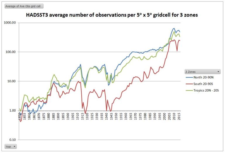
The 5000 temperature stations you refer to are with respect to CRUTEM, the land data. Whilst the greatest effort has been put into the land data, the ocean data is geographically more important for obtaining a global average, as ocean area is over twice that of land.
All temperature data sets suffer from the same problem with respect to data before 1950. The data coverage graphs posted @ 30 Jan 19 at 2:52 pm vastly understate the magnitude of the problem. A better indication is from looking at the average number of data observations within each 5 x 5 grid cell.
For HADSST3 no of observations data file, I have produced a chart of the annual average of the number of observations for data cells where there is at least one observation. On this basis, if a grid cell has a single monthly observation in a year, the average will be 0.083.
I have divided the globe into three roughly equal areas of 20-90N, 20N-20S and 20-90S. The tropics is the largest area overall, but in terms of ocean it is the 20-90S that has the largest area.
I have used a logarithmic scale to prevent a near flat-line prior to 1950. Since the Argo buoys were deployed in the last decade the number of observations have increased massively. Prior to this there was considerable improvement throughout the late twentieth century. But the data for the Southern oceans lagged behind those of the Northern. But during the World Wars the data collection was so sparse as to render long-term records unreliable.
The lesson to be learnt is that global temperature anomalies are only an estimate. Ceteris paribus, the quality of that estimate will diminish as one goes back in time.
LikeLiked by 1 person
STEVEN MOSHERThe reason I labour on so about the relative quantity of data over time is due to a crucial assumption in homogenizing temperature data. Venema et al (Benchmarking homogenization algorithms for monthly data, Clim. Past, 8, 89-115, doi:10.5194/cp-8-89-2012, 2012) neatly describes the issue.
This assumption generally holds good. But is does not hold over great distances. For instance, the Arctic has seen much greater increases in average temperature in both warming episodes since 1900 than more temperate latitudes. Trends can vary over much shorter distances as well. For instance, when I looked at the issues in early 2015, I found trends varied within Iceland, Southern Africa and Paraguay. Thus data homogenisation will eliminate real local trends as well as stand out data biases such as UHI. The problem is that we cannot determine whether differences between data sets are due to measurement biases, or with real climatic variations. But in general we can acknowledge that temperature trends vary with distance. The consequence is that before the 1960s, the further back you go in time that you go, the greater will be the impact of eliminating real climate variations in homogenization alongside genuine data biases.
To consider the problem, examine the BEST Global Land graph.
https://manicbeancounter.files.wordpress.com/2016/12/best-land-summary
From about 1850 onwards there is sufficient data to conduct full data homogenization. But in the nineteenth century, for most of land area – Asia, Africa & South America in particular – temperature data is very sparse indeed. So homogenization between stations hundreds or even thousands of miles apart will eliminate much of the trends. This is probably why from 1850 to 1900 there is so little variation. This is perhaps more accentuated with the BEST homogenization techniques than with the pairwise homogenizations used elsewhere.
As a result, I conjecture the magnitude of early twentieth century warming is understated relative to the more recent warming due to lack of temperature data in the earlier period.
I tried to explain this in more detail in a post last year.
https://manicbeancounter.com/2018/03/28/the-magnitude-of-early-twentieth-century-warming-relative-to-post-1975-warming/
LikeLike
The Best Global Land graph is below. My error in copying.
LikeLike
“This is perhaps more accentuated with the BEST homogenization techniques than with the pairwise homogenizations used elsewhere.
As a result, I conjecture the magnitude of early twentieth century warming is understated relative to the more recent warming due to lack of temperature data in the earlier period. ”
nice conjecture.
no evidence.
evidence in the form of newly archived
station data from data rescue argues you are wrong.
before BEST skeptics argued that CRU 5000 stations was too few.
the conjecture was unsampled places differed from sampled.
we did 40k stations. result? conjecture wrong.
now, the same argument is being applied. what about this region, that time peroid? the same hope that missing data will support your thesis.
but in every instance of newly recovered old data, in the arctic, in europe, in south america your type of conjectures are busted.
time after time.
LikeLike
hunter.
Lewis, vilified. not by the IPCC or folks who invite him to conferences. CRU worshipped as excellent? not by professionals.
here us the difference. when we criticize or point out the limitations of CRU we do so on technical grounds, not emotional, rhetorical, political blather.
since the depature of mcintrye skeptics are left with only pale imitations of his glorious snark, and none of balancing technical rigor.
you got jamie. eyeballing charts. you got cut and paste heller. you got anthony who has denied my data request for 6 years.
you got a pink team, no red team.
up your game
LikeLiked by 2 people
manic.
“Whilst there can be alternative explanations for the early twentieth-century warming and the subsequent lack of warming for 30 years (when the post-WW2 economic boom which led to a continual and accelerating rise in CO2 levels), without such explanations being clear and robust the attribution of post-1975 warming to rising GHG levels is undermined. It could be just unexplained natural variation.”
all explanation is underdetermined by data.logically the cause of anything could be other than the best current explaination.
it could be unicorns.
natural variation explains nothing. it is tge admission of no explanation.
the early warming is well explained by all GHGs, solar, and land use, with a small residual.
we call that residual, tge unexplained, natural variation.
now comes the stupid pet trick. attack the observations, claim a possible bigger rise in temps and then assert more uncertainty . next claim this manufactured uncertainty
is caused by the unicorn and argue wr have rule out unicorns causing the present warming
LikeLike
Steve,
Dodging, which you are doing, is undignified.
The predictions of the consensus have failed.
You seek to dodge that by forcing skeptics to have a full alternative.
That is bogus and you should know better.
The quality of the data the consensus provides is questionable to be diplomatic.
Yet you still dodge and avoid the reality-yhat the consensus is forcing expensive nonsense that doesn’t work.
You’d rather nitpick skeptics.
Sort of like bullying on your part.
Game indeed.
LikeLike
Mosh, you sound like Mogg! The red team is turning pink. Love it. Tickled pink in fact. Mogg: May’s red lines are turning pink. Of course. things move on and May raised a white flag instead of her pink lines. I can’t see sceptics doing that when the Blue Team has turned a sickly shade of pale green. So, even though pink sounds a bit gay, my guess is that they will prevail, in the end.
LikeLike
I think that McIntyre actually had a significant effect in that the Hockey stick is not even defended really by climate scientists anymore. It was clearly wrong. What was unethical and inexcusable was the way Schmidt, Mann, and the RealClimate propagandists refused to acknowledge any errors or omissions. McIntyre has made a great contribution especially when you consider that it was not paid work.
Likewise Lewis is having a profound effect. Scientists have apparently learned a lot from the Mann fiasco (or perhaps most scientists are not as personality and character challenged as Mann) and usually don’t argue directly with Lewis. That tells me he is usually right. Lewis’ work has inspired hundreds of papers trying to work around it or explain why it is biased. That effort I think has failed.
LikeLiked by 2 people
How could we have overlooked the articles in Scientific American, Nat Geo, Nature and the Guardian praising McIntyre and Lewis for helping climate science? Get real.
Curry and the Pielke’s were punished for daring to speak out of order.
Etc.
But skeptics, to point out the problems of the consensus, are expected to explain the alternative first
BS.
LikeLiked by 1 person
Guvuhmint funded science with a MISSION is no science at all.
Guvuhmint funded models of chaotic atmosphere/ocean systems
(with pesky unknown parameters,) that don’t survive or fall on how
they match observations without add-justments, is not science at all.
Guvuhmint funded science that doesn’t explain the see – saw rise
and fall of climate prior to the Industrial Revolution increase in CO2,
and in the 20th century warm/cool/warm record…and even seek to
eliminate Roman and Medieval warming periods, is not science at all.
LikeLike
Mosh says:
“the early warming is well explained by all GHGs, solar, and land use, with a small residual.”
He then goes on to accuse sceptics of playing a stupid pet trick. Mosher’s pet trick is not to state the obvious:
“The early warming CAN be explained by GHGs, solar and land use”.
Note, no reference to the approximate contribution from each forcing, so virtually useless in terms of quantifiable attribution. The fact is, E20C warming CAN be explained by solar, GHG and natural internal variability and published research actually estimates the contribution from natural internal variability to E20C warming to be very significant. There is even research which suggests an attribution of 40-50% to late 20th century warming from internal decadal variability.
As usual the science is NOT settled and it is not correct to say that something IS explained, only that it CAN be explained and that there is no consensus re. an explanation for E20C warming and mid 20th century cooling. Thus, logic dictates that even though late 20th century warming CAN be attributed almost entirely to GHG forcing, the attribution remains uncertain simply because recent past warming of similar amplitude can be largely attributed to natural causes.
LikeLike
“These anomalous events occurred during a period of strong global‐scale warming, which can be attributed to a combination of external forcing (particularly, greenhouse gas increases, combined with a hiatus in volcanic events) and internal decadal variability. The exact contribution of each factor to large‐scale warming remains uncertain, largely due to uncertainty in the role of aerosols in the cooling or stabilization of climate following the middle of the 20th century.”
You see Mosh, it’s not “manufactured uncertainty”, it’s real, structural, scientific uncertainty, otherwise known as gaps in our knowledge. The uncertainty re. aerosols and mid 20th century cooling is particularly egregious for consensus climate science because, if anthropogenic aerosols did not play a significant role in mid 20C cooling, then natural internal multidecadal variability most likely did, which rather messes up the attribution sums for later warming.
https://onlinelibrary.wiley.com/doi/full/10.1002/wcc.522
LikeLike
After reading Steve’s longer form posts it is not unclear as to why he prefers the haiku/drive by forms.
If the focus is on discerning what he means besides snark, then the lack of content and context is less obvious.
Funny how in the pre-apocalypse obsession, it was ok to talk about periods of past climate change that were much more dramatic and faster than today, and the lack of existential threat this caused.
Nowadays, however, the <2o change in about ~150 years is the end of the world, no matter the data otherwise.
The lying elephant in the room is the failure of slr doom that mainstream consensus embraced. Along with the lack of change in storm, drought, flood, etc. Yet another elephant in the room is the lack of Scientists self correcting. Instead they are being notable as silent dogs. Except of course when deplorable denialist speak up.
Notice how Rhamstorf and other scientist spokesman get to make the flakiest claims that always turn out to be false and no fellow scientists loudly point out how full of alarmist bs they are.
Yet heaven forbid a skeptic use consensus data to show problems in the consensus.
Then arrogant defenders pile on accusing skeptics of misusing their data.
By the way, I heard how the treatment of Lewis is defended. Did I miss the part about McIntyre?
Or Marohasey? Or Peter Reid? Or Pielke? Or Curry? Crockford?
Frankly the defense if the consensus by claiming Lewis is allowed to exist to be rather humorous.
LikeLiked by 1 person
Rather than eye-balling a chart showing a decadally smoothed average, I used the monthly HadCRUT4 data and calculated the exact numbers using the linear regression function (LINEST) on a Microsoft Excel spreadsheet. (Maybe that was too easy for Tamino?)
The trend in HadCRUT4 monthly from January 1910 to Dec 1945 (432 months) is 0.0011 C per month; so over 432 months that’s 0.50C warming in total. From Jan 1950 to Dec 2018 (828 months) the warming rate is 0.0010 C per month, which gives 0.83C total warming.
Rounding up, the total warming since 1950 is currently 1.7 times that seen between 1910 and 1945 according to HadCRUT4 (and Excel). For the same method using GISS it’s 2.1 times as much and for NOAA/NCDC it’s 2.0 times.
LikeLike
“Satellite to probe mystery of clouds and climate”
https://www.bbc.co.uk/news/articles/cyddezqrlmvo
…Some low-level clouds are known to cool the planet, others at high altitude will act as a blanket.
The Earthcare mission will use a laser and a radar to probe the atmosphere to see precisely where the balance lies.
It’s one of the great uncertainties in the computer models used to forecast how the climate will respond to increasing levels of greenhouse gases...
It seems the science isn’t settled, after all.
LikeLiked by 3 people
My impression on hearing this on the radio this morning was that scientists are probably even more eager to ascertain whether high level cirrus clouds formed by aircraft trails have a net warming effect, as claimed, or if they indeed cool the planet, as claimed by ‘chemtrail’ conspiracy theorists. Low level clouds quite obviously cool the planet by reflecting huge quantities of incoming solar radiation back into space.
LikeLike
A couple of days ago Willis published a piece on climate models and rain – well worth the read, because the models are so bad at this that it is scarcely believable.
Yes, the clouds reflect a lot of incoming, but they also reflect outgoing at night. [Presumably the former is the larger effect, based on the size of the flux.]
LikeLike
Jit, yes, it’s generally agreed that low level thick clouds have a net radiative cooling effect because the albedo effect outweighs the blanket insulation effect. The wild card is higher, thinner clouds. The reason the climate models are so bad at simulating the warming (or cooling) effects of clouds is that they fail to accurately predict the cloud cover response to increased atmospheric warming in terms of the the quantity, or even the sign (negative or positive) of cloud cover and its potential geographic variability (changes in tropical low level thick clouds will have a greater net radiative flux than similar clouds at high latitudes). They haven’t got a clue basically and the models are not fit for purpose, but global warming is still ‘settled science’!
LikeLiked by 1 person
“Termination shock’: cut in ship pollution sparked global heating spurt
Sudden cut in pollution in 2020 meant less shade from sun and was ‘substantial’ factor in record surface temperatures in 2023, study finds”
https://www.theguardian.com/environment/article/2024/may/30/termination-shock-cut-in-ship-pollution-sparked-global-heating-spurt
The slashing of pollution from shipping in 2020 led to a big “termination shock” that is estimated have pushed the rate of global heating to double the long-term average, according to research.
Until 2020, global shipping used dirty, high-sulphur fuels that produced air pollution. The pollution particles blocked sunlight and helped form more clouds, thereby curbing global heating. But new regulations at the start of 2020 slashed the sulphur content of fuels by more than 80%.
The new analysis calculates that the subsequent drop in pollution particles has significantly increased the amount of heat being trapped at the Earth’s surface that drives the climate crisis. The researchers said the sharp ending of decades of shipping pollution was an inadvertent geoengineering experiment, revealing new information about its effectiveness and risks.
High ocean surface temperatures smashed records in 2023, alarming experts who have struggled to explain the huge rises. But scientists have mixed views on the role played by the cut in shipping pollution.
Those behind the new study say it could be a “pretty substantial” factor. Others say it is only a small factor, and that the reasons for the extraordinary rises in sea and global temperatures remain an alarming mystery…
Still the science isn’t settled.
LikeLiked by 1 person
“Weatherwatch: Repair of ozone layer is making the planet warmer, study finds
Scientists say ozone is warming Earth by 40% more than expected but that repair is still right thing to do”
https://www.theguardian.com/news/2025/sep/04/weatherwatch-repair-of-ozone-layer-is-making-the-planet-warmer-study-finds
LikeLiked by 1 person
Mark – thanks for the link. Partial quote –
“Bill Collins from the University of Reading and his colleagues used a computer model to project the amount of warming associated with changes in ozone between 2015 and 2050, taking into account changes in humidity, clouds and surface reflectivity. If we continue to implement the air pollution controls mandated by the Montreal protocol in 1987 their results, which are published in Atmospheric Chemistry and Physics, suggest that the healing of the ozone layer will create more warming, cancelling out most of the climate benefits from stopping production of ozone destroying chemicals such as CFCs and HCFCs. By 2050 they estimate that ozone will be the second-largest contributor to warming after carbon dioxide.”
My take – boys with toys (girls also)
ps – notice the latest Guardian money plea –
“They’re fighting dirty. We’re fighting back Help fund the most crucial story of all.
As denialist politicians join with fossil fuel companies to dismantle climate progress, journalism is a critical line of defence for our planet. The Guardian’s independence is unrivalled: the world’s first major news outlet to ban fossil fuel ads, and with no profit-driven billionaire or corporate owner, we fearlessly expose those destroying our planet.”
Makes me wonder why they say “no profit-driven billionaire”? Bill Gates has so much money he just gives millions away to causes he supports (tax reasons?)
LikeLike