 I think this comes under ‘misinformation’/’disinformation’ and ‘propaganda’.
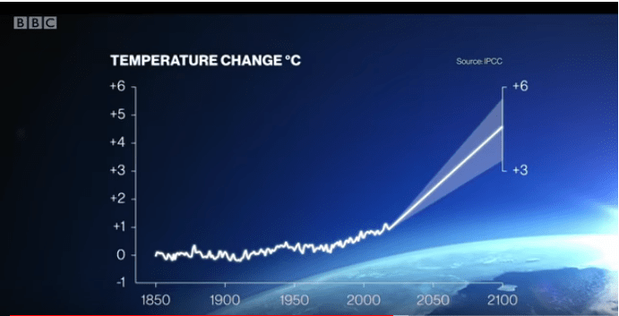
Talking of the projected rise in temperature to 2100, Attenborough says: “Based on our current trajectory, the various models predict our planet will be somewhere between 3 and 6 degrees hotter.”
The graph the program shows (above) is sourced from the IPCC AR5 SPM. It is a projection of the temperature rise expected according to the RCP 8.5 GHG emissions scenario. Though this scenario is misleadingly labelled “business as usual”, it is anything but; it is very much a nightmarish worst case scenario. In no sense whatsoever can it be described as “our current trajectory”, therefore Attenborough and the BBC are almost certainly deliberately misrepresenting the science in order to mislead the public into thinking that we must urgently reduce emissions now if we are to avoid catastrophic warming.
Firstly, when looking at the RCP scenarios, it is vitally important to realise that they are named after the greenhouse gas forcings (in Watts per square meter) which they will produce by 2100. Thus, rather than being constructed according to projections based around the assessment of likely future global social and economic development, based upon current trends, social and economic development are constructed in such manner as to give the desired forcing in 2100 – in the case of RCP8.5, this being 8.5W/m². This required the scenario designers to make some pretty drastic, even nightmarish assumptions regarding the future of humanity.
Ridley says this of RCP 8.5:
What is more, in the small print describing the assumptions of the “representative concentration pathways”, it [the IPCC] admits that the top of the range will only be reached if sensitivity to carbon dioxide is high (which is doubtful); if world population growth re-accelerates (which is unlikely); if carbon dioxide absorption by the oceans slows down (which is improbable); and if the world economy goes in a very odd direction, giving up gas but increasing coal use tenfold (which is implausible).
A Chemist in Langley says:
What the activists call: “Business as Usual” actually represents the 90thpercentile of the scenarios prepared for the IPCC that involved little change in environmental and economic policies (sometimes referred colloquially as the “no significant action” scenarios). These scenarios represented the worst of the worst where governments and industry did not do anything to improve their lot. As such the no significant action scenarios could only be described as “business as normal” if you happened to be living in 1990 or 1996 when the IPCC prepared its original couple reports. That would be before we had spent 20 or so years learning about climate change; before the Kyoto Protocol and the world-wide drive to renewable energy; before the discovery of tight shale gas and the move away from coal as the primary source of future energy plants in much of North America, Europe and Asia. To put it simply, being at the 90thpercentile of that group put you in pretty impressive company and does not relate to anything that anyone in the real world would actually expects to happen. Rather, in a relative sense as the 90thpercentile of all those earlier estimates, it would be the scenario that comes just below the scenario where Godzilla emerges from the sea to burn Tokyo and the scenario where the atmosphere spontaneously combusts from the endless bursts of Hiroshima-bomb-powered forcings.
A guest author at Judith Curry’s blog writes:
RCP8.5 assumes a nightmarish world even before climate impacts, resulting from substantial changes to long-standing trends. It provides AR5 with an essential worst case scenario necessary for conservative planning.
Unfortunately scientists often inaccurately describe RCP8.5 as the baseline scenario — a future without policy action: “a relatively conservative business as usual case with low income, high population and high energy demand due to only modest improvements in energy intensity” from “RCP 8.5: A scenario of comparatively high greenhouse gas emissions” by Keywan Riahi et al in Climate Change, November 2011, This is a material misrepresentation of RCP8.5. Scientists then use RCP8.5 to construct horrific visions of the future. They seldom mention its unlikely assumptions.
If Attenborough’s assertion regarding future warming was an isolated case of poor communication in an otherwise excellent, factual science documentary, one might be forgiven for thinking that it was a script error, an oversight. However, this BBC documentary is replete with half-truths, distortions, misinformation, naked propaganda and outright lies. Therefore it is almost certain that the program set out to deliberately mislead the public about the severity of probable future warming and that Attenborough was probably knowingly complicit in that endeavour (assuming he hasn’t completely lost his marbles and will now read out as fact anything which is put in front of him). That is a very serious breach of trust for a public broadcaster.

You can see Jaime just by looking at the graph the large slope discontinuity starting at the present year. That is not plausible given the largely constant increase in forcing we have been seeing.
LikeLiked by 1 person
DPY6629. I have looked in vain for a reflective image of the delectable Jaime in the graph. I carefully examined the place you suggested.
LikeLiked by 2 people
Alan
He did say that seeing Jaime…. wasn’t plausible. And yes, she isn’t there
LikeLiked by 1 person
I see you’ve got to be careful with your wording in comments here. 😉
This is very good Jaime. One of the things to reflect on is how not having any dissenters on anything ends up making the BBC entirely stupid. Such as on the likelihood of RCP8.5. Ridley’s points needed to be made in the programme. But all such people have been banished.
LikeLiked by 1 person
‘How would I know, why should I care
Please don’t bother tryin’ to find her
. . . . . she’s not there’
LikeLiked by 1 person
The BBC didn’t even bother to explain to viewers that the graph they presented was the worst case scenario RCP 8.5, so that the more enquiring among them could maybe go away and check out for themselves just how plausible (or not) it was. It was presented simply as the output of the ‘hugely powerful’ climate models.
LikeLiked by 1 person
DPY6629
If the temperature scale wasn’t so flattened, this would show up clearly as a hockeystick. Every five years a new IPCC report and a new graph splicing a dangerous projected upward woosh on to a gentle upward slope, with the turning point predicted to occur RIGHT NOW.
Can’t people see that this is insane? How long can proper scientists accept this being labelled as “science”?
LikeLiked by 2 people
Jaime: That’s as I expected. (I still haven’t bothered to watch.) But I’ve been thinking a lot about an effective complaint to the BBC. Rather than say, or seem to imply, that someone like Michael Mann shouldn’t get airtime at all we should rather make the point that on some crucial matters – Ridley on RCP8.5, Pielke on extreme events, Lewis on sensitivity – a dissenting voice has to be part in order to truly educate the public and fulfil the BBC charter.
LikeLiked by 2 people
Richard,
I can’t quite decide if a carefully compiled, very comprehensive, detailed complaint covering all the failings of this program, submitted by a well known sceptic organisation such as GWPF, is the best approach or whether bombarding them with lots of separate, less wide ranging complaints is a better idea? Or both?
LikeLike
I left out ocean-going hypocrisy. I’ll get to that in Part III.
LikeLike
“Business as Usual” should of course read ‘Bullshit as Usual’.
LikeLike
We are watching the imposition of the new state religion.
The key was to co-opt the “leaders” by way of centers of influence.
Attenborough is the missionary, speaking to the masses and the king.
Perhaps we should be grateful they are taking something closer to the Catholic strategy and not Islam’s.
LikeLiked by 1 person
This statement by Attenborough was one of the longest and most seemingly factual in the programme:
.
It is of course a magnificently constructed non sequitur. The source for the 8% extinction seems to be this meta-study https://science.sciencemag.org/content/348/6234/571.full
by Mark Urban. So for “scientists believe..” read: “a bloke in Connecticut calculates, using a Bayesian Markov chain Monte Carlo random-effects meta-analysis…” and the true figure is 7.9%, rising to 16% “if we follow our current, business-as-usual trajectory (representative concentration pathway 8.5.)”
Interestingly, “risks did not vary by taxonomic group.”
To be fair, Urban notes that:
The visual accompaniment to the section on biodiversity, (apart from the overheated fruit bats) consisted almost entirely of scenes of habitat degradation, including logging, palm oil plantations and the most horrifying images of landscapes ruined by solar panels I’ve ever seen.
Attenborough’s sleight of hand lies in the word “ultimately.” There is nothing in the Urban article suggesting the collapse of of eco-systems and a threat to “the whole of life on earth.” “Ultimately,” we risk the collapse of everything. It’s not only our planet which is finite, but also our own individual lives. But Mr Attenborough surely knows that.
Mr Attenborough will be missed.
LikeLike
From the Guardian’s report on the Extinction Rebellion demo:
This is how it works. The flying fruitbat is half way round the world before reason has got its sensible shoes on. This is when I tire of being reasonable and feel like being rude. Herr Wopperer is rejoicing about having recruited know-nothings inspired by Attenborough, and the same article reports that juvenile climate porn star Greta Thunberg will be joining them.
LikeLiked by 1 person
Please, oh please, an international incident involving sweet innocent Greta and some hefty British Plod of the female persuasion, brutally dragging her off by her heels. St. Attenborough shuffling to the rescue. I’ll take wagers on the content of any Trump tweet.
Not being an aficionado of Trump, I don’t follow his every tweet, so I am ignorant of whether he has offered any deep incites into the Attenborough opus. Can anyone enlighten me?
LikeLike
Deep incites is an apposite phrase for a Trump tweet Alan.
Geoff:
We all must feel the same. Oldbrew’s “Bullshit as Usual” writ large.
Still, something tells me that with the self-indulgent lack of care for ordinary people of XR we have an opportunity.
LikeLike
RCP 8.5 is not business as usual even Nordhaus has a far lower no-policy change scenario
LikeLike
Here is a comparison of the RCP8.5 emission scenario and the Shell suite of future scenarios.

LikeLike
Richard
Incites,insights My spellchecker is obviously wiser (and more witty) than I. Wish I could claim my choice was.
LikeLike
A very frustrating aspect of RCP scenarios is validating how reasonable are the emissions projections. An easy way to validate this would be to check against major countries. The RCP database (search “iiasa ac at web-apps tnt RcpDb dsd Action”) splits the world into five regions.
OECD90 – OECD in 1990
REF – Former Warsaw pact countries and former Yugoslavia
MAF – Middle East & Afirica
ASIA – those Asian countries not in the above, including India and China.
LAM – Latin America, excluding the OECD90 countries like Mexico.
One grouping often used is the EU28. The countries are split between OECD90 and REF categories.
Climate Interactive, for its C-Roads Climate Change Policy Simulator software “bravely” apportioned the categories to extract the major countries. On the basis of their apportionment, prior to COP21 Paris in 2015 they were able to predict that the INDC submissions if fully implemented would result in 3.5C of warming, as opposed to 4.5C from RCP8.5, which they falsely used as the non-policy BAU scenario.
This was used to castigate Bjorn Lomborg who had run a simulation to calculate the INDC submissions would only lower warming by 0.2C.
From the C-ROADs software I divided up the GHG emissions from 1970 to 2100 by 7 Regions.
Climate Interactive also had UN population projections. I thus derived GHG emissions per capita for the 7 regions.
Compare China and India. China’s population was projected to peak at 1.42 bn in 2030, then fall to 1.00 bn in 2100, whilst India’s population was projected to peak at 1.75 bn in 2060, then fall to 1.66 bn in 2100. Surely they would converge? In reality India was given very low growth estimates. So low that on 30th December 2015, to meet the GDP forecast for 2015 output would have had to have dropped by at least 25% in 24 hours.
Then look at the USA and EU27. Emissions per capita respectively peaked in 1973 and 1980. So why should they start increasing without policy? Rather than very low technological change, many countries seem to be consciously using energy less efficiently.
The key is China and India. China had said its emissions would peak by 2030, whilst India forecast high emissions growth to 2030 and no aims to peak emissions. Through the apportionment, China’s declaration (which would happen with very little effort) would reduced global RCP8.5 2100 emissions from 139 GtCO2e by 20-25 GtCO2e. Assuming constant emissions in the EU and USA would reduce 2100 forecast by about 11 GtCO2e. Conversely real emissions growth that will occur in many developing occur in many developing countries who have no intention of reducing their emissions was minimized.
RCP8.5 was used as means to make meaningless bits of policy waffle appear make a profound difference. Without silly assumptions along the lines of Climate Interactive claims that mitigation policies “combat climate change” are grossly misleading. The marginal impact of existing policies on global emissions is insignificant, but the marginal impact on long-term living standards on the people who endure the policies in very large.
LikeLike
The IPCC didn’t mean to scare people…really.
Myles Allen from Oxford ECI was a lead author on the IPCC 1.5 degrees report, now widely quoted as “the planet has 12 years” by XR. He says they didn’t really mean it like that. He was one of the very few climate scientists who co-authored the report. The rest was a motley group of lawyers, psychologists, sociologists, development specialists, economists, geographers and political scientists, with a goodly smattering of Potsdam and Stockholm institute personnel.
https://wattsupwiththat.com/2019/04/20/make-your-parents-pay-a-carbon-tax-myles-allen-to-teenage-climate-protestors/
“My biggest concern is with the much-touted line that “the Intergovernmental Panel on Climate Change (IPCC) says we have 12 years” before triggering an irreversible slide into climate chaos. Slogan writers are vague on whether they mean climate chaos will happen after 12 years, or if we have 12 years to avert it. But both are misleading. [a bit rich considering he was a lead author].
But an additional quarter of a degree of warming, more-or-less what has happened since the 1990s, is not going to feel like Armageddon to the vast majority of today’s striking teenagers (the striving taxpayers of 2030). And what will they think then?”
Allen has a long history of scary stuff and political activism and he was present at the 2012 meeting at La Jolla, when the Union of Concerned Scientists, led by Peter Frumhoff, constructed a strategy to bring prosecutions against fossil fuel companies in the manner of the tobacco class action. Also there, was Naomi Oreskes, who appears in the Attenborough shockumentary.
As Oreskes is in the film with Mann and Hansen, she could well be involved with its scripting. It’s also possible there could be people like John Cook and Ed Maibach from George Mason University, maybe together with a little help from Bob Ward. https://www.theguardian.com/commentisfree/2019/mar/20/donald-trump-stalinist-techniques-climate-science (Michael Mann and Bob Ward on Donald Trump).
https://www.newscientist.com/article/2199490-david-attenborough-finally-talks-climate-change-in-prime-time-bbc-slot/
“Climate Change – The facts” is part of a renewed BBC drive to tell climate change stories and follows its decision to give them a higher profile, which started last September. Insiders say that push is spurred by the desire to stay relevant with younger audiences.”
https://www.tandfonline.com/doi/full/10.1080/17524032.2017.1392109
A Reply to Cook and Oreskes on Climate Science Consensus Messaging
https://wattsupwiththat.com/2016/09/19/climate-skeptic-basher-john-cook-joins-the-george-mason-university-rico20-gang/
They are all birds of a feather, so it wouldn’t be a surprise if they flocked together to provide “The Facts” for Attenborough.
LikeLike
Dennis,
A rather half-hearted attempt by Myles Allen to wind back the unrestrained catastrophism of rabid climate protestors fed on a diet of climate alarmism by the education system and the MSM, which institutions derive their sense of an imminent “climate emergency” from scientists like Myles who rarely bother to correct exaggerations and errors in the popular press. I’ve left some comments at the Conversation article he authored.
https://theconversation.com/why-protesters-should-be-wary-of-12-years-to-climate-breakdown-rhetoric-115489
LikeLiked by 1 person
People have lost the ability to think critically and to read and absorb information, it would appear. Take, for example the exchange I have just had with a Conversation commenter, Helena Birecki, on Myles Allens’ thread. I despair, I really do, and ‘scientists’ are just not bothering to publicly correct these misapprehensions of what science actually says, even though they have a moral duty to do so.
LikeLiked by 1 person
As soon as phrases like ‘the various models predict’ appear, everyone knows – or should do – that what follows is going to be over-the-top alarmism. How they can get away with citing these dud models year after year as if they meant something is a mystery.
LikeLike
I note that the scientific adviser for the programme was Chris Rapley, professor at University College London, ex head of the Science Museum and the British Antarctic Survey, and author of the Royal Court hit comedy musical “2071 – the world we’re leaving our grandchildren.” (screenplay available on Amazon for 50p, or one cent in the US)
LikeLike
Chris Rapley, of “The Antarctic is an Awakening Giant” fame:
https://www.newscientist.com/article/dn6962-antarctic-ice-sheet-is-an-awakened-giant/
There will be much more of this kind of stuff before the 2020 COP, venue yet to be decided, but Claire Perry, with 2020 vision, has kindly put in a bid on our behalf:
https://www.businessgreen.com/bg/news/3068228/uk-formally-bids-to-host-cop26-in-2020
Help is at hand. The UN has a handbook for aspiring countries wishing to prostrate themselves before Gaia: https://unfccc.int/sites/default/files/resource/How-to-COP_2018.pdf
“The foremost gathering of climate change leaders, experts and influencers. It brings together tens of thousands of participants, from Heads of State and high-level officials, to leaders from United Nations and other intergovernmental organizations, civil society, business and academia, and a wide range of international celebrities involved in climate change action.
They come to share their stories at the panel discussions, exhibits, cultural events and hundreds of side events; the host country is closely involved in creating a space to support and channel their energy, innovation and commitment to action.”
Can you imagine it? Unfortunately they don’t seem to have a handbook on how to do Brexit.
This is the stuff coming out of UNFCCC at the moment, they are to have a “pre-2020 climate meeting in September, sounds like an Attenborough documentary:
“UN Secretary-General António Guterres is calling on all leaders to come to New York on 23 September with concrete, realistic plans to enhance their nationally determined contributions by 2020, in line with reducing greenhouse gas emissions by 45 per cent over the next decade, and to net zero emissions by 2050. [I thought concrete had a high carbon component…]
UN Climate Action Summit 2019 https://www.un.org/en/climatechange/un-climate-summit-2019.shtml
“Global emissions are reaching record levels and show no sign of peaking. The last four years were the four hottest on record, and winter temperatures in the Arctic have risen by 3°C since 1990. Sea levels are rising, coral reefs are dying, and we are starting to see the life-threatening impact of climate change on health, through air pollution, heatwaves and risks to food security.
The latest analysis shows that if we act now, we can reduce carbon emissions within 12 years and hold the increase in the global average temperature to well below 2°C and even, as asked by the latest science, to 1.5°C above pre-industrial levels.
Thankfully, we have the Paris Agreement – a visionary, viable, forward-looking policy framework that sets out exactly what needs to be done to stop climate disruption and reverse its impact. But the agreement itself is meaningless without ambitious action.”
There you have the 12 year meme again and of course, “the latest science”, which is every bit as visible as CO2 in the atmosphere.
LikeLike
“UN Secretary-General António Guterres is calling on all leaders to come to New York on 23 September with concrete, realistic plans to enhance their nationally determined contributions by 2020, in line with reducing greenhouse gas emissions by 45 per cent over the next decade, and to net zero emissions by 2050.”
Thats the strict scenario in the Nordhaus suite, his optimum scenario has peak emissions in 2050.
LikeLike
Of course, there is another meaning to the 12 year meme. If the guys who count sunspots are right and the earth is about to enter a deep solar minimum, predicted to be as deep as the Maunder or Dalton minimum, then it will take about 12 years for the majority of politicians to realise that global temperatures can go down as well as up.
LikeLiked by 1 person
How dumb do you have to be to present a graph with a kink in it located at the present time and then claim that it is “based on our current trajectory”?
David Rose in the Mail has an article about “the flaws in the great naturalist’s ‘alarmist’ new documentary”.
He points out the falsehood of Thunberg’s claim that “nothing is being done”. He also challenges the false suggestion from Maslin and Mann that storms and floods are getting worse. Again, there is the irony that the climate sceptic is the person quoting the IPCC against the supposed climate scientists.
LikeLiked by 1 person
David Rose rightly points out that the use of palm oil in EU ‘sustainable’ biofuels has mushroomed. So efforts to tackle climate change have directly resulted in the destruction of rainforest habitats, the reduction of biodiversity, extinction threat to growing numbers of species and . . . . a reduction in carbon sinks! The idiotic use of food crops to produce fuel to stop climate change has had disastrous consequences and will continue to do so, despite the EU’s equally ill thought out ‘ban’ on palm oil and other food oils used in biofuels. The genie is out of the bottle and it will not go back.
LikeLike
Paul. But wasn’t the last IPCC report criticized from the getgo as being much too weak by climate change activists? No wonder they’re not using it: it’s not fit for (their) purpose.
LikeLike
The David Rose article that I linked above now mentions the RCP8.5 issue. I don’t think it did before. I wonder if he updated it after reading Jaime’s post?
“But here we must turn to its most provocative claim of all – that IPCC computer model projections show that, by the end of this century, world average temperatures will be between three and six degrees higher than now. Needless to say, this would be devastating.
In fact, the IPCC issues not one but four such projections, each one showing what would happen with differing levels of future greenhouse gas emissions.
The most pessimistic – known in the trade as ‘RCP 8.5’ – suggests that by 2100, the world would indeed be much hotter: according to the 2013 IPCC report, between 2.6 and 4.8 degrees above the average between 1986 and 2005.
This, of course, is lower than the 3-6 degree range predicted by Attenborough.
Meanwhile, there is evidence that RCP 8.5 is almost certain not to take place. First, it posits population increases far higher than those now thought likely by many demographers.
UN forecasts claim the global population will reach 11 billion by 2100, but several expert teams now say falling birthrates mean it will peak much earlier.
‘It will never reach nine billion,’ says the eminent futurologist Jorgen Randers. ‘It will peak at eight billion in 2040 and then decline.’
For the RCP 8.5 prediction to become a reality would also require a massive increase in the use of coal, and the reversal of the emissions cuts which many countries have already achieved. “
LikeLiked by 1 person
For a programme hailed as presenting “the facts,” it was astounding that it featured only two scientists expounding on their areas of expertise. One was the bloke from Leeds on glaciers – and I leave to others to judge his credibility – his waffle was certainly so vague that it could possibly slip through as “facts.” The other was the younger Hansen with his satellite maps of deforestation. He was the only one to present convincing-looking documentation to back up what he was saying. Trouble is, it had nothing to do with climate change, except insofar as the growing of palm oil to combat climate change is making deforestation worse. Were the programme makers just too thick to see that their most convincing witness was arguing against their case?
LikeLike
The graph you reproduce from the programme is attributed to the IPCC, but this can’t be so. I checked it using the most rigorous scientific method (blowing it up, laying a set square across the screen, and counting the millimetres.) The cone of future uncertainty starts in 2019/20, right after the 0.3°C post-el Niño depression, but the IPCC report came out in 2014. If the compilers of the graph had started their cone at the 2016 el Niño peak, or even at the IPCC’s 2012 cut off date, we’d already be outside their conical danger zone, and might never get back into it.
They will argue, I suppose, that the cone of uncertainty is only a visual artefact; the scientific claim being made is the prediction (sorry, projection) of a 3-6°C rise by 2100, and it matters little how the temperature varies on its way to that “goal.”
There’s a Lewandowskian numerological argument to be made here, I think, to the effect that the prediction is either false or meaningless, whatever the global temperature turns out to be in 2100.
Assuming the 2100 forecast of a 3-6°C rise to be true, then it follows that it must be true whenever the prediction is or was made. Project the point of the cone back to almost any time in the past, and it is evident that most (nearly all, in fact) of the subsequent real temperatures fall outside it. The cone is clearly too narrow, or the sides of it shouldn’t be linear, or both. Loosen them out sufficiently so that 95% of future temperatures fall within them, independently of when you make the prediction, and you have, not a tight cone, but a large, loose bladder shape wobbling across the graph from your starting point to the target temperature, like a deflated sausage balloon that whizzes round the room making a farting noise when you release it.
Of course, it will still converge on the 3-6°C area of the 2100 vertical, because that’s our assumption. But I’m not finished. Their models oblige them to be able to produce similar predicted temperature ranges, and similar cones, for any future date you care to imagine. Repeat the process as often as you like, and practically the whole graph becomes your area of uncertainty, a rectangle with two corners rounded off by a couple of hyperbolae, (or hyperbollocks, in the vernacular) destined to converge asymptotically on the truth, whatever it might be.
LikeLike
Here is the graph from the IPCC report which shows warming between about 3C and 6C for RCP 8.5 (if I can manage to upload it):
(nope, can’t upload an image file from my computer).
It’s SPM.6 (a) in this report.
LikeLike
Thanks Jaime. I was looking at SPM 1a, for the “real” temperatures up to now, which go up to about 2014, and I assumed the cone represented error margins around a best estimate, whereas SPM 6a shows in fact error bars around model simulations for RCP 8.5. starting in c2005. The Beeb has sharpened the cone to a point, straightened it out, and transposed it 15 years into the future. Well, if a Nobel Prize winner like Michael Mann can do it, why can’t the Beeb?
LikeLiked by 1 person
Jaime, you don’t need to upload it. You can rummage around on the IPCC site, find the report you want, click on graphics, then click the one you want and right-click, ‘open image in new tab’ to get the URL for the image, then just paste that:
File under “what David Attenborough didn’t show”.
I don’t think the IPCC has a graph like the Attenbollocks one, so the “Source IPCC” is misleading.
LikeLiked by 2 people
Thanks Paul. I was trying to copy the image from an online PDF file and the only way I could save it was to do a screenshot and then save that image to my computer. But yes, if you search for the figure online, it takes you to the IPCC website where you can just right click on the image, copy the location and paste it anywhere.
LikeLike
The actual IPCC graph shows a temperature increase of anywhere between about 2.8C and about 5.4C (ref. 1986-2005 baseline). Attenbollox graphic shows a projected rise of between about 3.2C and 5.5C, so it’s not exactly the same, but the baseline may be different. God knows where exactly the graphic came from, but it’s almost certainly based on RCP8.5.
LikeLike
Actually, it looks like the Attenbollox baseline is pre-industrial, meaning (if we assume 1986-2005 was about 0.6C above pre-industrial) that the BBC graphic should show a temperature rise between about 3.4C and 6C. Attenborough says the rise is between 3C and 6C. I think the BBC genius who drew the graph got the lower bound about right but didn’t move the upper bound up enough, even though the bar was there as a guide!
LikeLiked by 1 person