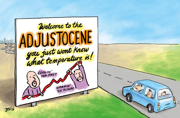
Climate scientists fiddling the data again and again and again and again
The history of climate scientists adjusting data to try to make recent warming look greater than it really is goes back quite a long way – it’s a regular topic at Paul Homewood’s blog for example. But climate scientists continue to do it, giving the sceptics plenty of ammunition. Here are three recent blog posts discussing how climate scientists continue to adjust data to exaggerate warming.
At Pierre Gosselin’s blog there’s a guest post by Kirje from Japan, on NASA GISS temperature adjustments. In the latest GISS version, V4, the supposedly “unadjusted” data sets are different from the unadjusted data in the previous version V3.
Tony Heller has a graph of the 2000, 2017 and 2019 version of NASA GISTEMP, showing that Gavin Schmidt and his team have managed to crank up warming, particularly in the era of the inconvenient pause. You can also see this effect in fig 2 and fig 4 of the GISS history page.
Here in the UK, the HadCRUT4 team are doing the same thing. Clive Best asks Whatever happened to the Global Warming Hiatus? The answer is that they have demolished it with a sequence of adjustments to the data. HadCRUT3, as published in 2014, shows a clear pause, with no warming from about 2001-2013, but the latest new improved data set HadCRUT4.6 cranks recent temperatures upwards. Clive thought that night be due to including different measurement stations, but checked and found that was not the case. The numbers have simply been adjusted.
The previous versions of HadCRUT4 are available here. From these you can see how the temperature difference between 2013 and 2001 has been steadily nudged upwards in successive versions:
| HadCRUT version | 2013 – 2001 temperature |
| 4.1.1 | 0.023 |
| 4.2.0 | 0.050 |
| 4.3.0 | 0.053 |
| 4.4.0 | 0.059 |
| 4.5.0 | 0.073 |
But the main point of this post (the 4th ‘again’ in the title) is to report on the very latest data fiddle, not mentioned in any of the above posts. This comes from John Kennedy and colleagues from the Met Office, and is described in a very long paper recently made available here. This is concerned with sea surface temperatures (SSTs) and the brand new data set is called HadSST4 (confusingly, HadCRUT4 uses HadSST3).
Here is Fig 14 from the paper. The axis label is on a lower plot, but the big tick marks are 1850, 1900, 1950, 2000. The graph compares the current version HadSST3 with the proposed new one, HadSST4.

Obviously, I don’t need to explain which is the new version and which is the previous one. Warming has simply been tweaked upwards by about 0.1C, or about 10% of the total.
Figure 16 shows temperature trends from the year marked up until 2012:

Here the red diamond is the raw data, the green diamond is HadSST3, and the new HadSST4 is shown as the black line, with grey shading representing uncertainty. In the early years of the 20th century, there was global warming that doesn’t fit with the carbon-dioxide-controlled theory of climate scientists, so that is adjusted downwards. But look at the trend over the pause era, since 2000. The raw data shows literally no trend at all. HadSST3 adjusted the trend upwards to create warming, and HadSST4 adjusts things upwards again, roughly doubling the previous adjustment. And this is in an era when the data quality should be excellent, thanks to the introduction of the ARGO float system.
So what is going on here? There’s a clue in the other two symbols, the blue and the orange. These are two other efforts to measure sea surface temperature, ERSST and COBE-SST. Since these have created a warming trend significantly greater than HadSST3, the Met Office had to adjust their temperatures upwards as well, to keep up. This “reduced discrepancy between datasets” is one of the key points highlighted on the first page of the paper.
Throughout, the paper talks of biases in the data and how they are removed. But the authors seem to be oblivious to the biggest source of bias, that taking place in their own heads.

Fiddling though Rome does not burn.
LikeLiked by 2 people
I agree Paul that this all looks very suspicious. There are literally millions of choices in these adjustments and I doubt if most of them have been thoroughly vetted.
LikeLike
Hide the decline
Shine on the incline
LikeLike
It seems that you’re very keen to keep the “pause”, despite a lack of surface warming being very surprising given our continued emission of greenhouse gases into the atmosphere. Have you considered that the adjustments to the surface temperature dataset is actually not all that surprising (i.e., that it’s not all that surprising that they’ve been somewhat under-representing the actual warming)?
LikeLike
Oh my gosh, and therein lies the perfect illustration of the AGW mindset as illustrated by Ken above, The theory says we should expect warming, therefore adjustments to the data which result in a significant warming trend which was previously not a significant warming trend (using the unadjusted data) should not surprise us! Everything is as it should be. Classic.
LikeLiked by 5 people
When theory don’t correspond to data, well then adjust the data. Say, Feynman, regarding the scientific method, mebbe you’re wro-o-ong.
LikeLiked by 1 person
Jaime,
Not quite what I’m saying (I guess uncharitable interpretations is a common “skeptic” characteristic). However, we are dumping GHGs into the atmosphere, and this is well known to cause surface warming. We certainly shouldn’t be adjusting the surface datasets to match this expectation, but it’s maybe not all that surprising that the adjustments make the supposed “pause” less of a “pause” than was initially suggested.
LikeLike
For yet another look at how the data gets adjusted read the series by Chiefio where he has downloaded and analysed the GHCN data from version 1 to 4.
This was his latest post, just one of many
https://chiefio.wordpress.com/2019/06/09/ghcn-v3-3-vs-v4-baseline-end-2015/
Then of course there is Jo Nova, Jennifer Marohasy and Ken’s Kingdom looking at the Australian BOM adjustments and manipulations.
Not only is the data being adjusted for presentation purposes but the ACTUAL RAW data is now being adjusted and or restricted as well.
It really is a Scientific Disgrace and outright fraud and completely condoned by Governments all over the world.
LikeLiked by 2 people
Any further incoherent or irrelevant comments about “dumping GHGs into the atmosphere” are liable to be deleted. [Done]
LikeLiked by 2 people
Ken,
“Not quite what I’m saying (I guess uncharitable interpretations is a common “skeptic” characteristic)”
You say we should not be surprised. Jaime says that your statement that we should not be surprised typifies the AGW mindset. You say that her comment is uncharitable because all you had actually said is that we should not be surprised.
Jaime is simply trying to draw attention to the issue that is begged by your line of argument. What you are trying to do, heaven only knows.
LikeLiked by 1 person
If you want raw data….
it shows
MORE warming
https://www.carbonbrief.org/analysis-major-update-to-ocean-heat-record-could-shrink-1-5c-carbon-budget
So what happens?
1 GHCN 4 is 27000 stations. in my experience more data almost always results in more warming
2. HADSST4, again a major addition of new data, more data more warming.
when you look at the globe and see all those places where there is no data, your assumption
is that these unsampled locations will be cooler.
Opps. you are wrong, they tend to be a tad bit warmer.
LikeLike
ATTP is for helping those pesky thermometers overcome their skeptical bias.
Reality is not cooperating with the climate consensus, and dim witted fanatics are still refusing to question why.
LikeLiked by 1 person
Steve,
You are bring circular. Again.
Thanks for playing.
LikeLike
Steven, that’s true over the entire period, but false over the pause era, as shown in Fig 16 which I have included and discussed in the post.
Fig 11 in the paper is worth a look too. It shows three different data sets in the pause era as black dotted lines, all showing less warming than HadSST4.
LikeLike
Meanwhile, UAH is apparently the last dataset standing, showing a return to the mean annual anomaly since 1995.

LikeLiked by 1 person
I am particularly sad to hear about HadSST3 since for years I have depended on it for monthly SST updates not subjected to Karlization.
LikeLike
To show how annoying the circular game regarding “adjusting” is, look at the hysterical reporting over the alleged French heatwave and ask this:
If the raw data show even higher temperatures, do you honestly say with a straight face that this would not be reported?
The dog ain’t barking.
Ron, your essay is great by the way.
LikeLike
John,
I wasn’t really trying to do anything, just making a point. For example, if there were an adjustment to the surface temperature data, what would I find most surprising?
a. The trend increases slightly
b. The trend decreases slightly
c. Evidence that climate scientists were actively fiddling the data, again and again and again…
Of the options that aren’t bonkers, the outcome that I would probably find more surprising is a slight decrease in the trend (based on our understanding of the impact of increasing atmospheric CO2 *and* that we’ve undergone a period of warming that seems slightly slower than expected). This doesn’t mean that I think adjustments should, or have been, designed to suit our expectations, it’s just a point about what I would find more surprising, given an adjustment.
LikeLike
a and b should be equally likely. If a happens repeatedly, it’s reasonable to conclude c.
Your last paragraph is self-contradictory. You are putting your prejudice before data, despite claiming that you are not.
Despite doing what I asked you not to do, I’ve let that one through.
LikeLiked by 2 people
No, this doesn’t follow. We have other information. If all we had was global surface temperatures then the default would probably be that the adjustments would have an equal likelihood of increasing, or decreasing, the trend. However, we have other information that provides some information of how we might expect surface temperatures to change with increasing atmospheric CO2. This shouldn’t guide our expectation of how an adjustment should influence the rate of warming, but – given this other information – it seems less surprising that an adjustment slightly increases it, rather than slightly decreasing it. I am, of course, referring to this in the context of recent warming. Overall, the adjustments reduce the trend, rather than increasing it.
I disagree, it’s completely unreasonable to conclude c. I think the idea that this is all some kind of conspiracy to fiddle the data to suit some kind of alarmist narrative is utterly bonkers. YMMV, of course.
LikeLike
Paul, please let more of Ken’s posts through.
It’s like playing skittles, the way they get knocked down.
LikeLike
Time for this reminder of what science is again
LikeLike
Paul,
1. I don’t recall the scientific method including accusations that others have fiddled the data because the results look suspicious to you.
2. I also don’t recall there being some kind of scientific norm suggesting that people should refrain from expressing whether or not they find a particular result surprising.
LikeLike
Ken,
I don’t disagree with what you say, but I still can’t see where you get the idea that Jaime had misinterpreted you, uncharitably or otherwise.
If data does not fulfil an expectation then, naturally, either the data or the expectation may be in error (or both). If errors are then to be found in the data, one would be surprised if the corrections did not bring the data closer in line with the expectation (that is, after all, the very definition of expectation). Equally, if errors are to be found in the expectation, one would be surprised if any corrections did not bring the expectation closer in line with the data.
The problem is that you and Jaime are starting with different expectations, so what is not surprising you is very much surprising her. Your expectation enables you to see nothing remarkable in the consistent trends that serve as the hallmark of all climate data corrections. However, others who do not share your expectations will find such consistency worth remarking upon, and will wonder why the fallibility of non-compliant data is always the default assumption.
If we all shared your expectations, Ken, then I’m sure the words “experimenter’s bias” would never enter our minds.
LikeLiked by 1 person
John,
Bear in mind that I’m only referring to these recent adjustments that have been reasonably minor. Overall, adjustments to the global surface temperature record reduces the trend.
LikeLike
Alternate datasets show essentially no warming at all for at least 2 decades. The following graph is the Rutgers snow lab data with a trendline added. What it shows is the NH snow extent has not changed since 1994, except for normal variations around the mean. Very easy to measure snow extent from satellite – it needs no adjustments. The snow extent anomaly is therefore an isotherm at 0 C. If the temperature is rising the extent should fall. Because it isn’t falling temperature isn’t rising in the northern hemisphere in the temperate zone. Snow doesn’t lie, it melts or it doesn’t.
LikeLike
“At Pierre Gosselin’s blog there’s a guest post by Kirje from Japan, on NASA GISS temperature adjustments. In the latest GISS version, V4, the supposedly “unadjusted” data sets are different from the unadjusted data in the previous version V3.”
Nasa giss upgraded from GHCN v3 ( 7000 stations) to GHCNV4 27000 stations.
1. No change in algorithm
2. More data… it what folks complain about right?
NASA only makes ONE adjustment and that is for UHI. There adjustment is NEGATIVE one.
oh, BTW Tony hellers chart is wrong. You shoul be able to spot the error in 2 seconds
lets see if you can
LikeLike
“Steven, that’s true over the entire period, but false over the pause era, as shown in Fig 16 which I have included and discussed in the post.”
Here is a CLUE.. its the warming over the ENTIRE RECORD that is the only thing that matters.
Especially for something like ECS.
Have a look at Nic Lewis work. Using his approach and “unadjusted data” you would end up with
HIGHER ECS.
The point is pretty simple. For all 12 years I have been doing this skeptics have pointed to the blank
spaces on the globe and screamed MORE DATA!!
So, ya we went out and recovered more data.
Guess what?
LikeLike
Steve, the bunkonium in your defense is the adjustments are happening all too regularly in well established data sets.
But do keep playing.
If more raw data = more warmth or whatever the climate consensus is hyping this week, they would promote it.
Instead the raw data of temps, storms, droughts, floods, fires, slr, are “adjusted” until there is a climate emergency.
Heller, by the way runs a nice daily video documenying the terror end of the world that the people you carry water have been predicting for over 30 years.
No matter how recursive and circular your arguments I defense are, the predicted doom has never come close.
Not a single metric is doing doom. Yet we skeptics are continuously slapped around for pointing that inconvenience out.
LikeLike
And just in case I’m not clear enough, I am referring to historical data points that are regularly adjusted, all down for the past and high for the recent period.
And using a corrupted satellite sourced database hardly makes things better, by the way.
LikeLike
This goes to the heart of one of the methodological issues I see with climate science. How to control for confirmation bias?
Even the experimental sciences have a problem with bias, which is why drug companies are required to run double-blinded randomised trials. What controls do the GISS and HadCRUT teams have to avoid them nudging things in their expected directions every time they perform a reanalysis?
LikeLike
Nobody figure out how heller Hoaxed you?
Fine detectives you’d all make
https://moyhu.blogspot.com/2019/07/fake-charge-of-tampering-in-giss.html
LikeLike
“Steve, the bunkonium in your defense is the adjustments are happening all too regularly in well established data sets.
But do keep playing.”
you dont understand how adjustments work and WHY they change when you add more data.
Let’s see if I can explain it to you ( even though the code has been on line for years)
Suppose you have 10 stations in a region. You run an open source validated piece of code
called SNHT . What this test does is look for Jumps in a data series relative to its neighbors.
It looks for the odd man out. In crystal clear cases there is one odd ball and 9 non oddballs
the odd ball is marked at its time of divergence. Say, May of 1934. You can then check the metadata
and find out that the station moved from a roof top to the ground..
In some cases you find noting in the metadata. perhaps they changed sensors, or build a building nearby ect ect
In any case using this divergence you then estimate the kind of adjustment you need to bring the station
into agreement with its neighbors. Note that SNHT works really well for jumps. Say station X is
always 2.3F warmer than its neighbors, then suddenly it -2.3F colder. Thats a Jump.
Any way the adjustment is made algorithmically to reduce the number of these jumps in your data set
The method works and has been double blind tested. it REDUCES bias and does not eliminate it.
Now, years go by and what happens?
The National weather service continues to digitize olf data.. the number of neighbors increases to 20.
And futher you discover that the original 9 neighbors actually have better source data. You recover the
orginal written records and re digitize them. a couple months change from here and there.
Now run your algorithm again! the adjustment will change.
you think the adjustments are happening in “well established” datasets.
Hmm.
GHCN v3 was about 7K stations.
Its taken years to add more stations to that dataset..to get V4 actually still BETA.
Its got 27000
For Berkeley we started with 36000, now we are up to 45000.
Every month more data is discovered.
Guess what?
More data means adjustments will change. its how algorithms remove more and more bias
LikeLike
I have deleted a couple of illiterate and repetitive comments from Steven Mosher.
> BTW Tony hellers chart is wrong
As I said in the post, you can see the GISS data fiddling at their own history page.
You can also see it at Sato’s web page, for example this figure –
showing how v4 warmed up the pause period after 2000 compared with v3.
LikeLike
> Here is a CLUE.. its the warming over the ENTIRE RECORD that is the only thing that matters.
That is false. Again, I explained it in the post, and I’m sure you know why it’s false. But I will spell it out anyway.
It is a source of embarrassment to climate scientists, and a topic regularly raised by sceptics, that the rate of warming in the early 20th century is much the same as the warming in the late 20th century, see for example
https://wattsupwiththat.com/2016/08/22/virtually-indistinguishable-comparing-early-20th-century-warming-to-late-20th-century-warming/
IPCC AR5 Fig 10.1a shows how bad the mismatch between models and observations is in the early 20th century.
So it is not surprising that climate scientists are keen to reduce the early 20th century warming and increase the recent warming.
LikeLike
In my audit of the HadCRUT4 temperature date I explained the likely cause of all this – adjusting temperature data according to the method recommended by the World Meteorological Organisation is usually incorrect.
Most adjustments are brought about by correcting an increasing non-meteorological distortion of the true temperature data (e.g. relocation in an urban environmental or removing nearby vegetation). In the case of a relocation for urbanisation the two sites are briefly run in parallel – the new site relatively pristine and the old site as distorted as it will ever get – and the average difference in the two temperatures is used to adjust ALL previous data (i.e. all data at the old site and any data adjusted from other locations adjusted to simulate being recorded at that location).
This adjustment by a constant amount is incorrect when adjusting for gradual distortion. The correct adjustment would taper back to the point at which there was no distortion. No only is earlier data adjusted excessively but the trend caused by non-meteorological influences will still be present because all of the data is modified by the same amount. (If we had a straight line trend from 15 to 20 then shifting the data down so that it’s 10 to 15 isn’t going to change the trend.)
Top cap it all off, this flawed method of adjustment changes 1961-1990 temperatures, so the average across that period changes and therefore temperature anomalies since 1990 will also change. (The data prior to 1961 will be adjusted by the same amount as the 1961-1990 temperatures so the anomaly, being a difference between a specific value and the 19861-1990 average won’t change.)
Will the WMO admit that its advice is faulty? I’d like to think so but the WMO is a co-sponsor of the IPCC and the correctly adjusted data might show that the temperature change is negligible, which would undermine the IPCC’s claims and its justification for existing.
– Dr John McLean
LikeLiked by 1 person
Hmmmm…
Hoax…like the hockey stick?
Or that slr is a crisis?
Or ocean acidification?
Or that Greenland is melting away?
Or that Antarctica is melting?
Or that droughts are increasing?
Or that California is in permanent drought?
Or that hurricane Florence was caused by President Trump?
Or that Arctic sea ice will be gone by summer of 2013/2015?
It is frankly annoying as shit that an alleged skeptic sits by silently for that list of proven climate consensus bs that is bring used to hurt the extremely effective and beneficial oil and coal industries and hurt millions of good jobs and the economic benefits of cheap reliable energy for proven crap predictions.
But it is more annoying to see alleged skeptics so brave to offer dubious but prompt critiques of people like Tony Heller while bring silent in the face of alarmist crap from alleged “credible” scientists.
And fiddling with past weather station data is still bogus, no matter how many words are used to rationalize it.
LikeLiked by 2 people
And in SYDNEY, AUSTRALIA; they believe that their massive exploding Fireworks displays on New Year’s Eve, is 100% #CarbonNeutral. Sydney also believes that the established scientific facts of the damage (respiratory diseases eg, Asthma, COPD, etc) caused from the toxic smoke (#pollution) released from fireworks, is eliminated, or simply vanishes because ‘they’ purchase #CarbonOffset(s) – and if governments buy these ‘offsets,’ especially with TAX-PAYER’S money, vis #CarbonTax, then that somehow ensures the governments that there was ‘zero carbon impact’.
It just doesn’t exist anymore, after the fireworks. Alakazam!
https://twitter.com/NecktopP/status/1146056590979674112
LikeLiked by 2 people
A middle-aged man is sitting at his desk in a private office. He is mid-conversation on the telephone to an unseen colleague.
“Ya, ya, you can imagine how upset we all are. How did it happen? Well, as you know we had this theory, and we knew the theory was correct. Ya, ya, that’s right, 100%. Well, we’d been collecting some data, and the data had been in agreement, until – inexplicably – it wasn’t any more. Ya, it diverged. That’s right, the data had to be wrong. That’s why we called it a pause, because we knew 100% it would start again. So we kept collecting the data, waiting for it to start agreeing with the theory, but it just wouldn’t go our way.”
“Anyway, that pause kept going for about 20 years. I know, I know, that’s a helluva pause. So eventually we decided that the theory had been falsified, and we’d been wrong. We were just about to announce to the world that there was in fact nothing to worry about, we were all going to be OK, and that we could close down the institute and go our separate ways. Ya, that’s right, new careers. Exciting times. We were all really buzzing.”
“You’re not going to believe what happened next. It was terrible. Well, the data guys found all this new data. Ya, something like 4 times as many sites as we’d been using before. What? Well they said they’d already used all the best, most reliable data, and they didn’t think it was that important. Said no one had told them there was anything major riding on it. It was just some science stuff, and besides, they’d been getting heavily into the new Minecraft release.”
“So it turns out the new data says there was never a pause, our theory was 100% correct, and we’re all going to die. You can imagine how upset everyone is. Ya, ya, lots of tears in the office. We’re all devastated.”
“What next? Well as we’ve finally proven our theory is correct, we’ll be closing down the institute and getting on with something that’ll give the rest of our lives some meaning. Me? I’m going back to writing – I’ve developed quite a taste for scaring small children, so I’m planning on knocking out some horror stories for the under 12s.”
LikeLiked by 1 person
The idea of a measurable average global temperature, how it is measured, adjustments to earlier measurements, the reasons for those adjustments, whether the adjustments are correct, whether they are adequate to deal with things like UHI etc are all linked areas that cause me to remain sceptical about some of the alarmist claims that are made.
Probably more than anything, if I were satisfied that the claimed temperature rises were bona fide and accurate, and exceptional, then my scepticism would be greatly reduced. It would, of course, still leave valid areas for debate, such as what – if anything – we can do about it and whether spending money on adaptation makes more sense that spending money on attempted mitigation, though those are separate issues.
Almost 3 years ago I opened a discussion thread at Bishop Hill about the effect of UHI and whether it was adequately catered for in the adjustments that were made:
http://bishophill.squarespace.com/discussion/post/2629432
I’m not convinced that anything in the intervening period has reduced my scepticism regarding this critical area.
LikeLike
“The idea of a measurable average global temperature, how it is measured, adjustments to earlier measurements, the reasons for those adjustments, whether the adjustments are correct, whether they are adequate to deal with things like UHI etc are all linked areas that cause me to remain sceptical about some of the alarmist claims that are made.”
Let’s see If I understand your argument, Your doubts about the surface record, lead you to doubt
things like “c02 causes warming” c02 is a GHG? it causes you to doubt that ice is shrinking?
it causes you to doubt that there was an LIA?
it causes you to doubt that the 70% of the globe ( SST) is warming and that we see this in rising
( but not yet accelerating ) SLR?
The first thing I would doubt is your understanding of the global temperature record.
lets ask some simple questions.
1. For the combined record of SST and SAT, that is land and ocean, does the raw data
( 70% of which is SST with zero UHI) show MORE warming than adjusted
or less warming?
2. How many stations in GHCN V4 ( 27000) do you think are urban?
Lets start with that and we can get to your questions about peterson after that
LikeLike
“But it is more annoying to see alleged skeptics so brave to offer dubious but prompt critiques of people like Tony Heller while bring silent in the face of alarmist crap from alleged “credible” scientists.
And fiddling with past weather station data is still bogus, no matter how many words are used to rationalize it.”
so If a station reports 35C for 5 months straight while its neighbors report -2C and lower,
you leave it be?
Hint if you didnt adjust SST there would be MORE warming in the record.
LikeLike
“Most adjustments are brought about by correcting an increasing non-meteorological distortion of the true temperature data (e.g. relocation in an urban environmental or removing nearby vegetation). In the case of a relocation for urbanisation the two sites are briefly run in parallel – the new site relatively pristine and the old site as distorted as it will ever get – and the average difference in the two temperatures is used to adjust ALL previous data (i.e. all data at the old site and any data adjusted from other locations adjusted to simulate being recorded at that location).”
Only problem.
A) This is not what NCDC do
B) This is not what GISS do.
C) This is not what Berkeley do.
As for adjusting previous data versus post data this doesnt effect the trend AND is actually an OPTION flag you set in the software.
go get the software. audit it
LikeLike
“It is a source of embarrassment to climate scientists, and a topic regularly raised by sceptics, that the rate of warming in the early 20th century is much the same as the warming in the late 20th century, see for example”
source of embarassment?
err no.
its the source of some really good papers you havent read.
He heres a challenge
Do you very best steve mcintyre and reconstruct Tony hellers chart.
Show what data you get from GISS, show the links, show that you can reconstruct his hoax
LikeLike
“That is false. Again, I explained it in the post, and I’m sure you know why it’s false. But I will spell it out anyway.”
err No its not.
As a good example take Nic Lewis work. To look at the change in termperature over long periods
he selects a start period ( say 1859- 1875) and an end period ( 2000-2015)
This is used to estimate ECS.
Do it with raw, do it with adjusted.
If we were interested in fudging data for high ECS we would use raw.
If you really wanted to earn some skeptical credibility you would dive into the WHY of the adjustments
but you wont cause you cant. you cant even reconstruct a tony heller graph. now thats funny
LikeLike
Paul about the “early 20th century warming”
are you suggesting that the early warming in the SST record is reduced because skeptics made arguments about the early warming ( 1900-1940) and the late warming ( 1975 to present)?
Here are a couple versions of this conspiracy story I have heard.
A) early SST ( prior to 1940) was adjusted to match the models better
B) aerly SST ( prior to 1940) was adjusted becasue the early warming was greater than the present warming?
Is your argument one of those?
I’ll suggest you dont know the publication history of these adjustments.
That would be something any strong sskeptic would look at ( I know I did back in 2008 when
Steve Mcintyre first exposed me to the bucket issue)
So since you studied this— without googling– tell us who was the first researcher to notice
a discontinuity in the data ( at 1940) what was the date of his publication?
And who was the first person to suggest a positive adjustment ( making pre 1940s data warmer)
And what date did he make this adjustment?
Then ask yourself. was it befoire any IPCC GCMs were ever run?
Was it even before the first ever global land/ocean series was constructed?
are you suggesting that temperatures taken from buckets can be naively compared with engine inlet temperatures? who knew you tested this?
In other words do you have any evidence for your conspiracy? which amounts to this
Scientists make up corrections, then publish their methods in the hopes that no one will
find the error.
Or go figure this: removing bias
from observations will always improve the explanatory power of a theory already known to be true.
Long ago Romer measured the transit times of the moons of Jupiter. They disagreed with Newtons law.
guess what?
Now think long and hard about that logic.
If a theory is true and you have biased observations, correcting the observations will always
look like a conspiracy to nut jobs. and it will always improve the actual science.
Your job would be to do one of the following.
A) construct better adjustments
B) construct a better theory
Romer was right he corrected the observations; Quite a famous incident in the history of science.
even Feynman loved it.
LikeLike
No Steven, you don’t understand my argument. You mis-read what I said, and read into it lots of things that I didn’t say. About standard for the debate around this topic, sadly.
LikeLike
I’m tempted to delete some of Mosher’s comments but I think I will leave them as an illustration of his illiterate gibberish.
He claimed that the warming over the whole period was the only thing that mattered. That’s so obviously untrue, and I spelt out why, but he continues to claim it.
> are you suggesting that the early warming in the SST record is reduced because skeptics made arguments …
No. I’m not. Mosher is writing incoherent gibberish again, and as Mark says, reading things into what people say.
Any future comments from Mosher will go into moderation and will only be let through if they are written in clear English and say something relevant and true.
I have also held back some sceptical comments about “IPCC FRAUDSTERS”.
LikeLike
Paul,
“You can also see it at Sato’s web page, for example this figure”
Compare that with Tony Heller’s difference plot:
Sato shows an excursion of around 0.05°C. Tony’s is over 0.2°C.
And that is for the rarely cited Met Stations only index, included for historic reasons. The usually cited GISS LOTI (Fig 2 on the history page) has more like 0.02°C.
LikeLike
Their data, their rules…
LikeLike
Paul,
You accuse Steven of being illiterate but he can’t be. At Climate Etc. he declared that he has a “Degree in English too, Honors, bunches of scholarships. woo hoo!”
They don’t give honors English degrees to the illiterate, that’s a scientific fact. So the illiteracy he demonstrates in his posts must be ‘biased observations’. Perhaps we should just be correcting his solecisms in order to improve the actual science?
LikeLike
Ken,
“Bear in mind that I’m only referring to these recent adjustments that have been reasonably minor.”
You are quite right. I got a bit carried away when I said ‘all climate records’. In truth, the concern is restricted to only land records of the last century and sea surface records from 1940. Both feature adjustments that seem unsurprising to one camp and yet surprising to the other.
LikeLike
John,
They don’t give honors English degrees to the illiterate, that’s a scientific fact. So the illiteracy he demonstrates in his posts must be ‘biased observations’.
Bear in mind that Steven Mosher is one of the few people who’ve actually acted on the basis of their scepticism. For example, here.
LikeLike
Paul. I wrote earlier, and partially in jest, about not deleting Mosher’s contributions. Now I’ll try more seriously.
One of the most admirable features of this site, in my view, is the near absence of moderation of the contribution of others with opposing views. This was true when it was infested with trolls (with few redeeming features). Now opposing voices are virtually restricted to Ken and Steve. If you believe that Steve’s contributions can be illiterate let us all see this. It could be argued that you do your readership a disservice by hiding this fact. As moderators you still exercise enormous power, you can annotate, rather than delete.
Also by selective removal, you lose the enormous advantage this site obtains when discussing matters with the likes of ATTP and his site.
But in the end this is your thread and you must do what you think best. I merely try to influence.
LikeLiked by 1 person
If I may be allowed to speak to the issue of censorship/editing.
The West in general and the UK and US in particular are being assaulted by attacks on free expression.
Steve Mosher is no troll. He is not personally attacking posters. I disagree with him strongly, as most have likely noticed, about the significance of and impact of many things regarding climate.
But I defend without reservation his right to post and participate.
Frankly I enjoy his challenges and feel like my arguments are strengthened by his posts.
As much as I disagree with Steve, I consider him one of the good guys and a friend.
Skeptics, unlike the consensus believers, have nothing to fear from open free discussion.
LikeLike
> Sato shows an excursion of around 0.05°C. Tony’s is over 0.2°C.
The comments are getting more and more ridiculous. I’ve posted the Sato graph, and anyone can see it goes up by 0.1C in the pause period.
Alan & Hunterson, I only deleted two very short and repetitive comments from him.
LikeLike
Ken,
There are lots of things that can be borne in mind, but very few of them throw any light on why someone with an honors degree in English should be posting with such a frustratingly casual attitude towards grammar, spelling, syntax, etc. Sometimes, the mismatch between prior understanding and the evidence placed before you can be quite a puzzle. This is one of those circumstances.
As for Steven’s more substantial contributions to the subject area, I trust no-one is deprecating them.
LikeLike
John,
Ahh, I thought that by illiteracy you meant about the topic of adjusting surface temperature datasets. I’m simply suggesting that it might be worth trying to work out what Steven is saying since he is one of the few who has actually acted on his skepticism.
LikeLike
Hunterson, Steve Mosher sometimes posts interesting stuff. My problem is his writing style is extremely cryptic and its often impossible for me to determine what he is saying. Crisp and specific prose would make him a much better contributor. The other thing though is the repetition (in so far as the comments are decipherable) is also off-putting. If a comment is repetitious, there is no harm in deleting it.
LikeLiked by 1 person
Why is the variation in the recente period larger than in the early period? I would expect just the opposite!

LikeLiked by 1 person
Mosher’s college education, which enabled him to earn the honors her reports, was accomplished at Northwestern University, Evanston, Illinois, a serious and respected institution.
LikeLike
ATTP’s point makes sense. Essentially, you’d expect the results of corrections to biases from different collection methods to converge with other data (including ocean heat content). If they don’t it needs further investigation.
LikeLike
Steve is less Delphic lately, which is much appreciated. This forum tolerates my *many* typos, for which I am grateful. Ken is tolerated, banal troll that he is.
Skeptics have nothing to fear from open dialog.
Only fanatics fear open discussion.
LikeLike
aak! “…her reports…” should be “…he reports..”
And yes, I did not study at Northwestern, nor it appears from my many errors, anywhere else.
LikeLike
If data is changing, shouldn’t one look to see what data has changed?
LikeLike
DPY6629. Your comment about Steve’s abilities with the pen immediately reminded me of James Hutton, an 18th century polymath, commonly known as “the father of Geology” (he of the unconformity). His revolution of geological understanding might have gone for naught because his writing style was said to be almost indecipherable. If it weren’t for more literary scientific friends who rewrote and popularized his work he would probably be unknown. Now, however, visiting geologists from around the world go to sites associated with him. When I visited Siccar Point, I met someone from Illinois and from South Africa.
So scientific acumen does is not always associated with literary prowess, just as ability to spell is not an indicator of inteligance.
LikeLike
Alas, I think the evidence suggests that Mosher is not an undiscovered polymath, hampered by his inability to effectively communicate due to poor grammar, spelling and English comprehension. I could be wrong, but we’ll never know will we, as Mosh insists on personally penning all his contributions to the debate. He has, like most of us, some sensible points to contribute but I think we can understand him quite sufficiently to recognise that this is far from always being the case, to say the least. His deliberate and repetitive misrepresentation of Paul’s point above re. the gradual erasing of the ‘pause’ by retrospective adjustments and subsequent waffle about E20C warming being a good case in point.
LikeLike
ATTP’s subsequent waffle in defence of his initial indefensible and hard to misinterpret (even “uncharitably”, by a supposed “skeptic” like myself) comment is rather more eloquent, literate and easily read, but no less dense and misleading. But keep it up guys; you’re all we have from the AGW consensus side of the argument – the ‘real’ scientists, the true defenders of the faith, the big hitters like Schmidt, Marvel, Mann, Ed “Barcode” Hawkins, Peter Stott and the rest, wouldn’t deign to visit such a lowly ‘contrarian’ site as this, not because they might risk having their pet theories robustly challenged, I dare say, but simply because they rise ‘above’ such low grade debate of the ‘settled science’ with climate deniers. Can’t argue with that, no, course you can’t, because they ain’t here to argue.
LikeLike
Dr. Jennifer Marohasy discussing the homogenization issue in detail.
LikeLiked by 1 person
LOL.
Schmidt: ‘It wasn’t us honest, it was the algorithm that turned cooling at Amberley into strong warming – by comparing the station to other stations up to 600 miles away.’
*whistles innocently*.
Nothing to see here. Move on.
LikeLiked by 1 person
Meanwhile, in the Guardian, Damian stakes a case for Peak woo
https://www.theguardian.com/environment/2019/jul/04/planting-billions-trees-best-tackle-climate-crisis-scientists-canopy-emissions
LikeLike
What is disappointing is that climategate emails are not used to show just how full of crap the rationalizations for historical data vandalism really are.
Here is a video showing the corrupt intentions behind data tampering as revealed on climategate.
Which is ironic on multiple levels…
LikeLike
Paul states that the “temperature difference between 2013 and 2001 has been steadily nudged upwards in successive versions.” Additional the magnitude of both the early twentieth-century warming and the earlier cooling period are being steadily reduced.

LikeLiked by 1 person
Paul Matthews states @ 02 Jul 19 at 1:26 pm
Although similar in magnitude, in HADCRUT4.6 the warming since the mid-1970s has been greater than the early 20th century.
In the HADSST3 ocean data, the warming is very much the same in both periods. It is the land data, covering 30% of the earth’s area that accounts for the difference. HADSST4 helps rectify this discrepancy with a few adjustments.
NOAA dataset has a similar discrepancy.
https://manicbeancounter.com/2018/04/01/hadcrut4-crutem4-and-hadsst3-compared/
LikeLike
Manic, Paul mentioned only the warming in the late 20th century, which is similar in magnitude (0.6C) to the warming in the early 20th century (0.5C). It only warmed rapidly again in the 21st century because of the 2015/16 Super El Nino, augmented by the 2014 Pacific ‘warm blob’. Your 7 year moving average reflects this extra ‘jump’ of 0.1C after the ‘pause’ (which existed but now doesn’t exist). E20C of 0.5C warming happened over a period of 31 years (1910-1941). L20C warming of 0.6C (culminating in another huge El Nino) occurred over a period of 27 years (1973-2000). So the E20C warming rate is 0.016C/year and the L20C warming rate is 0.022C/year (slightly less than 50% greater). If you take the whole period in your graph (1973-2015), the warming is 0.7C over 42 years which gives a warming rate almost identical to that of the early 20th century, albeit occurring over a longer period. Whichever way you look at it, recognising also that the late 20th/early 21st century warming was augmented by three exceptionally powerful El Ninos, the earlier warming (where CO2 can only have played a minor role) is comparable in magnitude and rate to modern warming (which ‘scientists’ tell us is all due to GHGs).
LikeLike
I suspect that Mosh is a mobile addict, which might explain the typos, and in-a-hurry, which might explain the less than polished prose.
LikeLike
I am not sure that the adjustments can be explained by conscious data fiddling. For example in an email from Kevin Trenberth to Micheal Mann on Mon 12th Oct 2009 (cc include Phil Jones, Thomas Karl, Gavin Schmidt , James Hansen)
When the observations conflicted theory, it is the observations that are blamed.
Another is from 01/02/2015 with ATTP was explaining data homogenisation. He stated.
From Ken’s comments at 01 Jul 19 at 7:53 am and 9:51 am it is quite clear that if temperature data processing results show warming, there are good reasons for that occurring, whereas if there is cooling there must be an error. With homogenisation, if the algorithm produces unstable results; data is homogenized multiple times; and there is a predjudiced evaluation of the results, then there will be a bias towards manually adjusting results that do not show a warming trend than ones that do.
LikeLike
A graph goes into the graph doctor’s and says, “Doctor, I think I may have trendinitis.”
So the doctor says, “Well you certainly don’t look well. We have tests we can perform that will confirm the presence of the disease.”
The following week, back in the surgery, the doctor has bad news.
“Well, we checked all your data points and I’m sorry to say, graphical trendinitis has been confirmed. Nearly all of your earlier points just happen to be too high and nearly all the later points just happen to be too low.”
The graph is understandably concerned.
“Are you sure? Are the tests that reliable?”
“I’m afraid so,” confirms the graph doctor. There is something called experimenter’s bias that could lead to a false positive diagnosis, but the chances of that happening are so remote you would have to be bonkers to believe it has happened in your case.”
“Oh dear,” says the graph.
“Don’t worry,” says the doctor. “Trendinitis is easily fixed.”
And with that, the graph is sent on its way with a course of adjustments, happy and content that a nasty outcome had been avoided.
Except for one thing. Has anyone in this story considered how rare graphical trendinitis is? Experimenter’s bias may be unlikely, but the same may be said of graphical trendinitis. And if it is rare, one should be more surprised by a positive diagnosis, therefore treating the possibility of experimenter’s bias more seriously. The point of the story is that the argument does not hinge purely upon the reliability of the diagnostic test; one also has to demonstrate that the pattern of posited bias in the unadjusted data was in no way unusual. The more unusual, then the more persuasive becomes the experimenter’s bias explanation.
So, is it experimenter’s bias or a bad case of graphical trendinitis? Don’t ask me, I’m the last person qualified to answer. I am merely pointing out what I think I should investigate before being qualified to comment.
LikeLike
Ken,
I note that over at ATTP you have offered the following summary of the commentary accompanying this post:
“I’ve been engaging in some discussions with people I shall politely call climate “skeptics”. It struck me that it’s a bit like the classic Black Knight scene from Monty Python. Start off being polite and complimentary. The resonse [sic] is unpleasant and aggressive. A metaphoric battle ensues. No amount of pretty clear evidence will convince the “skeptic” to change their mind. When it’s clear that there’s not much point of carrying on, they will insist they’ve won and that you’re a coward who’s running away.”
With reference to the commentary in question, would you be so kind as to provide the following:
a) An example of a compliment offered by yourself.
b) An example of how your compliment was met with an ‘unpleasant and aggressive’ response.
c) The identity of those who accused you of being a coward who’s running away.
I trust you can see where I am going with this. The truth should matter to you more than it seems to.
LikeLike
ATTP, when not doing a Sir Robin, consistently falls back on his great rendition of the Black Knight.
How entertaining.
I’m sure to be his example of aggressive disrespect.
lol
LikeLike
Hunterson,
Since your reference to ‘dim-witted’ was the only comment amounting to aggressive disrespect, one suspects that Ken will attempt to cite it. However, this does not work for two reasons. Firstly, you were not responding to a polite and complimentary remark, as claimed by Ken. Secondly, the comments against his own article, led very much by Ken, seem to be largely addressing what is perceived as Paul’s lack of intelligence. Indeed, Ken considers all sceptics who ascribe to Paul’s view as lacking intelligence. So he is hardly in a position to complain regarding your remark.
LikeLike
Ken lives in a bubble. When he comes here, the walls of the bubble get perforated and he peers out at the real world and even begins to half make sense at times, and manages to put a lid on the carping and the sniping, even managing to be polite and almost engaging. Then he goes back to ATTP and the bubble reforms and he starts bouncing his usual vituperous “anti-skeptic” narrative off of the perfectly elastic walls of his self-constructed prison.
LikeLike
Is Ken worth this much attention?
LikeLike
I have observed that the quality of the dialogue at both Ken’s joint and Real Climate has deteriorated very strongly over the last year or so. What I think has happened is that most of those with real expertise or something to contribute have dropped out leaving only the anonymous or pseudo-anonymous mostly non-scientists and climate activists. I have also noticed that moderation policies at Real Climate have gotten very lax with ad hominem arguments regularly appearing.
ATTP’s post about the Oreskes and Winsberg laying out the case for “narratives” in attribution of extreme events is really weak and the comments uninteresting. The milk toast attack on Koonin (echoed at Real Climate) is about minor points and a very weak attempt at consensus enforcement. Tobis’ posts on extreme events are likewise not even really about the science but about the narrow point of damages which are not evidence of much really. My learning rate has gone down recently as there is nothing reality of substance to take in. Science of Doom is an exception even though he rarely posts new items.
This I think is a consequence of the fact that people have finally realized that “doing something” that is effective to control emissions is virtually impossible given the state of the world of politics and the lack of technical innovation. You can either become psychotic over this as some have done and double down on insults and hysteria. The more rational approach is to put your energies into something else where the payoff is higher.
LikeLike
So the net impact of this fiddling is to create a song of chaos and fear and ignorance.
For example take a look at this bit of anti-scientific Claptrap.
https://www.truthdig.com/articles/greenland-is-on-track-to-lose-all-its-ice/?amp
LikeLike
Yet another example of spectacularly misleading bs about climate and oceans:
“Carbon saturation”
https://www.commondreams.org/news/2019/07/09/completely-terrifying-study-warns-carbon-saturated-oceans-headed-toward-tipping
Just how stupid will belief in the climate apocalypse make allegedly smart people?
LikeLike
> The algorithm doesnt produce “unstable” results.
Another untrue claim from Mosher. I demonstrated the instability of the GHCN adjustment algorithm here:
https://cliscep.com/2017/02/06/instability-of-ghcn-adjustment-algorithm/
Historical temperatures – and therefore the trends – fluctuate wildly.
Yet the climate scientists who do these adjustments have never acknowledged this.
LikeLike
Relentless increases in ocean temperature after 1975 re. HadSST3 vs. HadSST4.
Almost 0.1C added after 2000
https://pbs.twimg.com/media/D_i40psXYAEkmru.png:large
LikeLike
Our own Ron Clutz, at his excellent blog Science Matters, has found out how ATTP is hoping to advance his standing in the climate catastrophist community:
https://rclutz.wordpress.com/2019/07/17/spaceship-earth-ideology-officers/
LikeLike
Why is attp here all the time? Why is a****** Mosher here all the time? ‘Cause it’s boring where they are.
LikeLike
From an interview with former NOAA scientist Rex Fleming:
“The scientist also discussed manipulation of data within NOAA, accusing a few individuals of “fiddling” with ocean and atmospheric data under the Obama Administration. He also brought up the prominent scientific organizations’ censorship of viewpoints by refusing to publish skeptical scientific papers.”
LikeLike