Net Zero sceptics have seen in this week’s grid performance another example of the uselessness of renewables. We know they are useless at times; and that means they are useless throughout. They need to be held up by the burly arm of gas-powered generators. Without fossil fuels, the UK’s power would have gone off last week. [Renewables promoters are fond of noting how well their technology of choice is doing on the occasions when it delivers, but are less fond of admitting to their collapses. Meanwhile, politicians are seen on TV repeating Miliband’s mantra as if they believe it.]
See Notalot on the success of renewables, or the damning of them by faint praise.
However, the latest wind lull and dim days meant I made a few visits to the very useful grid.iamkate.com, which scrapes data on the UK’s grid from official sources and presents them in a very accessible form. One of the panels shows “all time” demand. It looks like this:

The white line shows total demand since 2012. Red is fossil fuel, green, as you might expect, renewables, blue “other” and grey imports. Demand in 2012 was 36.5 GW. In 2025 YTD, it is 29.7 GW. Of course, the average might go up a bit as we enter the end of the year. Last year, the average power was 30.1 GW. That’s a drop of 6.4 GW or about a sixth in 12 years.
Which got me wondering: why are we talking about electrifying everything, when we are making electricity so expensive that some heavy users are leaving and many of us are rationing our use?
[If at this point someone suggests the drop is due to “efficiency,” please look up Jevons’ Paradox.]
The graphic shown above is slightly misleading for reasons which will become obvious. If you go to DUKES (Table 5.5.a, total supply – imports + exports), you can calculate the power of the UK grid. Note, of course, this is an average power over the year.
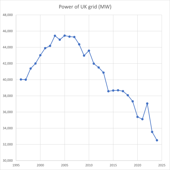
The earlier graphic omits the historical context. Now we can see that peak power was back in the days of peak UK – 2005.
Of course, since then an increasing quantity of whimsical generation has been added to the grid. This can be seen in the grid’s theoretical capacity factor: what proportion of available generation is actually being used to produce electricity?
[Aside: thinking about this rationally, an “ideal” grid would match generation with demand and never go wrong, never be down for maintenance, etc. There would be no excess capacity; it would have a capacity factor of 1. Of course, no such arrangement is possible. But we can measure how close to the idealised grid our own version approaches.]
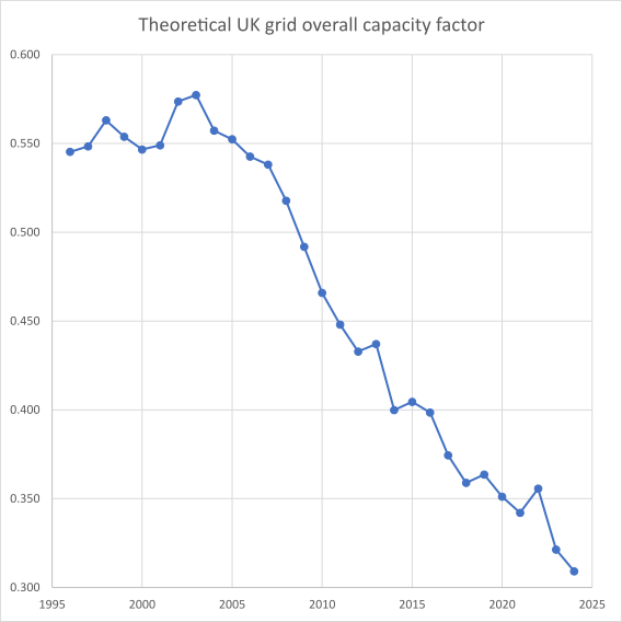
Here, I am over-dramatising somewhat by giving the renewables their “nameplate” capacity. Yes, it is unfair to expect them to get anywhere near that. The officially de-rated capacities for wind (on- and offshore) and solar are 0.43 and 0.17, as mandated by the Electricity Act 1989. In one year (2020) offshore wind nudged above 0.43 (0.45 to be exact), but that is the only time either form of wind has been anything other than below its “official” capacity factor. Solar has never been anywhere near. [Weighted average capacity factors, all time: onshore wind 25.1%, offshore wind 36.4%, solar 10.0%]
The closest our grid has come to an idealised grid in the series is 2003, at 0.58. On a de-rated basis, it’s now 0.45 (2024), or if you give renewables their nameplate as in the figure, 0.31. The figure shown is a measure of the duplication, or maybe triplication, in today’s grid. A sceptic might be able to claim that we now have the equivalent of three grids.
Maximum demand is now 47.5 GW (January 2024), and the sum of gas, oil and nuclear capacity is 41.9. Thank the stars for woodchips and interconnectors.
What about those gas plants? How busy are they? We might suspect that they are spending rather a lot of their time idle, now that they are having to give way to the renewables when they deign to deliver. Well, peak utilisation of gas was at 85% of potential in 1996; it is now below 30%. Thus, it could be argued that 2/3 of the gas fleet is standing idle. Of course, it still costs money to have them on standby, even if they are saving money on fuel costs. The dip in the early 2010s was due to a brief renaissance of coal.

Conclusion
We are supposed to be electrifying everything, but the trend is instead towards reduced electricity supply. Note also that the decrease in grid power has coincided with a rise in population. It’s also worth thinking about the way the market works: in a free market, over supply leads to reduced prices. This is not what is happening in our system.
Is the decline in electricity use something to be celebrated? Or is it a symptom of a decadent system propped up by increasingly desperate support?
Installed capacity: DUKES 5.12
De-rated capacity: DUKES 5.7
Electricity supply: DUKES 5.5
Electricity generated: DUKES 5.6
/message ends

The decline in national energy use is not something to be celebrated. It is the inevitable result (forced deindustrialisation and self-rationing) of sky-high energy prices resulting from our pointless, self-flagellating Net Zero energy policies. Leaders of our electricity supply companies have this week publicly debunked the Green Blob lie that high energy bills are due to the price of gas: https://x.com/aDissentient/status/1978502321009983618.
Current (2024) UK industrial electricity prices are the highest in the world and are set to keep rising, as David Turver explains: https://davidturver.substack.com/p/why-is-my-energy-bill-so-high.
Electricity use may increase in future if more people adopt EVs and heat pumps but that would be nothing to cheer about as adoption of these user-unfriendly products is totally pointless. An increase due to power-hungry datacentres will be quite amusing as the Green Blob totally failed to anticipate this eventuality: https://wattsupwiththat.com/2025/09/18/europe-ai-development-or-net-zero/.
Energy Bad Boys explain in a roundabout way how, because n*0=0, the “capacity values” of intermittent wind and solar plummet as their grid penetration increases. The conventional plant which provides the essential backup and balancing for wind and solar (and essential grid inertia) becomes increasingly important to overall system reliability as wind and solar is expanded. I suppose it’s another way of saying that wind and solar are almost totally redundant in terms of keeping the lights on: https://energybadboys.substack.com/p/more-is-less-with-wind-and-solar.
LikeLiked by 2 people
Thank you Jit – beautifully expressed. I think you, I and most Clisceppers reading your piece know the answers to the two questions in your concluding paragraph.
LikeLiked by 2 people
Over this past week our 32GW of metered wind capacity has generated at just 6% capacity factor. Our 20GW of solar capacity has generated at a similar CF.
7 days continuously. The amount and cost of the glibly suggested ‘storage’ will be astronomical.
LikeLiked by 1 person
This is nicely timed, tying in as it does with Paul Homewood’s recent critique of the latest nonsense from Carbon Brief:
LikeLiked by 2 people
We have received our ‘ Priority Services and your power cut plan ‘ letter from SSEN. It. Starts by explaining it is SSEN looks after the electricity network which means it’s their job to keep your lights and TV on at home. ( Not a good analogy for the all electric home.) Now, the Priority Service, during a power cut we have 24 hours a day proactive updates and a dedicated phone number if we need help. We also have the ‘power cut plan’ which will help us stay safe and well at home during a power cut.
The Power Cut Plan has 3 sections 1. Before a power cut – various advice inc. charge your phone and buy a power bank, fill a flask, keep supplies of food, meds and spare torch batteries. It would seem we should expect a power cut every day !
Section 2 During a power cut – various phone numbers, (not much help if you only have a land line through the router) check your house is not the only one without power, don’t wonder around in the dark. Again no help or advice for the electric home to stop it freezing during a prolonged cut, it is winter, we regularly get – 10c and lower .
Section 3 After a power cut – the main priority is checking appliances and systems reset correctly.
If we do get a power cut say for 4 days like 2009/10 with the same weather, deep snow then -18c the all electric home is going to be in a bit of bother regardless of power cut plans.
LikeLiked by 2 people
James S; it’s not just all-electric homes that could freeze up in a prolonged outage. No doubt you are aware, but it’s often overlooked that conventional boilers need power for their controls and circulating pumps. Also mobile phones will only work if the local towers have back-up power: aiui not many do. Which raises the question of how will folk be kept informed without phones, TV, radio, etc?
I’m looking at some form of battery back-up with enough juice to run my boiler’s electrics for a good while, maybe 12 hours (which I could use in bursts if an outage is prolonged). I intend to keep my hard-wired landline for as long as it still works.
LikeLiked by 3 people
With so much of the economy having been electrified (directly or indirectly) the nation is all the more vulnerable to a ‘single point failure’ which will induce a cascade of failures everywhere (cf. the Iberian electricity grid failure earlier in the year). And when such a major failure occurs I imagine that all those bad actors who have been hiding in the shadows will decide that the time has come to strike, thereby making a very bad situation very much worse.
So we owe a big thank you to all those individuals and enterprises that, eschewing robustness (for elitist and doctrinal reasons?), have consciously or unconsciously hardwired incipient cascade failure into the nation’s life-support mechanisms. Regards, John C.
LikeLiked by 5 people
Special bonus figure: how does the inflation of electricity prices compare to general inflation? Here, I calculated the ratio between the two, with 1996 = 1. So if the ratio is above 1, electricity is getting more expensive than life generally, and vice versa if below 1.
What is actually surprising to see is that in the early years of the series, electricity prices were growing more slowly than general inflation (they actually went down a tad). After 2005 (that year again) they exceed general inflation. Electricity prices are now double what they would be if they had been subject to “normal” inflation.
The x-axis meanwhile shows the progressive under-utilisation of the grid, as in the figure of the head post. To my eye, there is evidence that electricity was running away before Russia-Ukraine.
LikeLiked by 2 people
Jit, IIRC Rupert Darwall wrote that, in the latter years of the last century and the early years of this century, the UK was on a sensible electrical energy trajectory based upon “gas + nuclear”; your latest graph bears this out.
However, your excellent latest graph seems to suggest that, even before the magical thinking of the Climate Change Act (CCA) of 2008 was on the statute book, that self-same magical green thinking was already having its predictable and predicted inflationary effects, albeit behind the scenes. But nobody was listening to the hard data as UK leadership of the “energy transition” beckoned, thereby giving our political masters the opportunity to strut upon the world stage as leaders once again for the first time in decades. Little did they realise that they were leaders in gullibility rather than energy superstardom.
Your wonderful graph also shows that within a decade of the passing of the 2008 CCA, inflationary pressures in the electricity market were already running away with matters. And these last 3 years the inflation has passed, appropriately, into the stratosphere – there to remain for years to come (if the analyses of David Turver et al. are to be believed – and I think they are!). So the UK energy system/market is in a very bad place … and will probably stay there until some realism returns to the political realm. The sooner the better, I say. Regards, John C.
LikeLiked by 1 person