The day before the Lancet Countdown was released, the BBC ran a figure from it showing how droughts had changed in frequency over the past 70 years. Sceptic and alarmist alike would have expected a positive trend, although probably for different reasons. This sceptic though: he flew into a rage at what seemed a clear case of a lie in support of the Net Zero agenda. For it was impossible for the data to represent any version of reality; it indicated that before 1980, there were no deserts on the entire Earth, as the percentage of the Earth suffering from a 6-month drought before that time was trivial.

And what of the vast deserts that we know existed at that time? Erased.
My assumption at the beginning was that the Lancet Countdown’s authors had made a horlicks of compiling the data. It seemed the only logical possibility. We know there were deserts; their figure shows no deserts; the data must show deserts, so some slip has occurred, ‘tween cup and lip.
So your correspondent decided to emulate the figure, and (presumably) triumphantly demonstrate what it was supposed to look like, if the data were handled correctly.
Here’s how the Countdown put it:
[The drought] indicator uses the Standardised Precipitation Evapotranspiration Index to monitor the intensity and length of droughts on all land areas. The total proportion of global land affected by extreme drought for at least 1 month per year increased from 15% in 1951–60 to 44% in 2013–24. In 2023, 48% of the global land area was affected by at least 1 month of extreme drought—the second-highest level since 1951 and only 2% less than the record in 2020.
Sounds like tosh to me. But at least we have the identity of the drought index. So I put on my “Climate Auditor – Level Nought” badge and tried to emulate the figure. Because the data are in NetCDF format, I had to make a little program in R to handle it. I’m grateful to my son Dan for reading it through and checking the logic of it. [Should anyone want the code, it is available.]
Here’s my emulation, which should match the deep red line (the 6-month line) in the figure given in the Countdown’s supplementary information, and in the BBC news item:
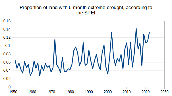
Well, it doesn’t match, but it shows a clear rise. [Asterisk: my data ends in 2022, because I stopped the loop counter 1 iteration too early.] Mine starts rather higher than the Countdown, and ends rather lower; but there’s no disputing the rise itself. Why the difference? I suspect this is in part due to the way I have interpreted things. My interpretation of a 6-month drought in a year includes 6-month droughts that overlap either the preceding year or the succeeding year as well as 6-month blocks within the year. Thus, if in October 1987 a drought began at a certain place and continued into March 1988, I counted that as a 6-month drought “occurring” in both years. And this may explain my higher beginning – but not my lower ending.
Having concluded that drought had gone up, according to the SPEI, and agreeing with the Lancet, I began to wonder whether some jiggery-pokery had gone on in the generation of the index itself. So I had to find out how the sausage was made.
Going back to the Lancet’s figure and the mere ~2% of the Earth’s surface that was suffering a 6-month drought prior to 1980: how can this percentage be reconciled with the known area of desert? A search of the internet tells us that a third of the Earth’s surface is desert. No-one is suggesting that deserts have spread, are they? In fact, it is well known that the surface of Earth is, on the average, “greening.” (An awful shorthand for the expansion of vegetation.) Of course, this is admitted grudgingly by some. Take this 2020 article by Burrell, Evans & de Kauwe in Nature Communications. Its title:
Anthropogenic climate change has driven over 5 million km2 of drylands towards desertification
Within which is said:
We also observed widespread global greening, with 18.0 million km2 of drylands having a significant positive vegetation change…
[Thanks to the miracle molecule, CO2 increasing the efficiency of water use by plants; but the authors decided instead to highlight in their title the rather smaller area that had gone the other way. And how exactly is this supposed to increase trust in climate science?]
So the bare minimum area for 6-month droughts prior to 1980 should be around 33%, not 2%. And that does not even consider the area of arid lands.
What is needed is a drought metric that shows that deserts are not experiencing droughts.
When you realise that, everything else becomes obvious. Here’s how the originators of the SPEI describe the way they have transformed it to make measurements at different sites compatible [p2]:
For this reason, it is necessary that SPEI series at different sites have the same average (x = 0) and Standard Deviation (SD = 1); the same is applicable to series of the SPEI recorded at the same location but at different time-scales.
Would you want a drought index to indicate how dry things are? I would. That way, deserts would have a high drought index score, and rainforests would have a low drought index score.
But that isn’t what happens here. In order to make the desert and the rainforest comparable, they both have an average SPEI index of 0. They also have the same level of variation. It seems crazy.
[ASTERISK: You may define drought as a period of low rainfall, or a period of unusually low rainfall. Under the second definition, a desert is not suffering a drought. However, since desert is a consequence of drought, I’m not down with that definition.]
But still: the area of drought has gone up globally, and you can’t argue with that.
Well, I can argue with it, and I will.
Before we go any further, we should make clear that the figure legends on the BBC report are untrue. Whether we describe this as misinformation or disinformation is up to us. They are wrong. The reason why there were no droughts before 1980 is because the index is not measuring drought.
It’s measuring an index of relative dryness and moisture where every place on the Earth has the same average value and standard deviation, no matter how dry or wet it is.
How is the index calculated? To answer that will surely show us what has gone on to produce such an outrageous increase in the index over the recent decades? [p1]:
…the SPEI uses “climatic water balance”, the difference between precipitation and reference evapotranspiration (P – ET0), rather than precipitation (P) as the input.
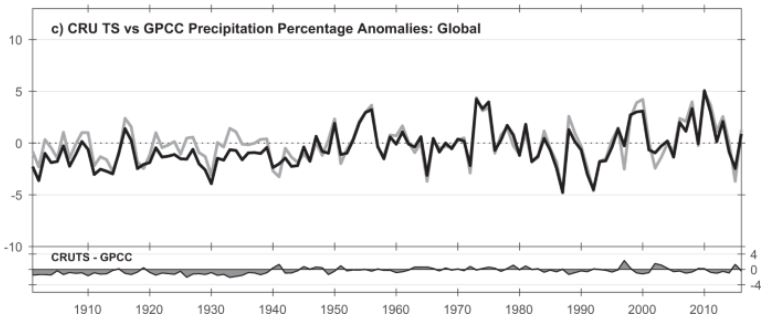
We can, in looking at the basis for this index, make the bold guess that precipitation, P, has not changed over the past hundred years. It seems quite clear that the lion’s share of the change in the underlying formula comes from the change in ET0. The climatologist, in searching for an increasing drought, would not overlook “just” precipitation, if that had gone down. As if. Here’s CRU TS precipitation, up to 2017 (from Harris et al’s description of CRU TS V4):
No change there. What about the other part of the index? What is ET0?
It’s reference evapotranspiration, calculated using some other climatic variables.
But before I describe the process in rough, let me just say a tad about the other variable: precipitation. SPEI uses CRU TS data. But CRU TS does not have records for every grid square (0.5 degrees) on every month since 1901, when the SPEI begins. In fact, in CRU TS a good bit of interpolation has gone on from “nearby” stations where there actually were measurements. And for places out of range of the interpolator, they are filled in by the climatology, assuming there is one.
Now ET0. How does CRU TS provide a number for reference evapotranspiration for every grid cell? These are the variables that we need (Harris et al again):
….we use the CRU TS gridded values of mean temperature, vapour pressure, cloud cover and static (temporally invariant except for the annual cycle) 1961–90 average wind field values.
Right, so we have mean temperature at quite a few places, or at least it can be estimated from the min and max temperatures, with a judicious bit of interpolation, and the usual pitfalls of UHI etc. What about the others?
Vapour pressure: do we have much data on that? Do we have humidity? Er, no. Instead, we calculate vapour pressure using Tmax and Tmin.
Cloud cover: do we have much data on that? No. Instead, we calculate it from… Tmax and Tmin.
Wind field values: well, they say themselves that this is simply the climatology, although presumably the climatology is itself of dubious worth.
So the only thing that really varies here is temperature. Everything else is a secondary variable driven by temperature. So when we get to the stage of calculating drought,
(P – ET0)
All we have got is precipitation minus a complex function of temperature.
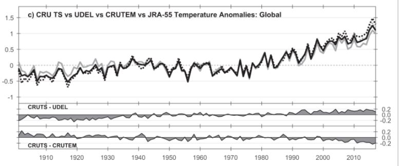
As we know, the world is hotter than it was. CRU TS shows an increase starting in about 1980 (Harris et al):
Therefore the value of (P – ET0) has, on the average, gone down since about 1980. Remembering that over the entire series, the overall average for every grid cell has to be 0, it’s obvious that:
In calculating the SPEI, then more recent values will be on average more negative, purely because of the rise in temperature.
Given this, it is now possible for us to produce wholly misleading figures claiming a large increase in drought, when what there has actually been, is a modest increase in temperature.
And how easy it is to slip such figures into the public domain, and hardly anyone bats an eyelid, even when confronted with obviously impossible figures!
Conclusion:
- The figure in the Countdown supplementary information is rubbish, and its reproduction at the BBC is misinformation or disinformation.
- Because precipitation is not playing ball, climatics have introduced new indices, which supposedly take into account the “true” effect of climate change on droughts, by including things that do not measure actual drought, and only serve to exaggerate the state of peril our world is in.
- Such indices do not, of course, include the positive effect of CO2 on making photosynthesis more efficient, which easily swamps whatever negative effect the climatics can generate with their added effect of increased temperatures.
- Droughts are not spreading or worsening.
References
Description of the standard precipitation evaporation index by Begueria et al: https://digital.csic.es/bitstream/10261/90646/1/BegueriaS_IntJClimatol_2013.pdf
Burrell et al:
Burrell, A.L., Evans, J.P. & De Kauwe, M.G. Anthropogenic climate change has driven over 5 million km2 of drylands towards desertification. Nat Commun 11, 3853 (2020). https://doi.org/10.1038/s41467-020-17710-7
Harris et al’s description of CRU TS V4:
Harris, I., Osborn, T.J., Jones, P. et al. Version 4 of the CRU TS monthly high-resolution gridded multivariate climate dataset. Sci Data 7, 109 (2020). https://doi.org/10.1038/s41597-020-0453-3
Lancet Countdown: https://www.thelancet.com/journals/lancet/article/PIIS0140-6736(24)01822-1/fulltext [Free to read with registration]
SPEI database: https://spei.csic.es/database.html
Addendum
The title of this post is of course a reference to Countdown to Ecstasy, the 1973 album by Steely Dan. Whether you know this song or not, now is the time to kick off your shoes, pop on your cans, start thinking about nuclear apocalypse, and press play. Heck, even light up a cobalt cigarette too, may it please you. You’ll be glad you did.

Thanks, as always. I’m glad your curiosity was triggered sufficiently to dig deeper.
It’s an interesting sign of the times that a study with the title “Anthropogenic climate change has driven over 5 million km2 of drylands towards desertification” can say in its introduction “Unsustainable LU is considered the primary negative driver of dryland degradation” and “Despite evidence for LU-induced degradation and the studies that find increased aridification over drylands, satellite estimates of vegetation greenness (a proxy for net primary productivity (NPP)) show a significant global increase since 1980. The key drivers of this global increase in apparent vegetation productivity are the vegetation’s response to rising CO2, increases in rainfall and temperature and LU…”
LikeLiked by 1 person
Jit – thanks for the hard work digging into this. Seems like the MSM fact checkers are only deployed when it suits.
ps – your vid link says “vid unavailable” & had to google “cobalt cigarette”, interesting, never heard of them.
LikeLike
Dougie, it’s working for me. Try refresh: and listen out for the lyrics re: cobalt cigarettes!
LikeLike
Mark, it is a strange juxtaposition, is it not?
LikeLike
More justification for my rule-of-thumb about “expert studies” in any field across the whole range of politically contentious issues: if they fall in line with progressive-elite orthodoxies, then it’s highly likely independent analysis will expose serious errors and it falls apart.
I really admire your tenacity, thoroughness and set of analytical skills, Jit.
LikeLiked by 1 person
A wonderfully detailed and careful piece of work Jit. Thank you.
LikeLike