The other day Robin noted that the 2023 Edgar emissions database had been released. You know me: I like numbers. So I decided to pull together a series of bullet points outlining how CO2 emissions changed between 2022 and 2023. All data comes from the Edgar spreadsheet, available at the link.
1. Global Emissions
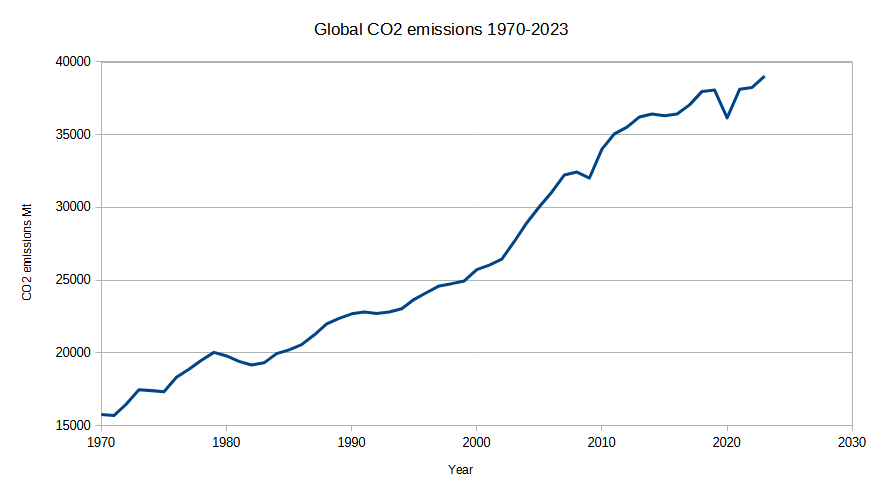
The global total emissions in 2023 were 39024 Mt CO2, up 777 Mt from 2022’s 38247 Mt.
It is no longer possible to pretend that the pre-Covid high was the global crest. The average increase, year-on-year since 1970, has been ~ 440 Mt CO2/yr. Last year we added far more than that. One would not be justified in claiming that the international agreements are anything more significant than pieces of paper.

2. Top- and bottom-ranked countries
The countries with the most emissions are largely those that you would expect in the absence of any data. Here are the top ten. (The UK now ranks 19th.)
| Country | CO2 emissions Mt |
| China | 13260 |
| United States | 4682 |
| India | 2955 |
| Russia | 2070 |
| Japan | 945 |
| Iran | 779 |
| Indonesia | 675 |
| Saudi Arabia | 623 |
| Germany | 583 |
| Canada | 575 |
Regarding increases and decreases, this list shows the CO2 emissions changes ranked from highest to lowest for every country with more than 1 trillion US GDP (about 30 countries). Slightly more countries in this subset are decreasing emissions than are increasing them, but the net is an increase.
| Country | Change in CO2 emissions 2022-23 Mt |
| China | 733 |
| India | 214 |
| Viet Nam | 48 |
| Russia | 44 |
| Mexico | 21 |
| Iran | 18 |
| Indonesia | 18 |
| Saudi Arabia | 18 |
| Philippines | 11 |
| Malaysia | 9 |
| Türkiye | 5 |
| Egypt | 2 |
| Bangladesh | 1 |
| Brazil | 1 |
| Canada | 0 |
| Australia | -1 |
| Thailand | -2 |
| Nigeria | -2 |
| Taiwan | -8 |
| Argentina | -10 |
| Netherlands | -10 |
| South Korea | -14 |
| Pakistan | -18 |
| Spain and Andorra | -18 |
| United Kingdom | -25 |
| Italy, San Marino and the Holy See | -27 |
| France and Monaco | -28 |
| Poland | -30 |
| Japan | -65 |
| Germany | -77 |
| United States | -105 |
3. Per-capita emissions
The usual countries are at the top and bottom of this list, although to the tyro some names might be surprising. Not all are petrostates: there are also tiny Pacific islands.
| Top ten per capita emitters | t CO2/cap |
| Palau | 63 |
| Qatar | 44 |
| Kuwait | 25 |
| Brunei | 21 |
| New Caledonia | 21 |
| Bahrain | 21 |
| United Arab Emirates | 20 |
| Trinidad and Tobago | 20 |
| Gibraltar | 20 |
| Saudi Arabia | 17 |
| Bottom ten per-capita emitters | t CO2/cap |
| Madagascar | 0.14 |
| Sierra Leone | 0.13 |
| Rwanda | 0.12 |
| Eritrea | 0.12 |
| Niger | 0.10 |
| Central African Republic | 0.07 |
| Burundi | 0.06 |
| Somalia | 0.05 |
| Faroes | 0.04 |
| Democratic Republic of the Congo | 0.04 |
At the top then we have Palau at 63 t CO2 per person per year, and down at the bottom, the Democratic Republic of the Congo at 40 kg CO2 per person per year. That’s a 1500-fold difference. The UK sits in about 70th place in a list of just over 200 countries at 4.4 t CO2 per person per year.
4. The dragon in the room
China increased its emissions of CO2 from 12527 Mt to 13260 Mt, a rise of 733 Mt. It is worth comparing this increase in a single year with the UK’s annual emissions of (2023) 302 Mt, down from 327 Mt in 2022. China’s annual increase of 733 represents ~2.4 times the UK’s annual emissions.
Very roughly, China is adding a new UK to the global emissions database every 5 months. Another way of phrasing this is that, if the UK vanished from the globe tomorrow, the gap our absence made in emissions would be made good by our Chinese friends in the space of 5 months.
5. GDP vs CO2
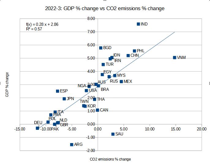
I have alleged before that the countries that are growing in wealth are growing in energy use and that therefore they are growing their carbon dioxide emissions. Plotting the % change in GDP of the ~30 countries with GDP > 1 trillion US against the % change in their CO2 emissions is an easy way to illustrate this. The GDP figures are back-calculated from within the Edgar spreadsheet: I divided the emissions by the emissions per GDP, with a suitable correction factor.

Of course, “mature” economies grow more slowly than developing countries, and those countries are likely to increase energy use and carbon dioxide emissions as they grow. But it cannot be denied that countries that are growing are doing so by increasing their energy use and that this is, so far, strictly tied to carbon dioxide emissions. It is possible to grow and cut CO2 emissions, but your growth in this situation cannot help but be anaemic.
The sceptic does not believe that growth and Net Zero are compatible.
Caveat
The figures do not account for offshoring emissions. As we have discussed before, for the UK, these may amount to 50% of our emissions. Given such an inflation factor, our emissions would not look so flattering.
Previous versions
I showed some statistics along these lines earlier this year (albeit using total GHGs emitted as CO2 eq). CO2 is the lion’s share of this, but some 30% is CH4 etc.
Thank you for the dramatic statistic that China is increasing its emissions by the equivalent of the UK’s annual emissions every five months. That should be shouted long and loud. For all those people who insist that the UK can make a difference and needs to be a global leader, surely that statistic alone should penetrate their quasi-religious belief systems.
LikeLiked by 4 people
Another stand out statistic is that the increase in emissions of China and Russia combined exactly equal the increase in global emissions. Talk about an axis of evil!
LikeLiked by 1 person
I forgot to add another mini-stat. The UK’s decrease of 25 Mt CO2 is ~ 29 times smaller than China’s increase (733 Mt).
LikeLiked by 2 people
From the “Global CO2 emissions 1970-2023” chart, it’s plain that Josh will need to update his cartoon:
https://pbs.twimg.com/media/Fg-DisZXEAEC5xo?format=jpg&name=4096×4096
LikeLiked by 2 people
The most important statistics are those that show no correlation between the CO2 delta and the “climate.”
LikeLike
Digging into the EDGAR reports a bit deeper, GHG emissions per capita t CO2eq/cap/yr are also interesting. We are often told that of course China’s emissions are large because it has a huge population. But then check out the per capita emissions. I have got used to pointing out that China’s per capita emissions are almost 50% more than those of the UK, but in reality they are now almost double, at least according to EDGAR:
China: 11.189
UK: 5.75
LikeLike
Mark, for some reason I have rather different figures:
The UK’s per capita emissions (4.42 t CO2/cap) are 110% lower than the Chinese figure (9.24) – despite the latter’s massively greater population.
This is also interesting:
The UK’s per capita emissions (4.42) are 10% lower than the Global figure (4.86).
Both emphasise the utter absurdity and pointlessness of Britain’s Net Zero policy.
LikeLiked by 1 person
The reason Mark is that I was using CO2 figures and you GHG figures.
LikeLiked by 1 person
It’s interesting: the column for GHG per capita emissions is incorrectly headed ‘t CO2eq/cap’. I’ve noticed errors in previous editions – one quite serious when percentages were incorrectly calculated. As a result, I’ve been in regular touch with a senior EDGAR author, Diego Guizzardi. I already emailed him about this one.
LikeLike
Aren’t those the right units? I fear I’m missing something!
LikeLike
Joe – thanks for that Josh cartoon/lampoon link. Funny how you notice things after a prompt.
Never thought about the Mann figure on the left before, raising his glass of Champagne with CO2 bubbles coming out, celebrating NZ success.
Anybody Know if Josh is still active/cartooning ?
LikeLike
Jit – from your post & 3. Per-capita emissions table –
Top ten per capita emitters t CO2/cap Palau 63.
Never heard of the place before, so – Palau – Wikipedia
As usual to much to quote, but from the “Economy of Palau”
Electricity – production by source
(1996)
Seems the US is keen to use it as a base – “The service sector dominates the Palauan economy, contributing more than 80% of GDP and employing three-quarters of the work force. The government alone employs nearly 30% of workers. One of the government’s main responsibilities is administering external assistance. Under the terms of the Compact of Free Association with the United States, Palau will receive more than $450 million in assistance over 15 years, $30 million per year, and is eligible to participate in more than 40 federal programs. The first grant of $142 million was made in 1994. Further annual payments in lesser amounts will be made through 2009. U.S. grants in 1999 totaled $24 million.”
Sounds a nice place to retire to.
LikeLike
Jit: yes, the units used for GHG per capita emissions are probably correct. But wouldn’t it would be clearer if the column was headed ‘t GHG/cap’? It’s easy to miss (or misunderstand) the ‘eq’. Or perhaps I’m missing something?
LikeLike
I suppose it’s complicated because the “eq” part shows that the total is a weighted sum, rather than a plain total. Each GHG would be its mass X its “global warming potential.”
Whether this is entirely the right way to do things I do not know, because as well as different GWPs, the different molecules have different residence times in the atmosphere.
LikeLike
Hello Jit, yes, my copy of Wallace & Hobbs [Ref. 1] gives different values for greenhouse warming potential for periods of 20, 100 and 500 years. The 100 year values are close to those quoted in [Ref. 2].
Russell & Hobbs explain that the figures include allowance not simply for residence time but also for the net chemical reaction effects during the period in question.
References
Regards, John C.
LikeLike
JiT: re GHG per capita I got this reply from Diego Guizzardi:
“Thanks for the feedback, I will forward it to my colleagues and in case they agree we will update the label in the next versions.
I would like to warn you that the report (in the country fact sheets section) had an issue and we replaced it (please download it again from our website). The problem was related mainly to some decimal rounding. No problems with the table on the website and the Excel files with the data.”
LikeLike