About two and a half years ago, I penned, or typed, “Randomly blows the wind.” In that story I reporting on a paper by Drew et al predicting the power frequency of a future wind farm fleet, based on historical data for the UK’s wind field. The results were not promising for a country planning to put all its chips on renewables. So much for models.
Then, six weeks or so ago, Paul Homewood reported on a dataset summarising the last five years’ worth of wind generation. He was kind enough to send me a copy: I was interested in whether, over the five years from 2019 to 2023, variability in supply had changed.
Several factors impinge on this question. For example, the widening distribution of wind farms (it is said) will contribute to stabilising outputs, since far-flung sites will be experiencing somewhat different weather. Meanwhile, acting in the other direction, greater capacity overall means that measures of dispersion like standard deviation will go up, with no change to the fundamentals. In other words, the same swing as a percentage of output results in a greater swing in absolute output.
The paper I reported on back then talked about several properties of the wind fleet, namely:
- Power frequency distribution, as mentioned
- Power ramps, both up and down
- Lulls and their duration.
So, with access to some actual output data, what do we find?
Power frequency distribution
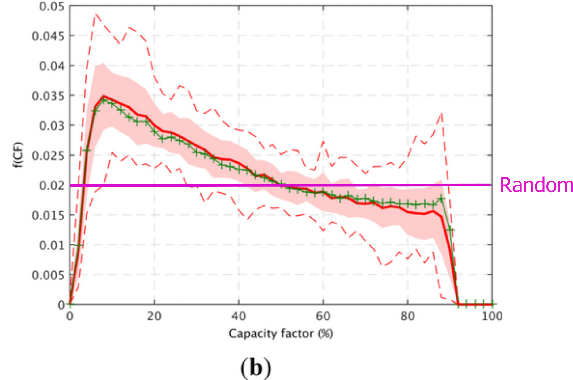
In my note of 2021, I remarked that the power frequency distribution of the modelled future wind fleet strongly resembled a random uniform distribution, where no output has a higher chance of occurring than any other. This was a slight exaggeration, but the curve was very flat (see figure below). It was not, by any stretch, a normal curve, say centered around 35% capacity. Instead, it was horrifying, bad enough to instantly disqualify the idea of relying on wind power.
So, what about the real-world data? We now have five years of real power frequency output. Here’s how the years 2019-2023 looked for wind-generated leccy in the UK (x scale is capacity factor):
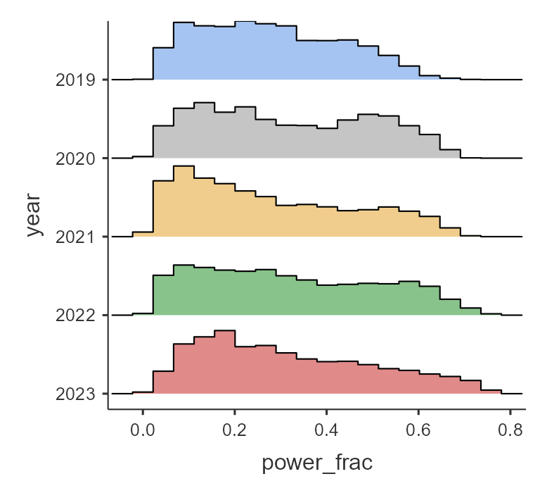
This set of histograms show that the situation is bad, and (to judge by the way the distribution seems to be getting squashed) seems to be worsening. On the plus side it looks as if higher capacities are more frequent in later years. And indeed, the maximum output of the wind fleet goes up by year (remembering that the offshore capacity of higher nominal turbines with higher theoretical efficiencies also goes up each year). But while the maximum output inexorably rises, the mean does not.
| Year | Max output, proportion | Min output, proportion | Mean output, proportion |
| 2019 | 0.703 | 0.0155 | 0.279 |
| 2020 | 0.708 | 0.0135 | 0.317 |
| 2021 | 0.724 | 0.0130 | 0.276 |
| 2022 | 0.763 | 0.0135 | 0.322 |
| 2023 | 0.767 | 0.0087 | 0.316 |
Swings
What about ramps, or the swinginess of wind? This is a vital question, because a sudden lull creates the necessity of a rapid grid response (as does a sudden ramp up in output). The next figure shows the frequency of power changes (MW) for each year. The mode is 0, as you might expect (the next half hour’s output is similar to the current half hour’s). However, swings of 500 MW within half an hour are not at all uncommon in all years. There is a suggestion that the histograms get flatter and wider year by year, showing an increase in swinginess. Note that this is not unexpected, because the same swing as a proportion results in a greater swing in absolute power output as the overall nominal power goes up year on year. It does though counter the idea that more dispersed wind farms might lead to greater stability.
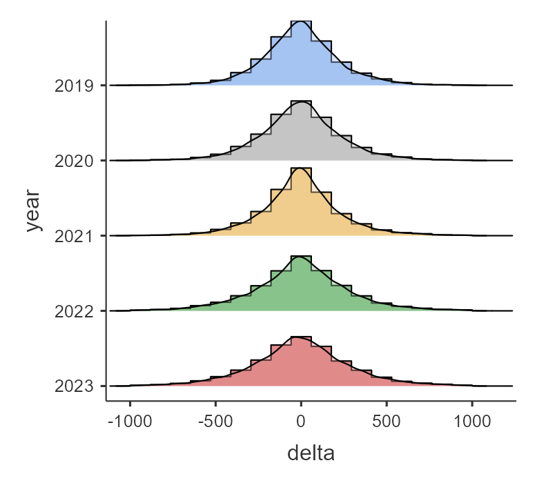
The histograms are clipped – the actual min and max swings within 30 minutes are “off the chart.”
| Year | Max downswing in 30 mins (MW) | Max upswing in 30 mins (MW) |
| 2019 | -1929 | +2193 |
| 2020 | -1285 | +1533 |
| 2021 | -2999 | +1969 |
| 2022 | -1462 | +1702 |
| 2023 | -2289 | +2451 |
The biggest swing in the series was in 2021, when c. 3 GW went AWOL between one half hour and the next.
Lulls
For this part of the analysis, I must thank my son Dan, who wrote and executed the code to calculate the frequency and duration of lulls in the data set. The next figure is a histogram of lull durations across the full five years. Here, as in the paper I reported on in 2021, the definition of a lull is <10% capacity. As you can see, there are a large number of short lulls, plus a few of long duration. A lull of 250 half hours is 125 hours is c. 5 days. There were two lulls of this length over the five years.
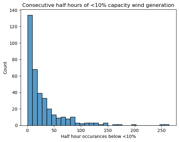
Those lulls are going to prove deadly for a government hoping to power the UK with (ugh) “clean” energy. I described a battery storage system in Assault and Batteries which retails at £75 million and stores 196 MWh. The back of my envelope says that to store and supply 10% of the existing wind nominal output for five days would take nearly 1,600 of those giant batteries, and the cost of building them would be north of £100 billion. And remember that the figure above shows output below 10% for 5 days: that 10% you’ve put in storage only gets you up to less than 20% output. And when you need the power… how much are those batteries going to charge you for it, knowing that any price is better than a blackout?
Conclusion
The variability shown in this dataset should kill off any pretense that wind power can achieve anything for the UK other than long-term decline. Not all electricity is equal. The electricity that comes when you want it, where you want it, trumps the kind that comes and goes as it pleases.

Thank you Jit and Dan.
Another article that should be compulsory reading for politicians but which, sadly, most will never see.
LikeLiked by 1 person
Outstanding stuff Jit. Thanks.
LikeLiked by 1 person
Surely millions of electric cars will be backing up the national grid in …er… the future? 🤪
LikeLiked by 1 person
Oldbrew; that meme comes up a lot, as we know. It’s a prime example of “easier said than done”.
Aiui, only one or two of the current crop of EVs are equipped for V2G. More significantly, none of the domestic “chargers” (really just connection boxes) are suitable – none are bidirectional with the necessary kit to prevent “backflow” to the grid during a power outage. So, before the idea could be realised, there’s a huge programme of upgrading/retrofitting required. In addition new chargers would have to be redesigned for the duty, which does not seem to be happening.
Quite a few vehicles are equipped for V2L (Vehicle to Load) with one or more 240v sockets fitted. This could easily cause problems in the future, if during a blackout, someone runs an extension lead from their car to their house.
It will be interesting to see how this plays out.
LikeLike
“On a bad day $20 billion in wind power across Australia can only guarantee as much power as two diesel generators
How much backup do we need for our 11.5 gigawatt wind system? About 11.4 gigawatts.”
https://www.cfact.org/2024/06/16/on-a-bad-day-20-billion-in-wind-power-across-australia-can-only-guarantee-as-much-power-as-two-diesel-generators/
Wind energy failed on Thursday at what must be close to a record low — with barely 88MW of production from 11,500MW of wind turbines. That’s about 0.7% of total nameplate capacity.
With construction costs running at $2 million for every theoretical megawatt of turbine, that’s $20 billion of machinery sitting out there in the fields and forests of Australia producing about as much as two diesel generators.
We have 84 industrial wind plants across 5 states of Australia, and the green band below was their total contribution to our national electricity needs on Thursday — put your reading glasses on...
…Wind power went from producing 7.2GW in the early hours of Wednesday to 0.09GW by lunchtime Thursday. It was sheer luck it bottomed out at lunchtime on a sunny day when solar panels were at their peak. Seven gigawatts of power disappeared in just 36 hours. If we lost 7 gigawatts of coal plants in a week, we’d never hear the end of it.
It’s the minimums that matter
Paul McArdle at WattClarity has all the grid data and provides a spectacular graph of the system-wide peaks and troughs of our wind generators over the last 13 years, which he has updated recently to highlight how bad the months of April and May were for wind production in Australia. Click to enlarge this graph to really appreciate the devastating message. While the total wind farm “capacity” has grown massively (the grey columns on the graph), the minimum lowest guaranteed production has not shifted much at all. This is the generation we can rely on; the minimum monthly points are marked in dark green at the bottom.
Ten years ago, the lowest monthly minimum was practically zero (reaching just 3.7MW one day in July 2014). But since then, we’ve built 8,000 MW of extra wind power at an effective cost of $16 billion and only bought ourselves effectively two diesel generators worth of reliable electricity....
LikeLiked by 1 person
I posted this comment on Open Mic yesterday, but if I had been more alert I would have posted it here, so now I am doing so. Better late than never:
From the Guardian Australia, it seems the UK isn’t the only country which has been exposed to energy worries due to its leaders not ensuring enough gas storage and relying too heavily on renewables:
“‘Very serious’: gas supplies in southern states under pressure, analysts warn
‘Threat notice’ flags elevated supply risks, as expert warns problems will get worse without urgent addition of more backup resources”
https://www.theguardian.com/australia-news/article/2024/jun/25/very-serious-gas-supplies-in-southern-states-under-pressure-analysts-warn
Gas supplies in southern states are likely to remain strained the rest of this winter, and the problems will worsen without the urgent addition of more backup resources, analysts including the market operator say.
Those states, particularly Victoria, have drawn down their gas storage as cold weather increased demand. Gas-fired power generation has also been double that expected on some days amid unusually calm periods, and gas production at Victoria’s Longford plant has dropped because of unscheduled maintenance.
Worried about gas supplies in Victoria, Rick Wilkinson, the chief executive of consultants EnergyQuest, described the situation as “very serious” and he predicted the state would “need a backup” to handle peak winter gas demand from 2026.
In what it called a “threat notice”, the Australian Energy Market Operator told major industry players last Thursday: “Reduced storage facility delivery capacity may pose a risk to gas supply adequacy in southern jurisdictions on peak demand days during the winter peak demand period (to the end of September).”…
I followed the link about unusually calm periods, and found this:
“Where’s the wind gone, through 2024 Q2? … with June perhaps even worse than April or May!”
Given what might turn out to be the early stages of a an emerging 2024 Energy Crisis, we’ve been interested to learn more about how Q2 has been evolving. Hence (starting with wind) we have taken the ‘worm line’ trend from the first article noted above, and have extended each of the 5 trends through until the end of June of that year (or for the current year to earlier today, 22nd June 2024).…
...it should be plain to see for all readers here that the aggregate yield from Wind Farms across the NEM in 2024 is easily the worst of the 5 years sampled:
(a) Even in absolute terms, it will be miles below the aggregate yield in 2023 Q2 and 2022 Q2 (i.e. that same quarter of the 2022 Energy Crisis!) .
i. In both 2022 and 2023 we see that the gradient of the worm line increased in June of those years (i.e. wind yield increased)
ii. In 2024 this definitely has not happened (save for 2 x 3-day spurts thus far) … and indeed I wonder if the gradient has not slightly dropped, compared to April and May?
(b) Given the growth in capacity from the earlier two years, it should be clear the performance is much poorer in 2024 Q2 compared to those earlier years:
i. Approximately 2,500MW more capacity in 2024 than 2021 (3 years earlier) and a yield that might be about the same level!
ii. Almost 4,000MW more capacity in 2024 than in 2020 (i.e. ~50% more) and yet a yield that might only be 15% higher than 2020 Q2.
3) In aggregate terms, eyeballing the chart it should be relatively easy to see that 2024 might be as much as 3,000,000MWh ‘short’ of wind production through 2024 Q2 compared to what some might have expected
All in all, what’s above is (at the same time) both a frightening picture … but also completely expected (at least by some of us).
I suspect there’s a lesson there for world leaders hurtling down the wind energy route, but I don’t suppose they’ll take any notice.
LikeLike
God is on our side:
https://x.com/CMorrisonEsq/status/1853340756150198695
LikeLike
Jaime; It’s good to see this ongoing wind drought given more publicity; solar has been largely absent too – a real dunkelflaute! Not sure what he means about the interconnectors: they have averaged about 4 GW – 13% of demand – over the past 24 hours.
LikeLiked by 2 people
Yes Mike, I checked.
Imports lowest contribution was 2.5GW early this morning. Not a lot, but not zero.
LikeLike
OK, I see that. Looking at the 24-hr plot, there’s an early-morning dip in all of the supplies except Norway….continental breakfast, presumably 😉
It would be interesting to know the economics of these large, consistent power imports. They infer that we can buy power cheaper from Europe than the marginal operating costs of our gas plants. Supplies from Norway and France I can understand but Belgium, Holland and Denmark (in this case I doubt the latter two have excess wind power they are looking to dump).
LikeLike
So the UK electricity grid hangs by a few threads from our continental connections. Blackouts or brownouts if, by accident or design, some of those threads broke? Where, pray, is the energy security in that, Mr Miliband? Regards, John C.
LikeLiked by 2 people