If the mainstream media is to be believed, the climate “crisis” is accelerating fast. Everything is so much worse than last year, and next year will be much worse than this year, and so on.
But just how much more potent is the greenhouse effect now than last year? It’s something that is not made obvious in discussion of emissions (globally seemingly flatlining according to EDGAR) or even as reflected in CO2 concentrations in the atmosphere.
The consequences of climate change arise downstream of the physical drivers. The most important driver of present interest is CO2 concentrations, to which global atmospheric temperature increases are related by a logarithmic function. As we know, CO2 concentrations are inching up year by year, but the thing that is dinned into us more often than anything else is the importance of the CO2 emissions themselves, in other words our current account spending, when the problem is in fact the overdraft.
This way of thinking only gets you so far, because if this “pollutant” was cleansed from the atmosphere, every living thing on Earth would die. Some pollutant. Situation “normal” we consider to be 280 parts per million of CO2 in the atmosphere by count of molecules, and it is against this benchmark that the climate “crisis” is judged.
Well, I decided to crunch the numbers to find out just how objectively worse this year’s climate is compared to last year’s in terms of the potency of the CO2 in the atmosphere.
I also wanted to answer a subsidiary question: How much better would things have been this year, if the UK had not existed at all?
Some interesting numbers 1: the mass of the atmosphere
According to Wiki, the mass of the atmosphere is 5.15*1018 kg, or 5.15 petatonnes. Of that, about 3.13*1015 kg is CO2, or 3.13 teratonnes. [Remembering that CO2 is heavier than the other molecules.]
In Denierland, I said that the present mass of C [not CO2] in the atmosphere is 850 Gt, which equals 3.12*1015 kg CO2, close to Wiki’s figure.
Allowing 0.04 % CO2 to equal this figure, you get 1 ppm CO2 ≈ 8 Gt (billion tonnes).
Some interesting numbers 2: global emissions of CO2
According to EDGAR, the total quantity of CO2 emitted globally in 2022 was 38.5 Gt. This is 3.85*1013 kg, or roughly 1% of the quantity of CO2 already in the atmosphere.
However, not all our emissions end up getting added to the atmospheric stock. Again referring to Wiki I find that 57% of humanity’s emissions were absorbed in 2012. I’m going to say that is reduced to 50% today, which is the same figure I used in Denierland (benefitting the alarmist case). So of the 38.5 Gt emitted, 19.25 Gt net is added to the atmosphere.
Net added last year / Existing stock = Proportion added last year
19.25 / 3120 ≈ 0.006
This is about 1 part in 167, so it would take a further 167 years for CO2 levels to double from today’s, given no change in our behaviour. [We are already well on the way to doubling from 280. This illustration would take us from 420 to 840 in 2190 AD, although we would probably run out of fossil fuels before then.]
We already have the estimate that 1 ppm CO2 ≈ 8 Gt, so we estimate too that the 19.25 Gt we added last year would have increased the CO2 concentration by 19.25 / 8 ≈ 2.4 ppm.
In May last year (Wiki again) the concentration of CO2 was 421 ppm. So on these numbers, it should now be 423.4 ppm.
What about the UK’s contribution to this increase? According to EDGAR, the UK emitted 0.34 Gt CO2 last year. This is 0.88 % of global emissions, meaning that we are responsible for 0.0088 * 2.4 ppm, or 0.0212 ppm out of the increase of 2.4 ppm.
Some interesting numbers 3: global temperature change
We know that every time you double the CO2 concentration, you get the same increase in global temperature. What this means is that every ppm you add is worth less in terms of warming potential than the previous. It also means that, if you have a baseline level of CO2 (280 ppm) it is easy to calculate the temperature difference resulting from any other concentration of CO2, with a couple of caveats.
Caveat 1: you have to put in a number for transient climate response (TCR). TCR is the fast-acting part of climate change, the bit that is relevant to a human timescale, before long-term feedbacks have reached equilibrium. Lewis & Curry (2014, ?Climate Dynamics) estimated this to be 1.33 K per doubling using an energy budget approach. Big computers give higher numbers. I’m very generously (for the alarmist case) going to call TCR = 2 K here. However, TCR is not instantaneous; it’s relevant to 2100. So the temperature change reported here would be in train but not wholly realised.
Caveat 2: there are other things going on other than CO2 concentrations going up. There are other greenhouse gases (in particular methane), and natural cycles, volcanoes, etc. This elementary analysis ignores all those.
The function you end up with (I don’t know if this is standard, or idiosyncratic) to calculate the temperature change from the baseline is:
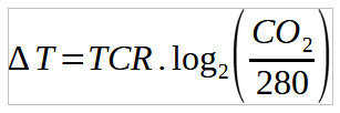
Or in words, the temperature change from the baseline equals TCR times the logarithm base 2 of the present CO2 concentration divided by the baseline concentration (280 ppm).
We can now estimate the temperature increase from the baseline by plugging in TCR = 2 K and CO2 = 423.4. The answer you get is that the global climate should be an average of
1.193 K
warmer than it was in the pre-industrial baseline situation (or it will be once the short-term feedbacks are settled).
If you plug in last year’s concentration (421 ppm) you get
1.177 K
So the annual increase in temperature in this idealised situation would be 0.016 K between 2022 and 2023, or a sixtieth of a kelvin.
What about the UK’s contribution to the temperature increase over the baseline? What if we had disappeared last year? What if, in 2022, the UK’s 0.34 Gt had not been emitted?
With the UK, the estimated increase over the baseline was 1.193 K. Without the UK, the estimate is
1.193 K
(Yes, it’s the same number because of insufficient significant figures.) In fact, on these estimates, the UK’s contribution to climate change last year was:
0.00014 K
Or roughly 1/7000th of a kelvin.
Bottom line
Although temperatures are rising, they (or the part driven by CO2 emissions at any rate) are rising at a non-threatening and incremental rate. With parameter estimates favouring the alarmist cause, the effect of CO2 emissions last year was of the order of a sixtieth of kelvin. The UK’s contribution to global warming from CO2 emissions last year was about 1/7000th of a kelvin, again with parameter estimates favouring alarm.
If these temperature changes drive other variables and give rise to dangerous weather etc, then it seems unlikely that any such changes would be noticeable on a year-to-year basis.
The climate “crisis” is not accelerating.
Editorial
Oh, for a leader who would stop dictating every aspect of our lives, and let us get on with them.

I’m sure Ken rice is furiously pounding his keyboard to refute this denialism
LikeLike
Jit,
Very interesting, and of course supportive of my worldview.
Playing Devil’s advocate for a moment, what about the alarmist claim that we are on the verge of one or more tipping points?
By the way, the whole article is excellent ammunition for Robin to use when he next sends a note to his MP.
LikeLike
Mark, the Earth varies so much on many spatial and temporal scales that I have an instinctive doubt about the possibility of tipping points. Think of this analogy: on a seashore, where the sea level is rising (or falling) by 3 mm per year, there will always be suitable habitat for intertidal organisms as the whole system shifts up or down. What causes a tipping point in this system? When you reach the top of the land or the bottom of the sea. I see no sign of that on Earth, despite the hyperbole.
However, if a catastrophic tipping point were to occur, there is no doubt in my mind that the peoples of Earth would finally take the problem seriously, and fix things inside 5 years. As it is, the people of the guilt-ridden West are taking pointless and expensive action, while everyone else looks on and shrugs.
LikeLiked by 1 person
Re CO2 as a ‘climate driver’ – when was the last time it wasn’t 0.04% of the atmosphere, to two decimal places of accuracy? (Thousandths of a percent don’t really impress).
LikeLike
About 1987.
LikeLike
Thanks Jit, most interesting. But I’m so used to having temperature expressed in ºC that you lost me when you used K with which I’m hopelessly unfamiliar. I seemed to remember that the way to convert temperatures expressed in K to ºC was to subtract about 250 from the K figure – looking it up I see it’s actually 273.15. But that doesn’t help me to understand your article. Help! (Apologies for being so ignorant.)
BTW you’ve probably noticed that on its useful tabulated page EDGAR now refers to GHG rather than CO2 as it’s done for years (no explanation). I think that’s unfortunate as many scientific studies and most climate-related articles refer to CO2. However their splendid pie chart (to which you provide a link) shows the 2022 CO2 figures. That’s useful of course but not much good if you’re looking for changes in CO2 emissions over time or per capita CO2 emissions. Any thoughts?
LikeLike
Robin, there is also the Energy Institute’s annual review (formerly called something like the “BP annual statistical review of world energy.”) It has emissions of CO2 by country over time, as well as lots of other things.
https://www.energyinst.org/statistical-review/resources-and-data-downloads
On EDGAR, there is a drop-down menu beside the pie chart to display per capita emissions, but only for the present year.
Regarding K/ºC, I try (when I remember) to use K when talking about temperature changes, and ºC when talking about the actual temperature that people experience in their environment. When you are talking about changes in temperature, the two scales are the same (in other words, a change of 1 K is the same as a change of 1 ºC.)
Of interest is the fact that climate computer modellers report temperature anomalies rather than the actual temperature (whether in K or ºC). By setting the competing models on a common baseline, it makes those spaghetti graphs they are so fond of look a lot better than if plotted using the actual temperatures. If you do that, you find that the models have quite differing opinions about how hot the Earth is.
This figure shows CMIP6 models, on an actual temperature (ºC) scale rather than as anomalies. They disagree about how hot the Earth was in the early 20th century by 2.5 K / ºC.
LikeLike
Thanks Jit – very helpful. I must say that I think EDGAR’s switch to GHG, although interesting (e.g. that the UK’s per capita emissions are below the global average), is unfortunate as CO2 is so commonly used. Re temperature, I’ve done a little more investigation and now understand why, re changes in temperature, the scales are the same. Therefore it would be correct to advise Bim (who probably knows nothing about K) that, on your estimates, the UK’s contribution to climate change last year was 0.00014ºC.
Your graph showing the CMIP6 models on an actual rather than anomaly scale illustrates your point about the spaghetti graphs beautifully – thanks.
LikeLike