Actually I made two
In a break from normal programming, I would like to present a humble artistic offering. A picture paints a thousand words, a bad picture anyway, so art of course has a way of short-circuiting the need for laborious explanation.
Some time ago, Professor Sir Doctor Admiral Hawkins came up with a striking image, which represented the rapid cooking of the Earth in the form of a series of stripes of reddening hue. The presentation has already been criticised as unscientific – for example by John in Alan’s post here. The great man received an award for his work, which was richly deserved (obviously that comment is a little saccharine thanks to implied sarcasm, but one presumes that the MBE wasn’t just for the stripes). I was going to say that the award was presented by the Chinese Communist Party, but our lawyer began to stare at me with his beady eye while twirling his moustache, so I relented. In any case no-one could seriously have believed such a comment to be anything other than a poor attempt at a witticism. And although our Chinese communist friends (Hi guys! Thanks for dropping by!) are watching the West’s self-vivisection on the green altar with grave concern, one can point to the fact that thanks to their co-ownership of Dudgeon wind farm to name but one they currently at least, by sheer coincidence, benefit from our madness. But Prince Charles (bestower of the award of an MBE on the artist) has no such mossy skeletons in his compendious and supernumery closets.
I had threatened to create my own version back then, but the wall shrugged (it didn’t shrug – it just sort of stood there with an indifferent expression). Anyhow the time came that I decided to make good my threat.
Times two.
My first attempt at a stripey work of sceptical climate art was based on a re-scaling of the original. Instead of covering one and a bit degrees, the global surface temperature anomaly of the globe over the past 170 years centred on 35 years ago, I made my set of stripes based on a scale whose extremes are the hottest and coldest places on Earth. Key below:

The result is predictable perhaps, but rather anodyne. We’re firmly in the pink.

Well, it was back to the easel in terms of finding something even modestly pleasing to the eye. In Denierland (copies of which are not available at your local bookshop, but the proprietor might be able to find you one, although I would whistle for Mr. Bezos) I presented a rather bad figure showing estimates of carbon dioxide concentrations over the Phanerozoic era, or the beginning of the Devonian onwards anyway, from the trove of data compiled by Foster et al in 2017:
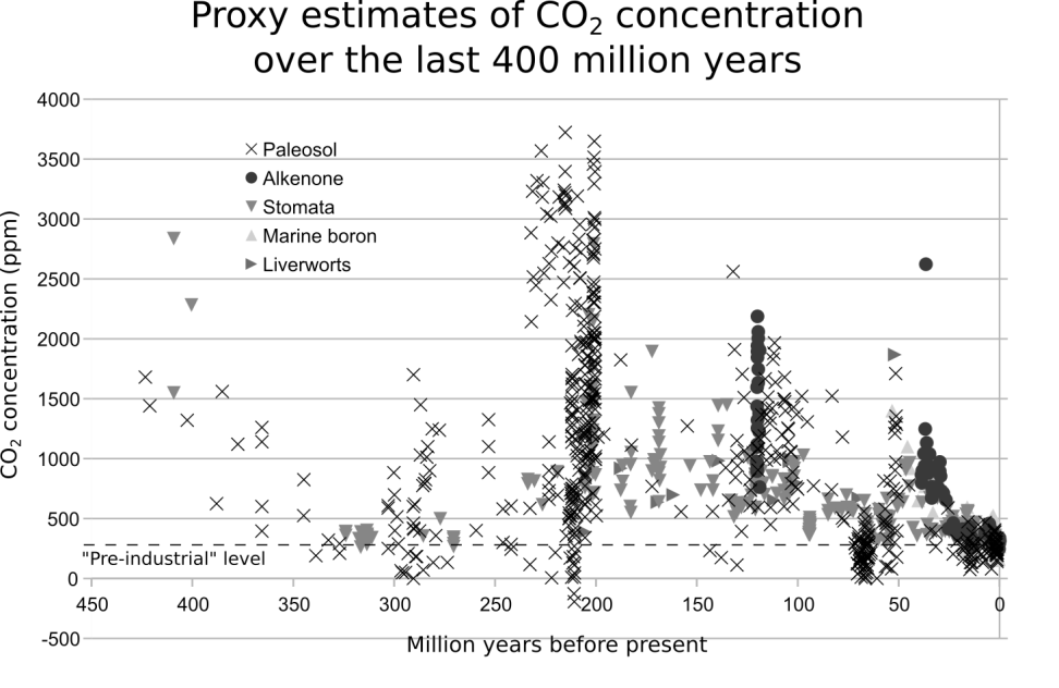
Not very pleasing to the eye. But it seemed to me to offer some opposition to the claim in their title, which was:
Future climate forcing potentially without precedent in the last 420 million years
I also presented a rather unwieldy CO2 wiki:
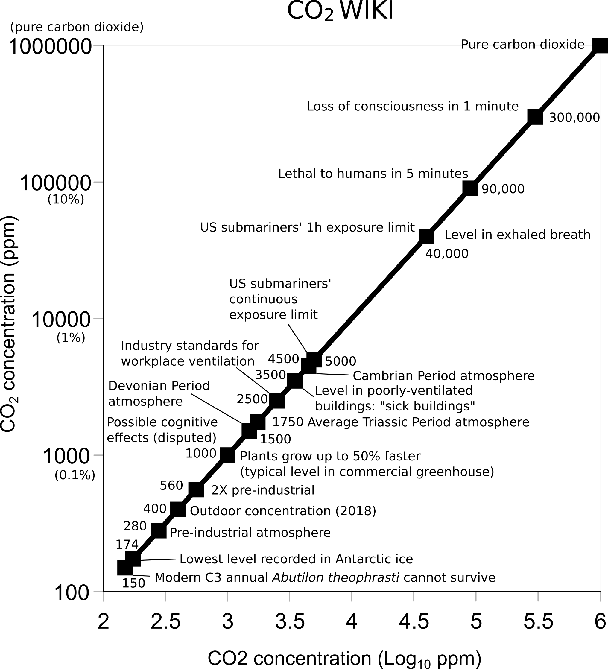
While functional, in order to fill the page both axes are in fact the same. Unsatisfactory artistically-squeaking.
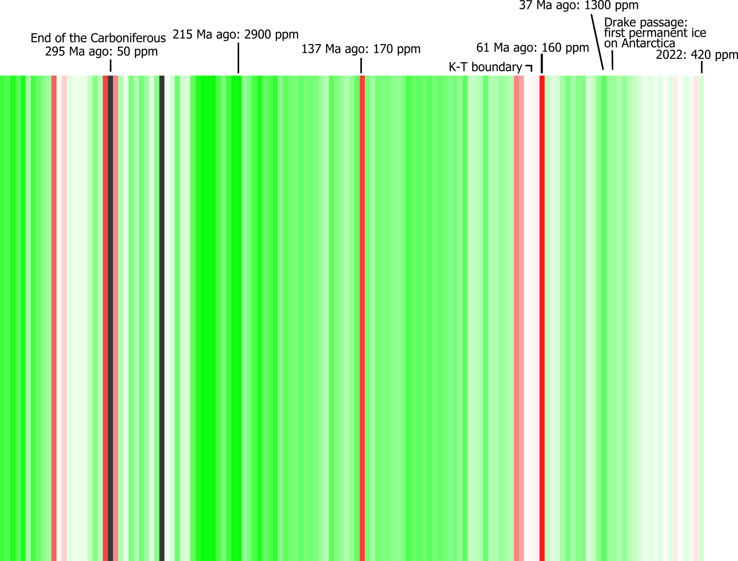
So, I wondered how a figure of CO2 over geological time would look if represented as a series of stripes after the fashion of Ed. The answer is of course that the way it would look is entirely determined by the choices the artist makes re: colour palette, scale and positioning. I chose more green for more CO2 up to the highest value in the series (about 3000 ppm) because plants like CO2 (that is a fact, so do feel free to check it). Values below the much-idolised “pre-industrial” level of 280 ppm are in increasing opacity of red the lower they go. Below 150 ppm, everything goes a sinister flat grey because at that concentration the plants, and the rest of us, are at risk of dying out altogether. Each bin, each stripe, represents 2 million years. The value for each stripe is the simple average of the CO2 estimates within that bin. So this is not remotely a valid approach for a metastudy. It gives the same weight to values based on one data point as it does to values based on a hundred data points. Some of the two million year bins have no data, and are missing (the adjacent ones are simply butted up next to one another, rather than using interpolation or leaving gaps). Nor can the colour scheme be described as scientific. But hey. If you don’t like it, tell your momma.
The key looks like this – note the annotations from the original CO2 wiki:

And the stripes themselves look like this:

The point I would like to make with my stripes is this. The present concentration of CO2 in the atmosphere is not, repeat not, unprecedented in Earth’s history. Nor will it be unprecedented when the concentration reaches double pre-industrial, 560 ppm, which it certainly will in due course (my estimate in Denierland was that we would reach that point in 2061, based on an extremely naïve model). The simple average figure for CO2 concentration since the Devonian is 750 ppm – a level that may be hard for us humans to achieve in the absence of a large-scale renaissance in coal. Far higher levels have been reached in the past, and life on Earth did not perish in those times. It thrived. Anyone who tells you that our emissions of CO2 are an existential threat just hasn’t looked at the available data.
Here are the stripes labelled up a bit:
Do feel free to cut, paste and share. In a very real sense, these stripes belong to us all.
Reference
Foster, G. L., Royer, D. L., & Lunt, D. J. (2017). Future climate forcing potentially without precedent in the last 420 million years. Nature Communications, 8, 14845. Available with a swift search of the interwebs.

Wow, the dark mode version on the Cliscep home page is awesome. Something to do with the way it handles the covering text? Anyway, it beats my version. Looks kinda like sommat out of The Matrix.
LikeLiked by 1 person
Here is the darkmode version as magically created by WordPress:
LikeLike
Heh Momma, I don’t like JIT’s stripyness. CO2 down to only 50 ppm for two million years when during this time – the Late Carboniferous and Permian the majority of the world’s coals formed. Difficult to believe.
LikeLike
Hi Jit
Was there a reason you didn’t simply replicate Hawkins’ hatchings but use the palette of colours below to represent how our globe has become more benign?
We already know extreme cold kills maybe 7x – 15x more victims than extreme heat.
LikeLiked by 1 person
Joe,
What a bloody good idea.
LikeLiked by 1 person
By which I mean we should present the stripy coloured version of the decreasing death rate due to extreme weather.
LikeLiked by 2 people
By the way, I recommend a reading of Denierland (well, several readings, actually – there’s lots of good stuff that might be missed first time round). As I said to Jit when I first read it, it’s the book I wish I’d written, and which I might have done had I been more methodical and better-organised. It deserves to be more widely known.
LikeLike
JR – or simply replicate Hawkins’ temperature hatchings, but use the above (or similar) colour palette of blues & greens rather than blues & reds.
After all, Hawkins’ temperature hatchings makes no acknowledgement that there MUST be a global ‘optimum’ temperature!
LikeLike
This should be Joe’s version of my emulation of the original. It probably doesn’t use the same data – I think mine is v4.6 of Hadcrut. It stops in 2019.
LikeLiked by 1 person
And this is darkmode:

LikeLike
John’s request is a little harder to fulfil, but I’ll look into it. It depends if the data is available by year: by decade, there won’t be many bars.
LikeLike
Alan, there were two data points in that 2 million year bin, one of 47 ppm and one of 50. They came from:
Montañez, I.P., Tabor, N.J., Niemeier, D., DiMichele, W. A., Frank, T. D., Fielding, C. R., Isbell, J. L., Birgenheier, L.P., and Rygel, M. C., 2007, CO2-forced climate and vegetation instability during late Paleozoic deglaciation: Science, v. 315, p. 87-91. (Don’t know if this is available to those of us who aren’t in an ivory tower.)
However, the data I plotted is the mean of the values reported by Montañez et al – it’s a column of data provided by Foster et al. Looking more closely, there is a separate column for “reported” CO2 rather than “mean” CO2. The “reported” values given in Foster et al are 190 and 158.
The arrow points to the bin between 294 and 296 million years ago, and although it is labelled “end of the Carboniferous”, it’s actually into the Permian. As to where the CO2 went, maybe it became coal because there was no fungus to decay the dead trees…
LikeLike
Mark, thanks for the plug. Now I feel like a sellout!
LikeLike
JIT. My objections are the result of the presence of abundant coal in the Upper Carboniferous (=Pennsylvanian) and Lower Permian. Those prolific coal-bearing periods have always been associated with periods when atmospheric carbon dioxide levels were high. Levels below 100ppm CO2 would have been associated with periods with vegetative die-off.
LikeLike
If the very low CO2 values come from the Early Permian, then how to explain the Gondwana coals of this age or the fact that the Late Carboniferous-Early Permian extinction frequency was relatively low? The significant end Guadalupian extinction event (= Olson’s extinction) occurred towards the end of the Mid Permian.
The main reason for objecting to a very low Early Permian (or in fact any other low CO2 event within the Phanerozoic) is that it would cause the death of (most? all?) plants, and therefore of all animals. This clearly never happened.
Thanks for your source references. I may attempt a visit to UEA’s library to consult.
LikeLiked by 1 person
Alan, I’ve had a look. Montañez et al is available to all, sparing you a trip. It doesn’t make a lot of sense to me – I’ll have to think about it more. I suspect there is an issue caused by dividing one thing by another leading to large uncertainties in the CO2 estimate. But you can probably understand it better than I can! https://digitalcommons.unl.edu/cgi/viewcontent.cgi?article=1103&context=geosciencefacpub
LikeLiked by 1 person
“Reading FC: Club’s new kit includes climate change design”
https://www.bbc.co.uk/news/uk-england-berkshire-62292080
“Reading’s new home kit features a stripe design to represent increasing average global temperatures.
The design on shirt sleeves and shorts was first created by Professor Ed Hawkins, a University of Reading academic, in 2018.
Each stripe on the shirts shows a year’s average temperature since the club was founded in 1871.
Blue stripes represent cooler than average years and red hotter than average.
Tim Kilpatrick, the club’s head of commercial, said he hoped the design would “inspire more climate conversations” amongst fans.
“We are not perfect, but this is the start of a journey. We will not aim to change the world overnight,” added Kilpatrick.
“We want to aim to reduce our carbon footprint as a football club and give our fans the opportunity to come with us on the same journey.”…”.
Strange choice of language. If they want to reduce emissions, the most effective way they could do so would be for the club and its fans to stop making journeys to other clubs up and down the country.
LikeLike
Mark: Thanks for making the connection with Ed Hawkins for me. I saw the story on the BBC and lost interest before even getting to that bit.
I get the point you’re making at the end but I’d say to Reading supporters: fill your boots and make as many journeys as you like (and can afford). Climate sensitivity is low. Not being able to support your team in person during Covid lockdowns was hard. Etc.
Fill your boots. geddit? Footballers wear boots. Oh never mind.
You’re making fun of a clunky metaphor about a journey together, which like so many related things is virtue-signalling with hypocrisy built in. (They want as many fans as possible to travel to them.) And don’t such empty words go like a treat with Dr Hawkins’ clunky and misleading colour scheme?
LikeLiked by 1 person
“Reading bus with climate change design hits the road”
https://www.bbc.co.uk/news/uk-england-berkshire-62433832
“A new bus with a stripe design representing increasing average global temperatures will travel across Reading over the next 12 months.
The natural gas-powered vehicle will be used across different routes to raise awareness about climate change.
It also aims to remind people that using public transport “is one of the easiest ways” to help cut emissions, Reading Buses said.
The company and University of Reading are behind the project.
The bus features the so-called climate stripes, first created by Professor Ed Hawkins, a University of Reading academic, in 2018.
Each stripe shows a year’s average temperature since the 1860s.
Blue stripes represent cooler than average years while the red ones are for when it was hotter.
Robert Williams, CEO of Reading Buses, said the company was “very excited” about the project….”.
LikeLike
“Climate stripes need new colour as world warms”
https://www.bbc.co.uk/news/articles/c72yrd8y9pwo
I suggest that this is propaganda, not science.
LikeLike
“Climate Wall has stripe added to show 2023 temperatures”
https://www.bbc.co.uk/news/world-europe-jersey-68500667
“A new stripe marking last year’s high temperatures has been added to the Climate Wall in St Helier.
The deep red stripe is the 130th to be painted on the wall on the Waterfront which is a visual record of average annual temperatures since 1894.
“I hope people look at this and actually take a moment to think about what it means,” Paul Aked, head of meteorology for Jersey Met, said…”
LikeLike
“Climate Stripes projected on to landmarks”
https://www.bbc.co.uk/news/articles/c3gg779z7x5o
The iconic Climate Stripes graphic has been updated to show the figures for 2023, the warmest year on record.
To mark Show Your Stripes Day,the graphic from the University of Reading has been projected on to landmarks across the world including the BT Tower in London and Story Bridge in Brisbane, Australia.
A new colour had to be added to the graphic in order to depict the average temperature in 2023.
Prof Ed Hawkins, the climate scientist who created the image, said he hopes it will inspire “conversations” and action to reduce warming.…
LikeLike
“Climate stripes updated for hottest year on record”
https://www.bbc.co.uk/news/articles/crkem2yz8glo
There is a delightful irony here. If, like me, you find this article on the laughingly-named “Science & Environment” section of the BBC website, you’ll find it directly next to this:
“Temperature drops to -18.7C in Highland village”
https://www.bbc.co.uk/news/articles/cg7z903ll25o
LikeLiked by 1 person
“Prof Hawkins said all was not lost. “We are causing this problem, which means we have the ability to solve it.”
He encouraged people to think about how they heated their homes, what modes of travel they choose, and what food they eat. “These are choices that we can all make ourselves to make a difference, and then when we look back from 20, 30, 50 years in the future, we’ll be able to say ‘yes, we took those actions that were needed at the time’,” he said.”
If he thinks his iconic “climate stripes diagram” will motivate anybody to change how they live he is a dreamer.
LikeLike
“Formula E car debuts climate stripes livery”
https://www.bbc.co.uk/news/articles/ckg4vwrn6q6o
...Prof Hawkins said: “It’s wonderful to see another sport taking the climate stripes and using it to start conversations about the risks we face from climate change.
“[I was] very excited to hear this, that it would be travelling all over the world, spreading the message far and wide, starting conversations amongst the fans, who are there watching, about the risks that we face and what they can all do about it.”...
LikeLiked by 2 people
I can imagine those conversations:
LikeLike
Just noticed in the photo, they’ve actually got the LGBT flag up in the background! Formula E? Is that the eco-friendly version of Formula 1? If so, Ed’s stripes might go down a treat.
LikeLiked by 1 person
Sorry for going O/T but can someone point me to the post which analysed some new legislation of electricity supplies? I’ve tried a few searches but can’t find it! Thanks.
LikeLike
MikeH,
Happy to try to oblige, but can you be more specific, please? As you have phrased it, it isn’t ringing any bells yet.
LikeLike
Jaime: Formula E is the battery-powered racing. I have not followed it, but I do remember that at its inception, batteries were incapable of completing an entire race, so that drivers swapped cars half-way through. Maybe things are better now.
LikeLiked by 1 person
Mark,
Thank you. I think you may have been the author. It was a long post covering some new legislation which, iirc, prepared the ground for mandatory “smart” appliances, remote control of demand and similar Orwellian measures. There was even something about granting powers to enter premises using force in cases of non-compliance.
LikeLike
Mike H,
Thanks. I think it may have been one of these articles:
LikeLike
Jit, in that case, I can’t imagine that there would be much crossover between the petrol head fans of Formula 1 racing and the eco-nerds following Formula E. I could be wrong . . . . .
LikeLike
Mark,
Many thanks for those links: they are the articles I was trying to find. (I put “Electricity Act” and similar terms into the search box….I should have used “Energy”!)
LikeLiked by 1 person
Jaime,
I have a few petrolhead friends and I follow some forms of motorsport (not so much F1). I never hear any mention of Formula E except for passing comment about drivers who went there after not making the grade in F1.
LikeLiked by 1 person
My pleasure, Mike. 😊
LikeLike