Met Office try to hide forecast fail
The Met Office have today issued their latest piece of warmest propaganda, Forecast suggests Earth’s warmest period on record.
It includes this graph, showing observations (black), forecast (blue) and previous forecasts (red).
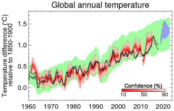
The climate scientists quoted seem to be in denial of the recent cooling shown in their own graph, claiming that the Earth’s average global temperature has ‘remained close’ to the 2015 peak.
But notice that in the graph there is a gap from 2015-2019, with no previous forecast shown there. Why would that be? Is it because the Met Office didn’t make any forecasts for that period?
Well, in fact they did. Here is the Decadal Forecast 2016 (confusingly, published in Jan 2017), which included this graph:
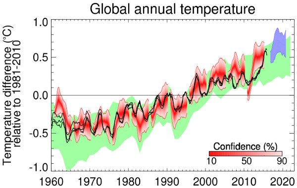
One thing to notice is that the Met Office has done some major goalpost-moving, switching the baseline from 1981-2010 to 1850-1900, which makes comparisons difficult, but if you compare the two you can easily see that the observations line in the 2019 graph (there are two of them, it’s not explained why or what they are) would fall out of the blue region of the 2016 forecast.
With a bit of image blending, it’s fairly easy to confirm this:
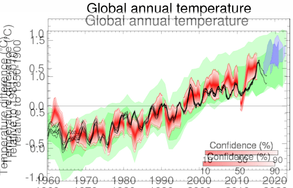
Even the upper of the two black lines is outside the blue region of the 2016 prediction, and is likely to get further away from it, since the latter curves up sharply.
HT Rog Tallbloke, who produced his own graph yesterday showing the mismatch between the Met Office forecast and the observations, before the Met Office’s latest graph came out today.

Shame on the wicked skeptics for not ignoring once again how useless and feckless climate hypesters are.
LikeLike
Meanwhile – of course – this (the sensationalism, not the half-truths) is BIG news on the BBC:
“Climate change: World heading for warmest decade, says Met Office
By Matt McGrath
Environment correspondent”
https://www.bbc.co.uk/news/science-environment-47144058
LikeLike
LOL – Look at their Jan 18 – 5 year ‘decadal’ forecast..
https://www.metoffice.gov.uk/news/releases/2018/decadal-forecast-2018
Forecast that changes every year. for a 5 years ahead…
LikeLike
Adam Scaife: “2015 was the first year that global annual average surface temperatures reached 1.0 °C above pre-industrial levels and the following three years have all remained close to this level.”
The trick is, the Met office have switched to quoting anomalies above pre-industrial, not 1961-90, so the differences between years look smaller. As I pointed out in my last post on El Nino, the two anomalously warm years of 2015/16 are 0.76 and 0.78 respectively with respect to the WMO current climate normal. 2014 was 0.58. 2018 was 0.59. So Scaife is basically misinforming the public. El Nino obviously raised global temperatures significantly for two years, with only slight cooling in 2017 and now more cooling in 2018 such that we are almost back to where we were in 2014. With another El Nino failing to materialise, it looks like 2019 is not going to buck the trend for cooler years. The Met Office are clutching at unicorns to keep the impression going that the world is warming in line with the expectations of global warming models. It isn’t.
https://www.metoffice.gov.uk/hadobs/hadcrut4/data/current/time_series/HadCRUT.4.6.0.0.annual_ns_avg.txt
LikeLiked by 3 people
They will be lucky to get an El Nino with this sunspot data…
Spotless Days
Current Stretch: 5 days
2019 total: 19 days (53%)
2018 total: 221 days (61%)
2017 total: 104 days (28%)
http://spaceweather.com/archive.php
LikeLiked by 1 person
Ha I was about to say I’d seen that on Tallbloke’s yesterday.
LikeLike
I only see one thing, the long term trend tells us that temperatures are rising fast.
LikeLike
Except that is not a “long term trend”, as it does not include the warmer 1930s & 1940s.
LikeLike
Fred,
CMIP5 multimodel mean 1979-present = 0.23C/decade
Hadcrut 4 observations: 0.17C/decade
UAH satellite lower troposphere = 0.13C/decade.
Models have failed. Temperatures are not rising fast.
LikeLike
It’s quite an achievement by the Met Office – producing a forecast in January 2017, which after just two years is off by 0.2 – 0.4C.
LikeLiked by 3 people
No signal here just greatly adjusted T data sets and even then ‘the rise’ is not made.
Utter wet office bollocks – what’s new?
LikeLike
It reminds me of this…
(From http://www.climate-resistance.org/2008/04/oh-to-be-in-england.html )
LikeLike
Dammit, how do image tags work in this comment thing?
LikeLike
Warmest decade – true 67 times since 1850 (HADCRUT)
– true 23 times from 1910-2007 for the UK
– true 24 times from 1659 – 2006 for CET
LikeLike
In the overlay comparison of the prior (2016) & the current graphs, I find it odd is that the spread of the 22-CMIP5-model ensemble is noticeably smaller than previously. It seems odd that a change in baseline period to a more remote baseline period would produce this effect. Also, for the 1960s the current range can be seen to lie toward the upper end of the old range, while in the 2010s the new range lies toward the lower end.
On a different note: in the current decadal forecast, the Met Office display a “Verification of previous forecast” (https://www.metoffice.gov.uk/binaries/content/gallery/decadal_verification_2013-8.png) about which they conclude, “the observations generally lie within the forecast uncertainty range.” The caption identifies that “stippling shows where the observations lie outside of the 5-95% confidence interval of the forecast ensemble.” Given such a wide confidence interval, one could reasonably expect about 10% of the lat/long cells to be stippled; it strikes me that about half the cells are. The Met Office seem to be giving themselves more credit for accuracy than is merited.
LikeLike
Fred (above) notes that temperatures are rising – fast. This is true on the given data but extend the series back in time and it is evident that the current warming is actually the exit from the “little ice age”. We have a convenient marker for the start of this with the furthest South extension of the Norwegian glaciers being recorded as the early 1840s.
As we all know (or should know), long term temperature graphs clearly show warm periods alternating with cold periods each extending for centuries – Paul Homewood’s previously published graphs show this very clearly. To ascribe this warming to industrialisation, as the definition “since the pre-industrial age” implies, is surely a case of picking a period which supports a contentious hypothesis whilst ignoring the contra-indications evinced by the full dataset.
LikeLike
Seems there is a bit of swamp that needs clearing out here. Trouble is there is no one to do it these days. Incestuous politicians are far too busy.
LikeLike
HaroldW wrote: “In the overlay comparison of the prior (2016) & the current graphs, I find it odd is that the spread of the 22-CMIP5-model ensemble is noticeably smaller than previously. It seems odd that a change in baseline period to a more remote baseline period would produce this effect.”
It’s not at odds at all if you consider that the models don’t agree with each other as well as they like to pretend.
As I said in another post, baselining hides a multitude of sins. One of them is to force agreement over a given period of time. By choosing the more modern baseline, they force a greater agreement in the modern period, hence, a tighter model spread. By choosing an earlier baseline, the forced agreement in the modern period is lost, and so you see a greater spread.
LikeLike
I’ve just seen this, in a BBC article by Matt Mcgrath:
WTF?
LikeLiked by 1 person
Perhaps someone can point out when political posturing 5 year plans ever worked.
LikeLike
Paul, that paragraph in full, and the next:
No mention, then, of the Decadal forecast 2016 that you refer to, which is already much warmer than observations. Is this just more cherry-picking or is there any possible rationale for going back to 2013?
LikeLike
Why I can’t take Met Office “scientists” seriously.
LikeLiked by 1 person
The 2016 forecast said:
“During the five-year period 2017-2021, global average temperature (see blue shading in Figure 3 below) is expected to remain between 0.42°C and 0.89°C (90% confidence range) above the long-term 1981-2010 mean (1.02°C to 1.49°C relative to pre-industrial conditions represented by the period 1850 to 1900)”
You’ll see from this week’s forecast post that in HadCRUT4, 2017 was between 0.89°C and 1.09°C above 1850-1900 so the lower end of the forecast range was within the range from the observations for 2017.
2018 was between 0.81°C and 1.01°C above 1850-1900, so the lower end of the 90% confidence range of the forecast was 0.01°C above the upper end of the 95% confidence range of the observations. Useful to understand why, but hardly the massive “failure” you are trying to claim.
LikeLike
Richard, if that’s what the 2016 forecast said, then they’re not doing too well are they. 2017 was 0.99C above pre industrial; 2018 is just 0.91 above pre industrial. Both these figures are outside the range quoted by the Met Office (1.02C to 1.49C) 40% of their forecast so far is a failure.
LikeLike
2018 was between 0.81°C and 1.01°C above 1850-1900
We’re still recovering from the Little Ice Age.
https://www.techexplorist.com/bottom-pacific-ocean-getting-colder-possibly-little-ice-age/19904/
LikeLike
The Met Office is being disingenuous. The temperature data for 1850 to 1900 is heavily biased to conditions in Europe simply because the coverage in the rest of the world was quite low.
The calculated margin of error used by the Met Office is generated from the current data and makes the assumption that data from the rest of the world will be similar, which is a huge assumption. Europe was coming out of a Little Ice Age at the time but the same can’t be sent for much of of the world.
LikeLike
Now picked up by Delingpole.
https://www.breitbart.com/politics/2019/02/08/the-planet-is-cooling-alarmists-shriek-its-warming/
LikeLiked by 1 person
I can see that alarmists will immediately claim that the ‘cooling’ is ‘just weather’, that Dellers is a moron and that the long term warming trend remains intact. The first and the last are true – not the bit about James! However, what is not generally noted is that the acceleration in warming (which we saw in the early 20th century and again in the late 20th century) has tailed off markedly. If CO2 and other greenhouse gases are driving global warming, this is not what we would expect. Scientists explained the mid 20th century cooling by invoking anthropogenic aerosols. They’ve postulated all manner of causes for the 21st century ‘pause’, even to the point of declaring that it does not exist, but clearly, rapid warming has ceased. This graph of 30 year trends in annual GMST (GISS) from Bob Tisdale at WUWT:
https://bobtisdale.files.wordpress.com/2019/01/figure2.png?w=640&h=426
https://bobtisdale.wordpress.com/2019/01/31/global-mean-surface-temperature-early-20th-century-warming-period-models-versus-models-models-versus-data/
LikeLike
Richard Betts is in denial of what the graphs produced by his own organisation show very clearly.
He seems to prefer text to graphs, so let’s look closely at what the text says.
The 2016 forecast (which was issued in early 2017) says:
So it’s perfectly clear from this that the prediction is that the temperature will not drop below 0.04 of its 2016 value over the period 2017-2021.
This enables us to check the accuracy of the forecast, despite the goalpost-moving.
Let’s look at the anomalies according to HADCRUT4
2016 0.797
2017 0.677
2018 0.596
So we can see that 2018 is 0.2C lower than 2016, way outside the Met Office prediction.
In summary, the Met Office prediction was that temperature from 2016 would be within the range -0.04 to +0.43; in fact it was -0.2. The forecast is off by 0.16 – 0.63C in less than two years (as shown already graphically by Tallbloke and me).
LikeLiked by 2 people
Paul, even with the benefit of another year into their decadal forecast, the Met Offices’s cooler, La Nina influenced annual forecast for 2018 was for it to be between 0.88C and 1.12C above 1850-1900, with a central estimate of 1.00C. It turned out to be 0.91C, at the bottom end of their 90% confidence range. We’re now supposed to believe their 2019-23 decadal forecast of a return to rapid warming?
https://www.metoffice.gov.uk/news/releases/2017/2018-global-temperature-forecast
LikeLiked by 1 person
Richard Betts says:
“2018 was between 0.81°C and 1.01°C above 1850-1900, so the lower end of the 90% confidence range of the forecast was 0.01°C above the upper end of the 95% confidence range of the observations. Useful to understand why, but hardly the massive “failure” you are trying to claim.”
Of 2017, he said on Twitter:
Essentially, what he is saying is that a decadal forecast of ‘global temperature’, quoted with a 90% confidence interval, has the added luxury of a further 95% confidence interval on the actual observations of individual years, though this is not made explicit in the decadal forecast. Thus, when observations of individual years, 2017 and 2018 (0.99C and 0.91C) fall outside the 90% confidence range of the forecast (1.02 to 1.49C), the Met Office can simply say ‘Ah, yes, but 2017 may have been as warm as 1.09C, so it’s within the forecast 90% confidence range’. So 2017 wasn’t a forecast fail. 2018 was (just) because it may have been as warm as 1.01C which is still outside the decadal forecast confidence range. However, note that 2017 may have been as cool as 0.89C and 2018 may have been as cool as 0.81C, meaning that both years were a lot cooler than forecast.
Using error bars in observations to try and claim legitimacy for a decadal forecast basically renders a decadal forecast meaningless. As we can see from above, some years might be cooler than forecast by 0.2C, and it would still be ‘right’ or wrong by such a tiny amount that it was hardly worthy of note! Most sensible people would interpret the decadal forecast to mean ‘global temperature’, meaning the measured global temperature, meaning the median value quoted.
LikeLike