Yesterday there was an article in the Mail by David Rose, regarding manipulation and adjustment of temperature data. This issue comes up fairly regularly, but what’s new is that the source of the information this time is a “whistleblower”, John Bates, a highly regarded climate scientist who actually worked at NOAA until retiring last year. Bates has a substantial and technical article at Climate etc.
The purpose of this post is to confirm one detail of Bates’s complaint. The Mail article says that “The land temperature dataset used by the study was afflicted by devastating bugs in its software that rendered its findings ‘unstable’.” and later on in the article, “Moreover, the GHCN software was afflicted by serious bugs. They caused it to become so ‘unstable’ that every time the raw temperature readings were run through the computer, it gave different results.”
Bates is quite correct about this. I first noticed the instability of the GHCN (Global Historical Climatology Network) adjustment algorithm in 2012. Paul Homewood at his blog has been querying the adjustments for many years, particularly in Iceland, see here, here, here and here for example. Often, these adjustments cool the past to make warming appear greater than it is in the raw data. When looking at the adjustments made for Alice Springs in Australia, I noticed (see my comment in this post in 2012) that the adjustments made to past temperatures changed, often quite dramatically, every few weeks. I think Paul Homewood also commented on this himself somewhere at his blog. When we first observed these changes, we thought that perhaps the algorithm itself had been changed. But it became clear that the adjustments were changing so often, that this couldn’t be the case, and it was the algorithm itself that was unstable. In other words, when new data was added to the system every week or so and the algorithm was re-run, the resulting past temperatures came out quite differently each time.
Here is a graph that I produced at the time, using data that can be downloaded from the GHCN ftp site (the unadjusted and adjusted files are ghcnm.tavg.latest.qcu.tar.gz and ghcnm.tavg.latest.qca.tar.gz respectively) illustrating the instability of the adjustment algorithm:
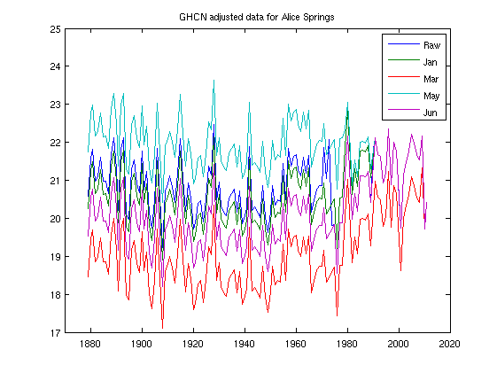
The dark blue line shows the raw, unadjusted temperature record for Alice Springs. The green line shows the adjusted data as reported by GHCN in January 2012. You can see that the adjustments are quite small. The red line shows the adjusted temperature after being put the through the GHCN algorithm, as reported by GHCN in March 2012. In this case, past temperatures have been cooled by about 2 degrees. In May, the adjustment algorithm actually warmed the past, leading to adjusted past temperatures that were about three degrees warmer than what they had reported in March! Note that all the graphs converge together at the right hand end, since the adjustment algorithm starts from the present and works backwards. The divergence of the lines as they go back in time illustrates the instability.
There is a blog post by Peter O’Neill, Wanderings of a Marseille January 1978 temperature, according to GHCN-M, showing the same instability of the algorithm. He looks at adjusted temperatures in Marseille, that illustrate the same apparently random jumping around, although the amplitude of the instability is a bit lower than the Alice Springs case shown here. His post also shows that more recent versions of the GHCN code have not resolved the problem, as his graphs go up to 2016. You can find several similar posts at his blog.
There is a lot more to be said about the temperature adjustments, but I’ll keep this post fixed on this one point. The GHCN adjustment algorithm is unstable, as stated by Bates, and produces virtually meaningless adjusted past temperature data. The graphs shown here and by Peter O’Neill show this. No serious scientist should make use of such an unstable algorithm. Note that this spurious adjusted data is then used as the input for widely reported data sets such as GISTEMP. Even more absurdly, GISS carry out a further adjustment themselves on the already adjusted GHCN data. It is inconceivable that the climate scientists at GHCN and GISS are unaware of this serious problem with their methods.
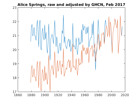
Finally, I just downloaded the latest raw and adjusted temperature datasets from GHCN as of Feb 5 2017. Here are the plots for Alice Springs. There are no prizes for guessing which is raw and which is adjusted. You can see a very similar graph at GISS.
Please only put comments specifically relevant to GHCN adjustments and their stability on this post. General comments about David Rose’s article or the Karl et al paper can go on Geoff’s thread.
Update:
Steve McIntyre has confirmed these results, written an R script to illustrate the adjustments, and posted some of the data files. There’s a tidied up script that can be easily adapted to look at any station you like. For one site in California he found a bizarre annual oscillation in the adjustments.

Are all the stations affected or just some of them? Are all of them subject to this error if the right circumstances arise but most of the time the figures appear stable? Are the stations where the data varies a lot the result of a small error that propagates through the process of homogenisation or thought the choice of stations to homogenise? Or both?
How can any science be built on unstable data? This is their foundation. What kind of convoluted software comes up with a different result each month? Especially when the fault can’t be fixed within hours, never mind years?
This instability must have a knock on effect to other work calibrated to the wobbly data. Studies would be almost meaningless if the data they’re synchronise with changed after they’ve downloaded it. Even if the data is published with the study, the result would be potentially wrong. Just the endless tinkering with the data makes climate research dodgy.
LikeLike
Just curious if there are any other scientific fields where already-“measured” data changes retrospectively? It must make it difficult to defend a hypothesis if the data you looked at yesterday will be different tomorrow.
LikeLike
Yes Paul, This is very disturbing and is something competent scientists should not accept much less publish. Have these issues been brought up with the people involved and did they have any response? Based on my own misadventures looking at the instability of CFD simulations, my guess is that they simply refused to discuss the issue.
[PM: Your guess is correct, see for example this post by Paul Homewood.]
LikeLike
Man in a Barrel, Yes, real world data is often adjusted to account for uncertainties and known sources of error. In a wind tunnel, there are many known sources of “error” and there are well known ways of adjusting the data. These are perfectly honest and valid as long as they are reproducible and disclosed. I’ve also seen instances where the data is adjusted “after” a simulation disagrees with the raw data. That’s not acceptable I would say.
LikeLiked by 1 person
Pursuing data-quality improvements is a noble cause, and can be very productive. Operating deliberately with a poor quality data-adjustment process sounds like professional irresponsibility. When I worked in industry, the DMAIC framework was a handy one for project planning: Define, Measure, Analyse, Improve, Control. Most folks wanted to jump from Define (where problems/opportunities were specified) to Improve (where solutions were sought and implemented). OK perhaps, if you are lucky, in an emergency, but when time was spent on Measure (checking data quality, checking measurement process capabilities), it could be very useful indeed. Sometimes, for example, the problem motivating the project was found not to be with the production process itself, but with the measurement or monitoring process – an insight that could save huge amounts of time and money. The Analyse phase was allocated to discussing and testing possible causal factors, and their interactions.
I think the jump from Define to Improve is roughly what helped the CO2 Fiasco take off so effectively. Here’s a problem, here’s what to do about it. Must act, this is an emergency! When of course, it was not an emergency, and the haste of attributing a role to CO2 which it has not had in the past, nor seems to have in the present, of dominating the climate system is something which might have been avoided with more time in an Analyse phase, and more time might have been spent there if the poor quality of global climate data was better known and better handled.
Well, we are where we are. Kudos to Bates for coming forward, to Rose and Curry for drawing attention to his criticisms, and to Paul M and Paul H and others who have had their teeth in this particular bone of contention for many years.
LikeLiked by 4 people
Tiny, these are all good questions! The linked O’Neill post has plots showing that some stations are affected more than others, and some not at all. He has another post looking at Africa, where the adjustments seem to be quite ‘volatile’, as he puts it.
There are also two posts by Paul Homewood showing this effect in Russia and in Argentina (“The temperature for 1931 has been reduced by 0.59C , from 19.71 last week to 19.12 this week”).
LikeLike
What’s the root cause of the instability? One would assume it’s because it’s processing data in a non-deterministic order and is using single length floating point or some other means of losing precision.
[PM: that’s a good question too. If the scientists behind this were competent they’d have figured it out and fixed it. Somehow, it seems that adding in a new data point makes the code behave differently, so that this week the code will come to a step in the data and decide it’s fine, but next week when it comes to the same step it will decide that it needs to be adjusted.]
LikeLiked by 1 person
Josh has taken a look at this data adjustment lark, and does not like it one bit: https://wattsupwiththat.files.wordpress.com/2017/02/climategate2-noaa-vs-truth.jpg
LikeLike
Thanks for the response DPY. I imagine that circumstances in a wind tunnel, however, are slighhtly more complex than recording a temperature measurement but there are obviously checks that can be made on raw data to determine whether it is acceptable or not. As for adjusting raw data, it has to be done in a documented and reproducible way, and the rationale has to be clear, otherwise you are at the mercy of charlatans.
LikeLike
Heller’s blog has been documenting the bias over time in adjustments. Koutsoyiannis’ 2012 EGU paper* proved statistically that the adjustments to all long record high record quality GHCN were biased warm. The GHCN adjustment instability noted by Bates and multiply proven here is different but equally disturbing. Possibly the bug is actually a feature.
* E. Steirou, and D. Koutsoyiannis, Investigation of methods for hydroclimatic data homogenization, European Geosciences Union General Assembly 2012.
LikeLiked by 1 person
Paul, it would be helpful if you placed the various versions onto an FTP site, so that results can be confirmed. I have some vintage (2008, 2009) versions of GHCN when I looked at these sorts of issues.
LikeLike
Paul, I did a study of GHCN records of US stations rated CRN#1.
The analysis showed the effect of GHCN adjustments on each of the 23 stations in the sample. The average station was warmed by +0.58 C/Century, from +.18 to +.76, comparing adjusted to unadjusted records. 19 station records were warmed, 6 of them by more than +1 C/century. 4 stations were cooled, most of the total cooling coming at one station, Tallahassee. So for this set of stations, the chance of adjustments producing warming is 19/23 or 83%.
An interesting finding was the impact from deleted data as well as changed data in the adjusted datasets.
https://rclutz.wordpress.com/2015/04/26/temperature-data-review-project-my-submission/
[PM: Ron, thanks, yes, the deletion of sometimes quite large chunks of data in the adjusted file is another curious ‘feature’ of GHCN.]
LikeLiked by 1 person
Two thoughts occur to me.
1. Does it matter?
2. Isn’t this eminently testable?
I don’t mean to be flippant with 1, but it occurs to me that if a station is adjusted up by 0.5C, and it’s 5 neighbours are adjusted down by 0.1C each, there is no change on average. And gridding may also affect things.
It also seems to me that the algorithm should be easily tested using simulated data with a known trend plus added noise and biases. Maybe if there’s any math or computer folks here it would make an interesting project (though I’d imagine that NOAA did that already).
LikeLike
Nothing to see here. All adjustments have been subjected to extensive peer revoo and BEST demonstrated ‘beyond all doubt’ that the global historical temperature record is virtually unaffected by adjustments to raw station data since 1940, with adjustments prior to 1940 actually warming the past, rather than cooling it.
https://www.theguardian.com/environment/climate-consensus-97-per-cent/2016/feb/08/no-climate-conspiracy-noaa-temperature-adjustments-bring-data-closer-to-pristine
LikeLike
William,
1. Yes it does matter quite a lot. I’ve heard similar things too many times to count from apologists for some calculation or the other. The standard line is:
. This situation is ALWAYS a sign that something very fundamental is wrong with the simulation or software.
2. As to whether NOAA did these tests themselves. If they did their silence about it is not a good sign. I would have thought they would have included such things in the published paper or at least in some SI.
LikeLike
Part of the problem is what they call a hemispheric mean is really a large area mean. This large area changes in size and location as stations drop out or are added in. Spurious trends can result simply from this artifact in the data.
They also do large scan spatial extrapolations which should not effect the means, but strangely do, as for example in Africa or the arctic, where no data exists but a warming trend always shows up. They may be doing some temporal interpolations as well, with unknown effects on trends.
The data quality is low and sparse. In the Southern Hemisphere the data is so spare before 1958 that no reliable trends can be deduced. Hence, this is also true for the entire globe. One can see a lot of these problems by abandoning temperature anomalies and using absolute temperatures in Kelvin instead. They won’t do this because then the problems become glaringly obvious.
LikeLike
If I understand skeptic arguments correctly, there are two issues involved: Process, which has inspired numerous well-founded criticisms over the past 15 years, and the possibility of skewed results.
The unadjusted record is cooler than the adjusted records. This is clear. However, skeptics seem to be inclined to argue that the beginning of the modern temperature era has been adjusted downwards to make the climb (to a lower total) look more impressive.
The process argument is arguably more significant in the long run. The potential for skew is highly relevant to the debate of the past couple of years and will certainly be a factor for the new US administration.
I think we should be clear about which battle we’re fighting–and I’m not, at this point. As a lukewarmer, I don’t really have a dog in this fight, but I’d like to see a) the truth and b) resolution on both of these issues.
LikeLiked by 1 person
To start to understand why the adjustment algorithm is unstable I believe it is first necessary to
(a) understand why adjustment algorithms are necessary
(b) understand the limitations
The reason that adjustment algorithms – data homogenisation – is necessary is that individual temperature data sets can have measurement biases. That is due to re-sitings, changes in the environment (e.g. the UHI effect) or changes in the instruments. The algorithm consists of pair-wise comparisons of temperature data sets in a particular area over a number of models runs, adjusting the anomalous data in a series of steps. This is fine if the real (climatic) variations over the homgenisation area are small relative to the measurement biases. The problem is that there are real variations over relatively small areas. For instance, Paul Homewood’s original posts on temperature adjustments were in Paraguay. I looked at both the GHCN/GISS and BEST data sets for the eight temperature stations covering about two-thirds of Paraguay. At the end of the 1960s all eight showed a drop in average temperature of about 1C, but this was not replicated in the surrounding area, whether Northern Argentina, South-West Brazil (Parana, Mato Grosso do Sul) or Southern Bolivia. The average adjustment is below.

It is an extreme example, but shows that a limitation of algorithms is that very real localized climatic changes that are not replicated in the surrounding area will get smoothed. Conversely is that there are biases that are consistent across a large number of the highest quality weather stations (such as at airports where there is a lot of tarmac) then these biases will to an extent remain post homogenisation.
LikeLike
Climate science makes a lot of noise about its consensus which suggests precision and clear cut proof. How can you have a high consensus in data that changes on a month by month basis? If BEST and GISS global series are right today, why was there a consensus last year that they were right? Or in 2000? Or 1990? Where was the press release a few years ago saying ‘soory, but there are serious things wrong with the global records, we’ll let you know when we’re satisfied AND AT THAT POINT WE’LL STOP FIDDLING WITH IT.’
LikeLike
Let’s say you’re a computer software developer. You write your ‘weather data algorithm’ and set out to test it. How are you going to know if your results are satisfactory?
LikeLike
The Paraguayan temperature adjustments are but one example. There are others. Real Climate hit back at the growing criticism of temperature adjustments with an example of where temperature adjustments had dramatically reduced the recent warming trend – at Svalbard, by nearly 2C. Problem is that the early twentieth century warming was reduced by an even greater amount and the mid-century cooling also dramatically reduced.

The attack line of Real Climate was also quite typical of what I have found elsewhere (such as in the Guardian). That is
– Attacking a secondary source (Christopher Booker), not the primary source.
– Narrowing the criticisms to one dimension (cooling the past) rather than the wider aspects (seemingly arbitrary adjustments). A single counter-example then serves as a refutation.
– Concentrating on a few examples rather than the wider number.
– Looking at the authority of consensus to dismiss the arguments of individual outsiders.
LikeLike
I would like to tell you of my latest book, “Human Caused Global Warming”.
Available on ‘Amazon.ca’ and ‘Indigo/Chapters’.
http://www.drtimball.com
LikeLike
The question is how do you test for biases in the adjustment algorithms? It is fine highlighting extreme examples such as Alice Springs, but this might be counter-balanced by contrary examples, or the net effect might be approximately zero. There are thousands of land temperature data sets for examples. Having looked at the data, a major issue that I noticed is that for much of the land data, pre-1950 the data was much more sparse that post-1950. As over large distances (say > 2000km) there are quite large differences in temperature trends, the relative density of temperature stations over time could impact on the relative extent of homgenisation adjustments. To test, conduct temperature homogenisations for a region (e.g. South America) for the entire twentieth century for:-
(a) all the data sets used in GHCN.
(b) only for continuous data sets over the entire period (or at least similar numbers of data sets.
My hypothesis is that in the first early twentieth century warming would be smoothed out to a greater extent in (a) than in (b) relative the the late twentieth century warming.
Another hypothesis is that, over time, repeated homogenisations will smooth out past trends.
To test, take the same set of continuous raw data sets from 1900 to 2010 and homogenize.
The take the same data set, but only until 1990 and homogenize. Then add in the data to 2000 and homogenize. Then the data to 2010 and homogenize. If the homogenisation is unstable, but unbiased, then the first, single phase homogenisation should produce very similar results to the second three phase approach.
I explored these issues here.
LikeLike
MBC, thanks. Iceland is another example that has been discussed repeatedly at Paul Homewood’s blog. In the mid-1960s there was a strong cooling observed consistently across all the stations, and even remarked on in the newspapers at the time. But the GHCN adjustment algorithm declares that this didn’t happen and ‘corrects’ for it, leading to spurious warming, see for example this plot for Rejkyavik. (That’s the adjustments as they were in May 2015, at which point GHCN stopped updating these figures.)
LikeLike
Yes, Iceland weather service protested at one point since their records had undergone quality control before submission to GHCN. Another strking example of the Iceland adjustment pattern is Vestmannaeyjar:
ftp://ftp.ncdc.noaa.gov/pub/data/ghcn/v3/products/stnplots/6/62004048000.gif
LikeLiked by 1 person
The ‘Musings from the Chiefio’ blog has some posts which may be of interest here, although I have not had time to study them much. He took a deep dive into the software that, as he puts it, ‘turns the GHCN history into that global ‘anomaly map’ and claims to show where it’s hot and how hot we are’. Here is a long posting about his investigations in 2009: https://chiefio.wordpress.com/gistemp/, and it is one which may need a computer whiz to make the most of it. Here is a 2017 post on ‘scraping data’ out of host sites such as the archives at NOAA: https://chiefio.wordpress.com/2017/01/30/scraping-noaa-and-cdiac/
I mentioned on some other thread last year his downloading of GCM software. Here is an update on his work there: https://chiefio.wordpress.com/2017/01/18/gcm-modele-elephants-playing-mozart/ . He notes
Again, this is primarily of interest to programming experts of which I am not one, but I noted with interest this remark:
I have long harboured the suspicion that these models can, and do produce almost anything in their outputs, and therefore need a lot of pampering and monitoring and cutting-room floor work to produce results which can be used to illustrate the theories and imaginings of folks alarmed by our CO2 emissions. That remark encourages me to remain bitterly clinging to my hunches pending evidence to the contrary!
LikeLike
The discussion of these temperature reconstructions should not ignore the inherent bias coming from the use of anomalies rather than actual temperatures. Clive Best did the heavy lifting on this, along with Christopher Scotese.
https://rclutz.wordpress.com/2017/01/28/temperature-misunderstandings/comment-page-1/#comment-2386
LikeLike
Alice Springs may not be the best example, the Australians have adjusted it in their ACORN-SAT version of Oz temperatures (post 1910), it was a case study (page 86) in the rather good document produced by Blair Trewin:
Click to access CTR_049.pdf
Not sure I agree with their adjustments for rainfall, that to me is genuine climate, but they claim a site move in 1974, which seems to match a shift in GHCN data. Data before 1910 may have been recorded in whatever was used before Stephenson screens, but the surrounding data for comparison must be sparse in the extreme.
A general problem with sceptic attacks in this area is that they tend to show only one station. No set of temperatures from any station can be trusted unless they have been compared with several neighbours.
[PM: The sharp cooling at Alice Springs in the mid 1970s is apparent in raw data at other nearby stations as well. This is a good illustration of the failure of the GHCN algorithm. If it did what it was supposed to do, it would notice this and regard it is genuine, rather than putting in a big adjustment at this point.]
LikeLike
The UHI effect also works to ‘cool’ the past once the measured temperatures are converted to anomalies. This is because the warm period post urbanisation is normalised to zero ‘temperature anomaly’ for example relative to 1961-1990. This shifts rural normal values to apparently ‘colder’ values.
If you then remove the ‘warmest’ large urbanised areas (Beijing,Tokyo,Moscow etc.) from the analysis, this is the result you get.
A classic example of this is Sao Paolo which grew from a small village to a sprawling city of 12 million in less than 100y. Its temperature anomaly apparently increased by over 3C !
LikeLiked by 1 person
Paul Matthews @ 2pm
The Reykjavik temperature adjustments show quite clearly the issues with adjustment algorithm. The GHCN raw data, (i.e. that received from the Icelandic Met Office ) shows less than 0.5C C20th warming; peak temperatures around 1940; and significant cooling mid-century. The GHCN V3 adjusted data shows 2.0C C20th warming; peak temperatures at the end of the century; and hardly any significant cooling mid-century. What is more the adjustments made the data discontinuous. GHCNv3 has no data for 1926 or 1946.
However, the GHCN “raw data” had already been adjusted by the Icelandic Met Office applying standard procedures to the local conditions. Then, NASA GISS homogenise the GHCNv3 data to create their temperature data set. I charted the size of all three sets of adjustments.
The Iceland Met Office do not appear to have altered the trend. Surprisingly NASA GISS restore some of the early C20th warming that GHCNv3 removes. At the linked post I also compared the GHCNv3 adjustments with the station relocations. There appears to be no relationship to the frequent GHCNv3 adjustments to these relocations. The relocation data is likely to be accurate, as the weather station is located near to Met Office building. I would suggest this indicates that compared with other temperature stations in the area there is a lot of seemingly random variation. Pair-wise comparisons will distort high quality data. Add in a couple more years and the distortions could be quite different.
LikeLiked by 1 person
Clive,
Your post says:
which isn’t quite the same as you suggest above.
LikeLike
ATTP, as I mentioned above, there is potentially a serious issue that skeptics bring up frequently but to date I have not seen addressed. Perhaps you can do so or refer us all to an existing answer.
The issue is that when Zeke and Mosh tell us all (repeatedly) that adjustments lower the temperature, that is not potentially the entire story. What they tell us can be 100% true–however, if adjustments lower the early part of the record more than is appropriate, even if the entire record is cooler the warming ‘looks’ more dramatic.
This is something specific that, if addressed to the satisfaction of skeptics (and I must admit, at least this particular Lukewarmer) would be a useful contribution to the climate conversation.
It is true that even if this topic is successfully closed, many skeptics will move on in search of the next issue. Nonetheless, I think it is worth discussing.
LikeLike
Tom,
I don’t quite follow the issue that you’re highlighting. My understanding is that a completely unadjusted record would show more overall warming than one that has been adjusted. Can you indicate an example of what Zeke and/or Mosher have actually said?
LikeLike
Hi ATTP, you’ve got it right. An unadjusted record does show more warming than one that has been adjusted. I have no problem with that–I’ve seen it both from Zeke and Mosh, along with other stalwarts of the climate establishment.
What skeptics are saying (and I at least am wondering about) is that the adjustments lower the first part of the temperature record (possibly inappropriately). So although the total record is less warm after adjustment, global warming looks more severe and dramatic because the earlier years are shown as cooler than (perhaps) in fact they were.
LikeLike
Tom,
I don’t see how that makes any sense. All the temperature datasets are presented as anomalies, which means that the values are presented relative to a baseline, normally 1961-1990, or 1971-2000. If you move the baseline to be a later period, the the earlier values will get lower, and if you make it an earlier period, they will get larger.
LikeLike
Well, what I’ve seen some skeptics write is that the adjustments for the earlier part of the record are (in their opinion) done with a finger on the scale–I haven’t seen them propose a mechanism, but then I haven’t seen anyone write about a solution with the same clarity that (eg) Zeke and Mosh write about the entirety of the record. Which just leaves the question open.
I really doubt if anyone’s doing this intentionally, but it’s still possible that it’s being done.
LikeLike
You have to distinguish between land temperatures measured by weather stations back to the 17th century and ocean temperatures. Since oceans are 70% of the earth’s surface they will dominate global temperatures.
But how well do we know ocean temperatures? Measurements were very poor before the 1980s, so land measurements were far more reliable. One cannot really deny that there was not an underlying aim in climate science to bring both sets into agreement. That meant adjusting old ocean temperature measurements. It is then easy to justify various fudge factors based on steam engine temperatures, or wooden versus metal buckets.
LikeLike
Mr. Best, how would someone be able to manipulate the records to show an incorrect total? It seems unlikely that a team working on a dataset would collaborate to do so, and any individual attempt would almost certainly be discovered in short order.
I’m not saying it’s impossible–but you seem to suggest it’s happened on multiple datasets–I’d like to see a reasonable explanation of how cheating would work. Do you have any thoughts?
LikeLike
Just to be clear, I have actually supervised bucket temp measurements and I can see plenty of room for error. I also am aware of difficulties using intake shipboard temps. There’s plenty of room for error. I just am trying to get my head around how someone would doctor the records across multiple datasets with multiple stakeholders.
LikeLike
Thomas, The point of this post is that the adjustment algorithm used in the paper may be unstable in that very small additions of the latest data point cause very significant changes in the adjustments. Forgetting about anything else, that’s a very very serious scientific issue in itself. Also forget about Mosher and Hausfather. So far as I know they have said nothing about this issue. It needs to be addressed with a serious audit of the algorithm itself.
I personally have always felt that this “algorithm” for adjustment of temperatures is questionable. In any other testing data adjustment process, the test setup is examined on a case by case basis and adjustments are done with attention to the details of each case. That’s the case for wind tunnel tests for example. All tests are different and adjustments are different too. Trying to use a single algorithm would be a disaster and specialists would not stand for it. It’s also the lazy man’s way to avoid doing any real detailed and hard work of wading through the individual station data and records.
LikeLiked by 2 people
DPY (David Young), thank you for restoring the focus. Yes, the point of this post is the apparent instability of the algorithm, which is a serious problem, and I do not recall seeing it discussed by climate scientists.
Stephen McIntyre has checked these results and produced his own graph, using the ghcn data files that I made available to him:
He has also written a script (in R) that generates his plot. The script uses the data files that are now publicly available at climate audit.
LikeLiked by 1 person
@thomaswfuller2
No-one is guilty of fraud. Instead I believe there is more of a groupthink mentality at work. The 15 year Hiatus in warming was a surprise – even an embarrassment for climate scientists. First it was explained as perhaps Chinese coal burning leading to increased aerosol forcing. Then that the missing heat ( energy imbalance TOA) had gone into the deep ocean. Perhaps it was just natural variability – AMO.
Then a surprising newcomer came to the rescue – Kevin Cowtan a chemist from York. First he was able to squeeze some more warming in recent years by infilling Arctic temperatures from satellite data, and then he got yet more warming by changing SST to 2m before combining with Land data. This ‘blending’ process has continued by many others until now the hiatus has completely disappeared.
Every new release of temperature data has already begun to slowly eliminate the 15 year pause in temperatures, but if you look at the land station data it is still here.
LikeLike
Steve’s graph includes one extra data set, from Oct 2012, that I didn’t include in my graph.
This makes things “worse than we thought”. In my graph, the variation in reported adjusted temperatures is about 3 degrees C, but Steve’s graph including Oct 2012 shows that it’s over 4 degrees.
Here are the actual numbers from the two adjusted GHCN files issued in May and October 2012, for each month of the year 1880, in hundredths of a degree. They differ by 4.31C.
May 2012
1880TAVG 2878 2948 2908 2218 1818 1268 1188 1918 1898 2398 2928 2958
Oct 2012
1880TAVG 2447 2517 2477 1787 1387 837 757 1487 1467 1967 2497 2527
[However, the Oct 2012 data set is version ghcnm.v3.2.0, while the others, Jan-June, are version ghcnm.v3.1.0. So the change in October may be due to a new version of the code rather than an instability of the algorithm.]
LikeLike
Which does beg the question: How is it that a stable global dataset can emerge from an adjustment algorithm which is so obviously unstable on a regional level?
Steve McIntyre suggests an explanation:
But this is highly unsatisfactory. Science requires certainty. If your end product just ‘happens’ to be valid, but when you take it apart to examine it in detail you discover that some of its individual parts are basically rubbish, you need to know why the sum of the parts is somehow more meaningful than the parts themselves. Which I think takes us back to the old argument: Is a global mean temperature really that useful a metric? Should we instead be looking at regional climate change?
LikeLiked by 1 person
Fundamentally there is a genuine warming signal when all the different measurements are mixed together and although these spurious adjustments are acting as noise, a pattern still emerges. What you can’t tell is if there are other signals caused by faulty logic.
LikeLike
Over at WUWT a commenter by the name ikh:
https://wattsupwiththat.com/2017/02/07/more-on-the-bombshell-david-rose-article-instability-in-the-global-historical-climate-network/#comment-2419112
suggests that the problem might be caused by implementation of floating point arithmetic, do the experts here have any comments on that suggestion?
LikeLike
Good summary Tiny.
LikeLike
Tiny says:
“Fundamentally there is a genuine warming signal when all the different measurements are mixed together and although these spurious adjustments are acting as noise, a pattern still emerges”.
What concerns me is that the single-minded pursuit of a “genuine [global] warming signal” has taken precedence over the investigation of equally genuine regional climate changes which have become sidelined and obscured by the statistical blunderbuss that is pairwise homogeneity adjustment. This might not be such a big problem were it not for the fact that climate alarmists, when it suits, also like to point to (adjusted) regional warming trends which are supposedly highly indicative of man-made climate change (e.g. the Arctic).
LikeLike
Jaime Jessop says: 08 Feb 17 at 10:27 am
“Which does beg the question: How is it that a stable global dataset can emerge from an adjustment algorithm which is so obviously unstable on a regional level?”
The claim is that historical adjustments are needed to produce “global trend of temperature”. But then the ‘anomaly’ is still but a deviation from some arbitrary ‘average’, with no scale to anything physical. All these statistical word games are the major part of the scam.
“Which I think takes us back to the old argument: Is a global mean temperature really that useful a metric? Should we instead be looking at regional climate change?”
Not only has “global mean temperature” have no possible meaning; the word “temperature” itself has no meaning, except as a diagnostic for some ‘anomaly’, (human body temperature is 37C, or wrongness)! Since thermometric ‘temperature’ is a measurement of the (sensible heat/specific heat) of some amount of mass; even the average of two temperature measurements of to different locations (masses), is not even a ‘temperature with no meaning’; such average is not even defined! Not for science, not for statistics, not for anything but fraud.
LikeLike
Global mean temperatures are a bit of a playground, and one which has served those alarmed about our CO2 emissions very well on the political front. We have here one technical flaw highlighted – the instability of an adjustment process. Next up from there, we have the bigger scandal of the apparently frenetic and goal-directed winnowing of piles of data to extract a rising temperature signal well-suited to political opportunities at the time, notably the Paris conference.
A concentration on regional temperatures would be considerably less removed from ground-truth than global temperatures for some regions, but would be less attractive for political purposes since I understand the GCMs perform even worse at regional levels than they do on the global one, and furthermore many regions do not display politically satisfactory temperature histories. This political problem is, presumably, even more more marked for specific locations, for individual temperature records.
These are very important matters for the climate alarm industry, since it depends so obviously on high levels of support which seems contingent on the sustained ringing of alarm bells. But they are also important in different ways for those who might have made better use of the monies diverted to ‘climate science’, and for the people whose hardships, physical and mental, have been increased by that incessant ringing and the various responses to it.
LikeLiked by 2 people
“… furthermore many regions do not display politically satisfactory temperature histories”.
*Titter*
The commendable ethos of GHCN adjustments/homogenisation is to iron out the wrinkles caused by station moves, change of instrumentation etc. The suspicion though is that, along with these artificial inhomogeneities, real regional and local climate changes have also been ironed out, changes which might actually tell us very useful things about global atmospheric/oceanic circulation patterns. And as Paul has demonstrated here, the algorithm which should be consistently ironing out station bias isn’t; it’s producing different results within the space of just a few weeks, A temporally highly unstable adjustment algorithm inspires even less confidence in the usefulness of the GHC record.
“The claim is that historical adjustments are needed to produce “global trend of temperature”. But then the ‘anomaly’ is still but a deviation from some arbitrary ‘average’, with no scale to anything physical. All these statistical word games are the major part of the scam.”
I hesitate to call it a scam, as such, which implies a deliberate, calculated attempt to deceive the public, but the industry that has grown up around climate alarmism in general certainly is a scam.
LikeLike
The instability of the GHCN algorithm may arise from the order in which they homogenize nearby stations. If the order varies from one run to another, as may happen if some stations drop out, then you can expect to get entirely different corrections. It is kind of like vector addition. The order of the corrections is important.
LikeLike
Clive Best wrote:
“The UHI effect also works to ‘cool’ the past once the measured temperatures are converted to anomalies. This is because the warm period post urbanisation is normalised to zero ‘temperature anomaly’ for example relative to 1961-1990. This shifts rural normal values to apparently ‘colder’ values.”
Just from looking at your example cartoon graph, you cannot correct UHI with a static shift (whether in anomaly or absolute temperature). UHI is causing an error in the gradient of the temperature series. Given that the increase may be accelerating ie not a constant error in the gradient, correcting it cannot obviously be achieved from the data itself but would require external estimates of the nature of the error – population growth curves for example. Given the general population has likely increased everywhere, any method that does not reduce the gradient after applying the correction is likely biased to an increased global warming.
Is it the case that UHI is corrected by normalisation (ie static shift)? if so, that is clearly nonsense.
LikeLike
One point I hope to remember to refer to in the future. This is another Climate Issue Of The Week that nobody will be discussing three months from now. And yes, we’ve been getting issues of the week every week since 2008, when I started looking into all of this.
Temperatures are rising–check. It’s an easy assumption that human emissions are part of the cause, one I have no problem with.
But rising temperatures are a symptom, little more. We need to focus on impacts. Despite desperate efforts to elevate Xtreme Weather to a current problem, it isn’t. Drought is declining on a global scale, precipitation is up, but not very much, storm frequency and intensity does not appear to be moving outside the cyclical variations noted prior to global warming.
So I don’t believe present-day impacts justify the level of panic about climate change that we see in the Romms and McKibbens of the world.
What about future impacts? The IPCC listed 26 impacts projected for this century due to human-caused climate change. They are not at all scary–I wrote at length about them here: https://thelukewarmersway.wordpress.com/2015/05/28/ipcc-wg2-tells-us-what-26-key-risks-of-climate-change-are-and-how-to-fight-them/.
If current impacts are close to nonexistent and future impacts are eminently survivable (in style, not just huddling in a bunker), I struggle to understand (thanks ATTP) what the uproar has been about for the past 30 years.
LikeLiked by 3 people
@Thinkingscientist
Red is Urban, Green is rural. Both start out at same ‘temperature’ say in 1850. Rapid urban growth causes the city temperatures to rise faster than rural before the normalisation period which sets the baseline for calculating ‘anomalies’.
LikeLike
Clive Best says: 08 Feb 17 at 7:31 pm
“@Thinkingscientist Red is Urban, Green is rural. Both start out at same ‘temperature’ say in 1850. Rapid urban growth causes the city temperatures to rise faster than rural before the normalisation period which sets the baseline for calculating ‘anomalies’.”
If the ‘urban’ temperatures rise faster than rural that is what MUST be reveled by the temperature measurement record!! have you any valid explanation as to why the measurement record has been “adjusted” to hide such revelation? Anything anything at all!! These flagrant adjustments are an obvious coverup to hide the proof that the so called climate models represent nothing close to what Earth’s atmosphere physically does!!
LikeLike
I really would like to hear from Mosher on this issue and how he might approach the problem.
[PM: Err, really? You can see comments from Mosher at Climate etc if you wish. They include such insights as “Mcintyre has not confirmed the instability.”]
LikeLike
Clive Best: your response appears to address nothing I raised. I can read the chart and I don’t need an explanation of it. The point is, UHI is an error in the gradient of the temperature series (something we are profoundly interested in if we seek a global warming signal). The UHI signal should be removed by a gradient estimate, possibly a curve, before normalisation. How is the performed?
LikeLike
As a thought exercise some years ago I subtracted Stornaway’s temperatures from several UK stations to see how they differed. I chose Stornaway because although the station is at the aiport, upwind of the town I figured that it would show the least distorted series as the island is continually bathed in Atlantic breezes. The result showed all of the other stations I looked at and even the CET warmed compared to Stornaway. Oxford warmed most and while Sheffied warmed rapidly at first, it then slowed down compared to Oxford, possibly mirroring the change from Sheffield’s industrial heyday and Oxford’s booming success.
If all those stations were mixed together, would the answer be true? Without knowing the details of those sites, how would an algorithm determine UHI or whatever else has caused those sites to vary?
LikeLike
Australian data.


A few years ago I downloaded average annual temperatures for Darwin & Alice Springs. Used avsimple internet search and grabbed what was dominant at the time. Lost the detailed metadata in a disc crash, apologies. Posted this earlier this week on WUWT after the action moved on at
More on the Bombshell … Feb 7 for more detail. Reposted graphs here because of high relevance.
Message is self- evident. Do please ask questions. I have looked at material like this since 1993.
Geoff
LikeLike
Geoff, thanks for that. So as I read your second graph, there was a “consensus” in around 2009 that there had been little if any warming at Alice Springs over the last century.
But how ignorant people were back then in 2009. Now we know, thanks to the adjustment algorithm experts, that there’s been about 3.5 degrees of warming. Isn’t science wonderful!
LikeLiked by 1 person
I have just noticed another feature of GHCN correction algorithm. It invents data where there are no measurements. The Icelandic station Vestmannaeyja has no measured temperature data between March 1938 and January 1942. The war must have had something to do with this and the uncorrected GHCN V3U data are all set to -9999, which means undefined.
However, the corrected GHNC V3C has magically infilled all the missing data with ‘corrected’ measurements. No doubt this is not a unique occurrence.
LikeLike
Good grief. It just gets worse (or better).
LikeLike
Uncorrected (1941).
Corrected.
LikeLiked by 1 person
Clive,
Euan Mearns when looking at data around the world noticed the same thing as well. In some places data is deleted, in others places it is added in.
Some put it down to deliberate antics. I would put it down the homogenization process. Whilst it is claimed to be an exercise in cleansing the data of measurement biases, what it is actually doing is transforming each data point into a representation of the surrounding area, the boundaries of the area being defined by the other data points. Despite the assumption that temperature trends being more or less the same in an area this is clearly not the case. At a local level, trends can vary quite markedly. It could be just data noise, or real variations. What makes it worse is that data sets are not continuous. So a continuous data set in say Southern Africa, might be homogenized against temperature data sets with a couple of hundred kilometers in the 1970s, but with data sets a thousand kilometers or more away a few decades earlier.
Euan Mearns station count for when he looked at 26 weather stations in Southern Africa (inlcuding Namibia, Zimbabwe, & Tanzania, as well as South Africa) is below.
http://euanmearns.com/the-hunt-for-global-warming-southern-africa/
Figure 6 is an interesting screen capture of data deleted between two versions of GHCN data sets (in yellow) and data added in (in green).
LikeLike
Clive,
I am aware of circumstances where
(a) Data exists and is available on the Iceland Met Office site, but there are big gaps in the data at GHCN (including Teigarhorn and Stykkisholmur, see next post).
(b) GHCN u data exists but the adjustment algorithm deletes big chunks of data, leaving big gaps in the GHCN a data.
You can see both these effects in their plot for Teigarhorn (produced May 2015).
But I was not aware of what you say, data creation.
I think you may have the files the wrong way round? Can you check?
When I look, it’s the unadjusted file qcu.dat that has
200 0 20 0 290 0 540 0 830
and the adjusted file qca.det that has
-9999 X0-9999 X0-9999 X0-9999 X0-9999
The adjustment algorithm deletes a chunk of data from March 1939 to Jan 1943.
LikeLike
Paul Matthews 9 Feb re Darwin, Alice,
First I conclude that the errors in these time series are large. I consider that the 95% or whatever bounds should take in most of ALL of the lines shown. Roughly +/- 2 deg C about the mean. This is an arguable assertion, but I cannot remember an argument against it. Logic, each of these was proposed by its compiler as being useful for a purpose. None was voluntarily withdrawn. Each has some probability of being correct. Such an error eliminates these numbers from many uses to which they are now being put.
Next, in the context of stability of versions, there are some GISS sets to add to your collection.
Third the manner in which there is departure from the original (here the 19922 BOM lines) there is adjustment of AUST data indicated by GISS lines. I am trying to find if these were pre- or posr- CLIMAT stage. There should be no TOBS required as much of the Aust data are nominal 0900 hours recordings. So what are the origins of the differences raw versus GISS?
Last, Darwin is right by the tropical seas whose SST tops out globally. One would expect any sea influence on land temperatures to cause minor variation only over this 150 years. If Darwin land temps did change, what was the mechanism?
Those are the main points.
Thank you for your patience.
Geoff
LikeLiked by 2 people
I made an attempt to figure out what the right answer should be for Alice Springs, but have concluded that it is a bad apple, and have spat it out. It has several problems that may make it un-homogenisable by both Man and Machine, such as non-standard exposures before 1900, and possible urban heating at the Post Office site before it moved to the airport. ACORN-SAT makes so many adjustments to it that it is effectively just a composite of its neighbours, but one with a possibly fake warming trend:
https://climanrecon.wordpress.com/2017/02/10/historical-temperatures-at-alice-springs/
LikeLike
So much smoke heat and fire.
LikeLike
“Massive Retrospective Adjustments Made to Temperature Databases Used to Promote Net Zero”
https://dailysceptic.org/2024/04/04/massive-retrospective-adjustments-made-to-temperature-databases-used-to-promote-net-zero/
LikeLike