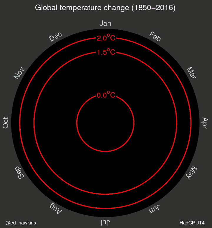
It’s an illustration of the vacuousness of the vast climate industry that one rather silly and misleading graphic has caused such a frenzy in their community over the last couple of days. Climate scientist Ed Hawkins from the University of Reading put this animated gif on his Climate Lab Book blog on May 9th and promoted it on twitter, and since then it has ‘gone viral’. Climate hysteria seems to be spiralling out of control.
Here are just a few of the daft responses to it in the media:
One look at this visualization will make you a climate change believer
See The ‘Doom Spiral’ That Perfectly Explains Global Warming
This “Doom Spiral” Is All You Need to Understand Global Warming: Global temperatures are spiraling out of control, and this spiral animation proves it.
Animation shows how global warming is spiraling out of control
This viral climate GIF offers an incredibly clear view of rising temperatures
The spiralling climate crisis GIF every business leader should see: But “terrifying” doesn’t even cover it. As you watch the accelerating outward spiral of the post-industrial revolution temperature record the true scale of the environmental challenge hits home like a freight train, like a forest fire, like a cleaving glacier.
This scientist just changed how we think about climate change with one GIF
Sobering GIF Shows Earth’s Climate Spiraling Toward The Brink
The Earth is warming at scary rates, and this GIF proves it
Can a GIF change the way we think about global warming?: Mesmeric yet terrifying, given its implications, the GIF will continue to make waves on the internet for a while yet. But will it change policy?
And here are some examples of the twitter-terror-tantrum:
Hawkins even tried to get Leonardo DiCaprio interested:
But then, a bit like the authors of another recent piece of climate overhype, he seemed to show a bit of concern about the over-reaction:
Other climate scientists praised the diagram as an example of excellent science communication.
But two Met Office scientists expressed some doubts about it:
Retired statistics professor Roman Mureika pointed out some flaws:
leading to this suggestion from Jonathan Jones:
[Thanks to Barry Woods for some of the links.]

Just how do you compete with this kind of thing? Plain old science isn’t enough to counteract this nonsense.
LikeLiked by 2 people
My reaction to the graph:
https://twitter.com/shubclimate/status/730357237483331585
LikeLiked by 2 people
Traditionalists might prefer a graph, but this GIF moves and is perfect for the internet age. All it lacks is kittens.
LikeLiked by 3 people
A lot of viewers of the graphic seem to be having kittens.
LikeLiked by 3 people
I am in agreement with Ralf – more kittens 😉
http://www.minor-foundation.no/spotlights
(the link is not a parody)
LikeLike
Richard, yes, I wonder if we should include a trigger warning at the top of the post –
“Warning. This post contains material that some readers may find terrifying”?
LikeLiked by 3 people
I like Svein T veitdal’s description of a ‘166-year animation’. Given it often takes three or four days just to make a 30 second animation, I’d guess 166-year animations take 956160 years to complete. About the same length of time it takes me to complete a post on Cliscep.
LikeLiked by 2 people
Warning! Hypnotic imagery. Focused attention may induce belief in CAGW.
LikeLiked by 2 people
kudos – to Karl
Karl Mathiesen @KarlMathiesen May 10
Please stop tweeting about how climate change sank five islands in the Solomons. It’s bad journalism.
And
And
LikeLiked by 1 person
This is what the last 200,000 years looks like in Ed’s plot
Polar plots with selected scales are a bit naughty.
LikeLiked by 3 people
9 out of 10 kittens prefer Hawkins’ Doom Spiral compared to regular temp graphs.
LikeLiked by 1 person
Clive Best – they are indeed a bit naughty. Radial scale goes from a chosen zero to a chosen upper limit which maximises the visual impact – a big sense of some 100% out there to be approached. A visual impact complicated (some might say deceived) by the increasing area enclosed by spiral as it goes round and outwards, yet presumably the radial distance is the measure being used.
Hard to say if this is yet more turpitude. Or stupitude. Or innumeratude. Or astatisticismatude. Or just some dude having a laugh at almost everyone else’s expense.
LikeLiked by 1 person
Can you slow down a GIF? I think if you did, you would see that the spiral does not build uniformly (it expands and contracts) and the ‘out of control’ loose thread at the end is not a good guide to future growth.
LikeLike
if you run it backwards we go down the drain.
LikeLike
Or vanish up our own base line.
LikeLike
The #1 problem with the doomy graph is that it cannot prove anthropogenic causation, just warming. And that is what the debate is about, causation.
LikeLike
Didn’t you know, all things catastrophically anthropogenic lend themselves perfectly to be represented by a spiral, e.g. Arctic Death Spiral:
In fact, if it’s a spiral and it has to do with climate change, it’s virtually certain that the cause is anthropogenic; because, as we all know, Nature doesn’t do spirals – well, at least, not Death or Doom ones.
LikeLike
If cold was on the outside and warmth on the inside, the animation would look much the same. It grew inward and outward because the most obvious changes are new temperature records. When you start at a year and move forward, you get a lot of new records both hot and cold.
LikeLike
Someone adept with gif’s should make one in kelvin, although watching a dot go around in a circle might be boring. Of course both Gif’s could be displayed on tablets fastened side by side with brads. They could be the keys to understanding how hyped it is.
LikeLike
Josh has another great take down on the spiral of doom
https://wattsupwiththat.com/2016/05/13/friday-funny-another-look-at-ed-hawkins-scary-temperature-spiral/
You sceptics are real meanies, not letting Ed’s scary chart last a week before de scary-fying it.
LikeLiked by 1 person
I live in a rural area and farmers are always looking for new and inventive ways to scare pigeons of their crops. Ed’s spirograph looks like it could be perfect for the job. Ed could become a self-made millionaire if he gets in quick and patents his design.
LikeLike